17 / 19 · Retail insight, edited for each reader

Fresh

Fresh is a Manthan-promoted community of retail, technology and analytics insight. I designed the desktop site, which suggests trends and articles from how each reader behaves on the platform and on social media.

Role
UI/UX designer
Client
Manthan
Industry
Retail & commerce
Year
c. 2015
Work
UI/UX, Web design, Product design

Manthan, a retail business-intelligence company, wanted one place to share thinking on retail decision making. It would carry articles, interviews, blogs and webcasts on trends such as demand sensing, data discovery and multi-channel retailing.

Retail, technology and analytics cover a lot of ground. A merchandiser and a data analyst want very different reading, and a single editorial feed would bury most of it for both.

What would make a retail insights site feel like it was edited for each reader, while still helping new readers discover what matters?

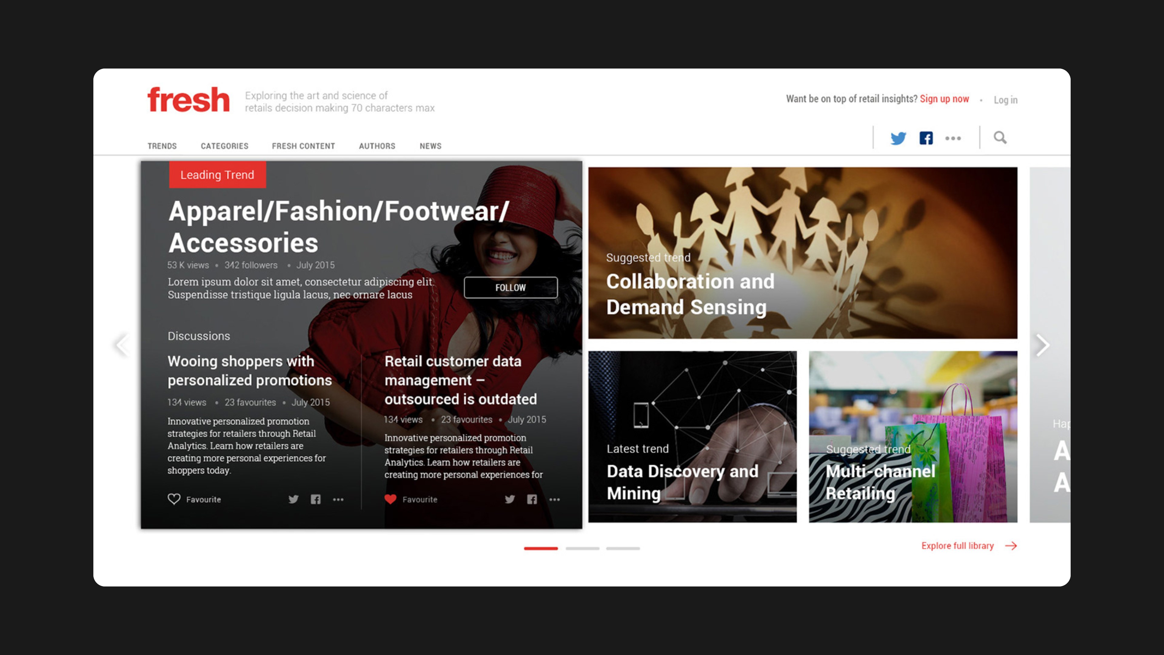
I designed every page to mix editorial and personal signals. The homepage leads with a mosaic of leading, suggested and latest trends, ranked by the reader's preferences. Readers can follow trends, categories and authors, and each article suggests related trends, categories and reads. Subscribe prompts and ad slots are part of the layout from the start.

My role

UI/UX designer. Designed the platform's desktop experience: homepage, trends, categories, articles, authors, article detail, personalisation surfaces, subscribe flows and ad placements.

What made it hard

  • Breadth of topics

    Apparel, CPG, convenience stores, big data and advanced analytics all needed a home without overwhelming the navigation.

  • Personal and editorial together

    Pages had to balance Editors Pick and Most Popular with suggestions just for the reader.

  • Many content types

    Articles, interviews, blogs, webcasts and discussions each needed a clear format.

  • A commercial forum

    Ads, newsletter sign-ups and Manthan's own promotion had to fit in without hurting reading.

Questions we asked

  1. Which signals should drive suggestions: what a reader opens, favourites, follows or shares?
  2. How do trends, categories and authors relate, and which should lead the navigation?
  3. Where does a subscribe prompt help rather than interrupt?
  4. What does an article page owe the reader after the last paragraph?
01

A homepage led by trends

A mosaic of trend tiles opens the site: a leading trend, a suggested trend and the latest trend, each with views, followers and a follow button. Below sit tabs for Most Popular, Editors Pick, Just For You and Categories, with a monthly newsletter card built into the grid.

A homepage led by trends

Opening the leading trend expands the slider in place, with live discussions beside it.

02

Categories, articles and authors

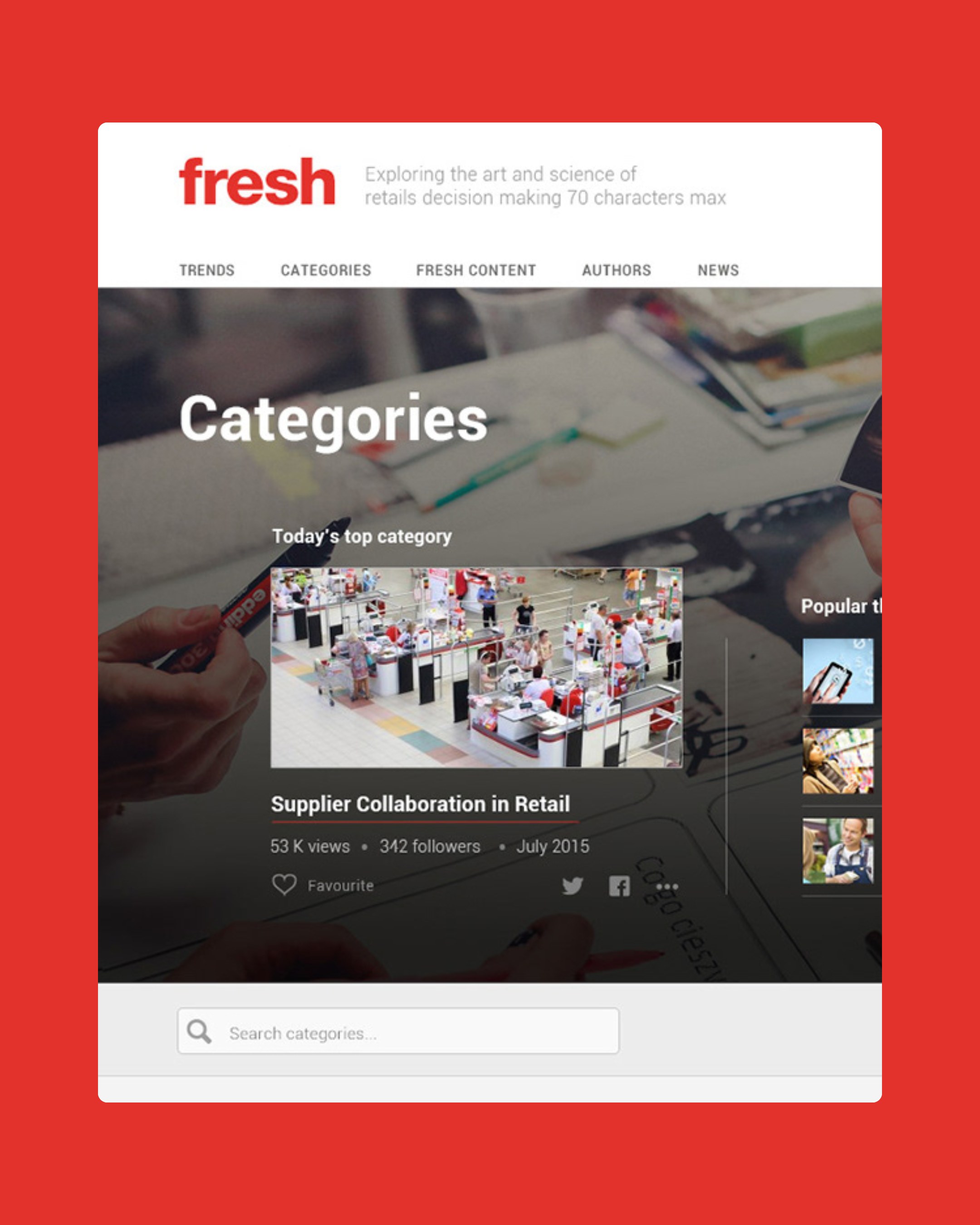
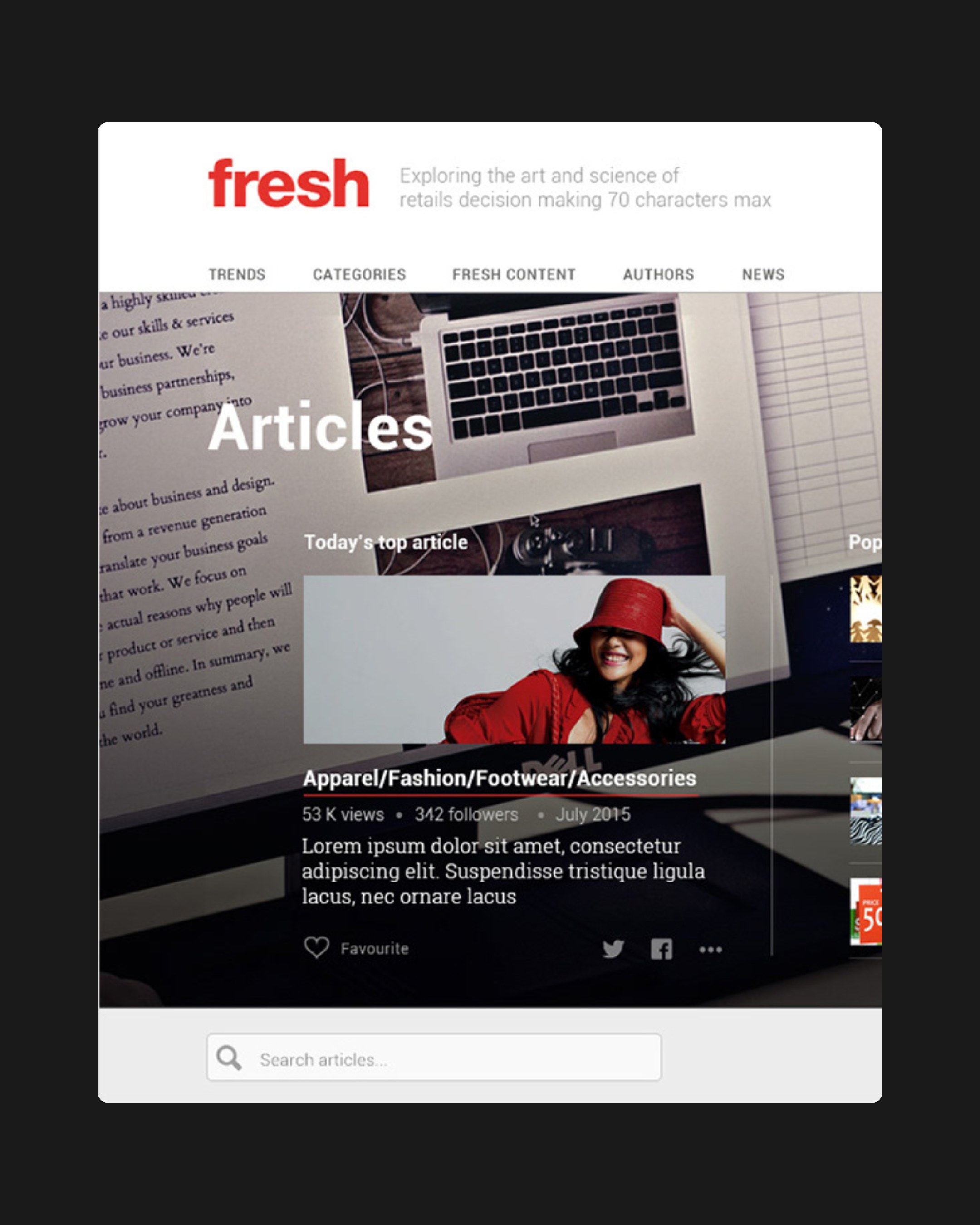
Each listing page shares one pattern: a hero with today's top item, what is popular this week and a suggestion for you, followed by search, filters and sorting. Authors get a directory of portraits with follow buttons and their latest pieces.

Categories, articles and authors

Categories and articles share one landing pattern: today's top item, popular this week and a suggestion.

03

Your Fresh

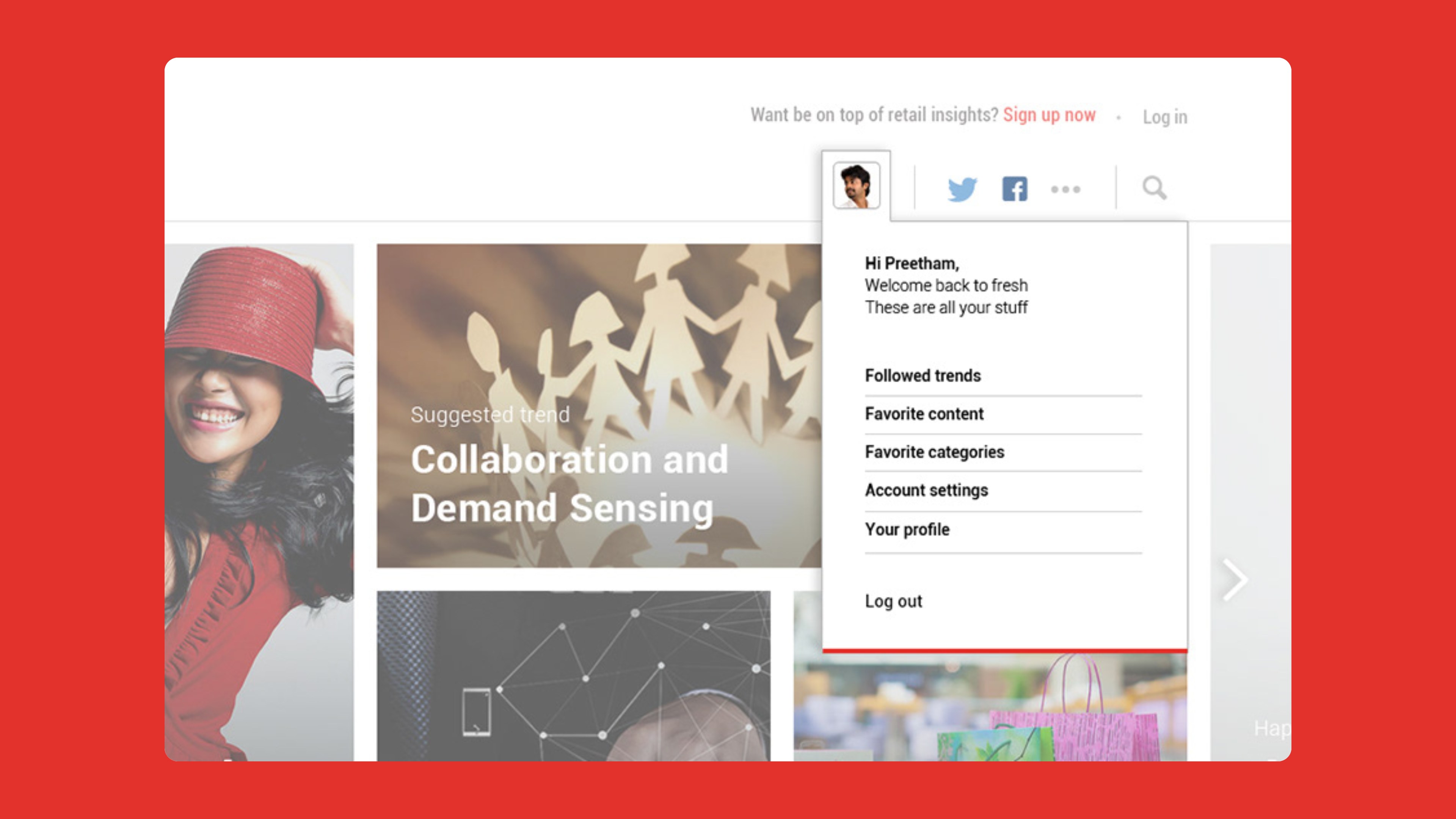
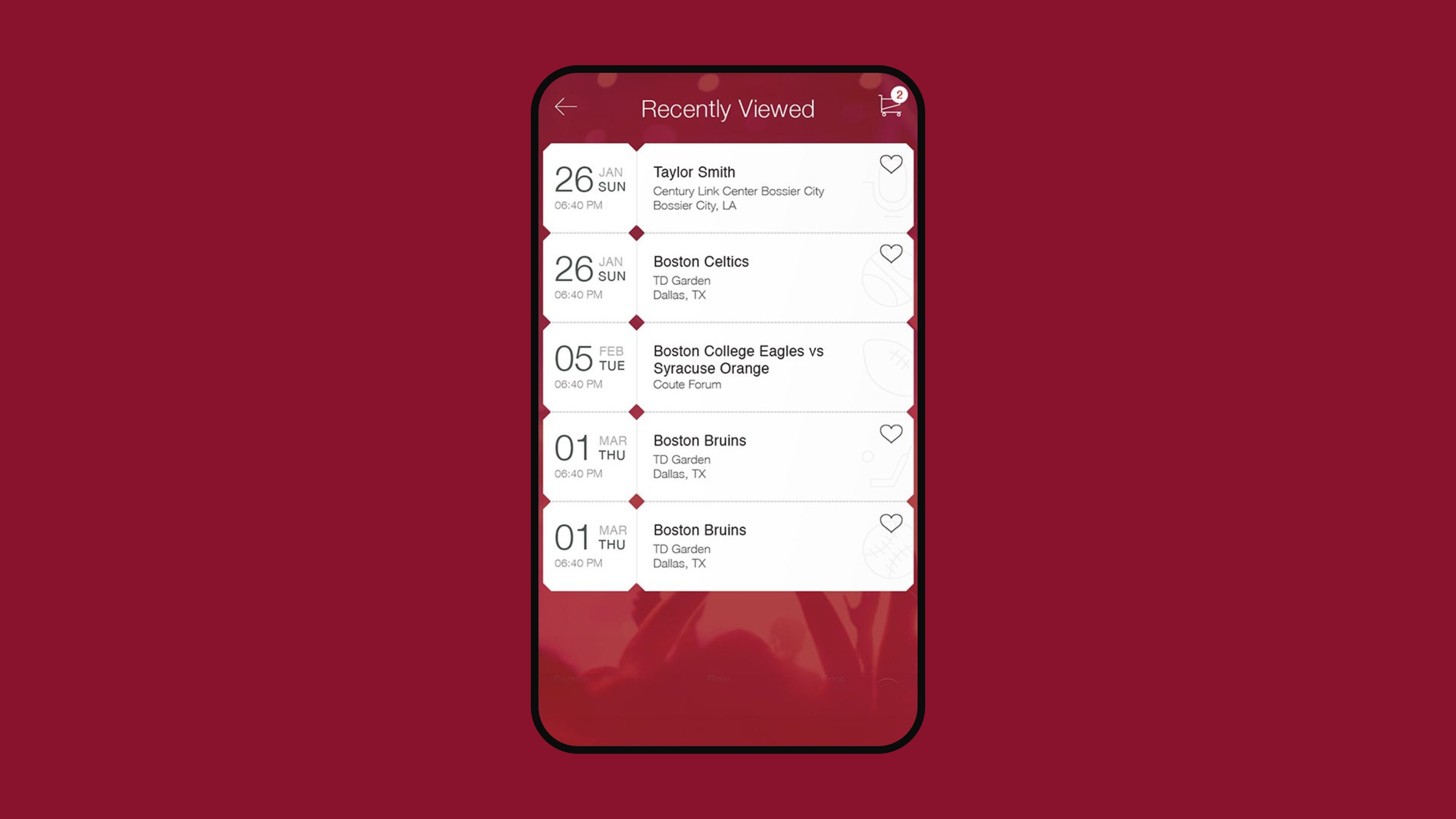
Signed-in readers see a personal menu with followed trends, favourite content and favourite categories. A Just For You page counts the articles, interviews, blogs and webcasts chosen for them.

Your Fresh

The personal menu gathers everything a reader follows or saves.

04

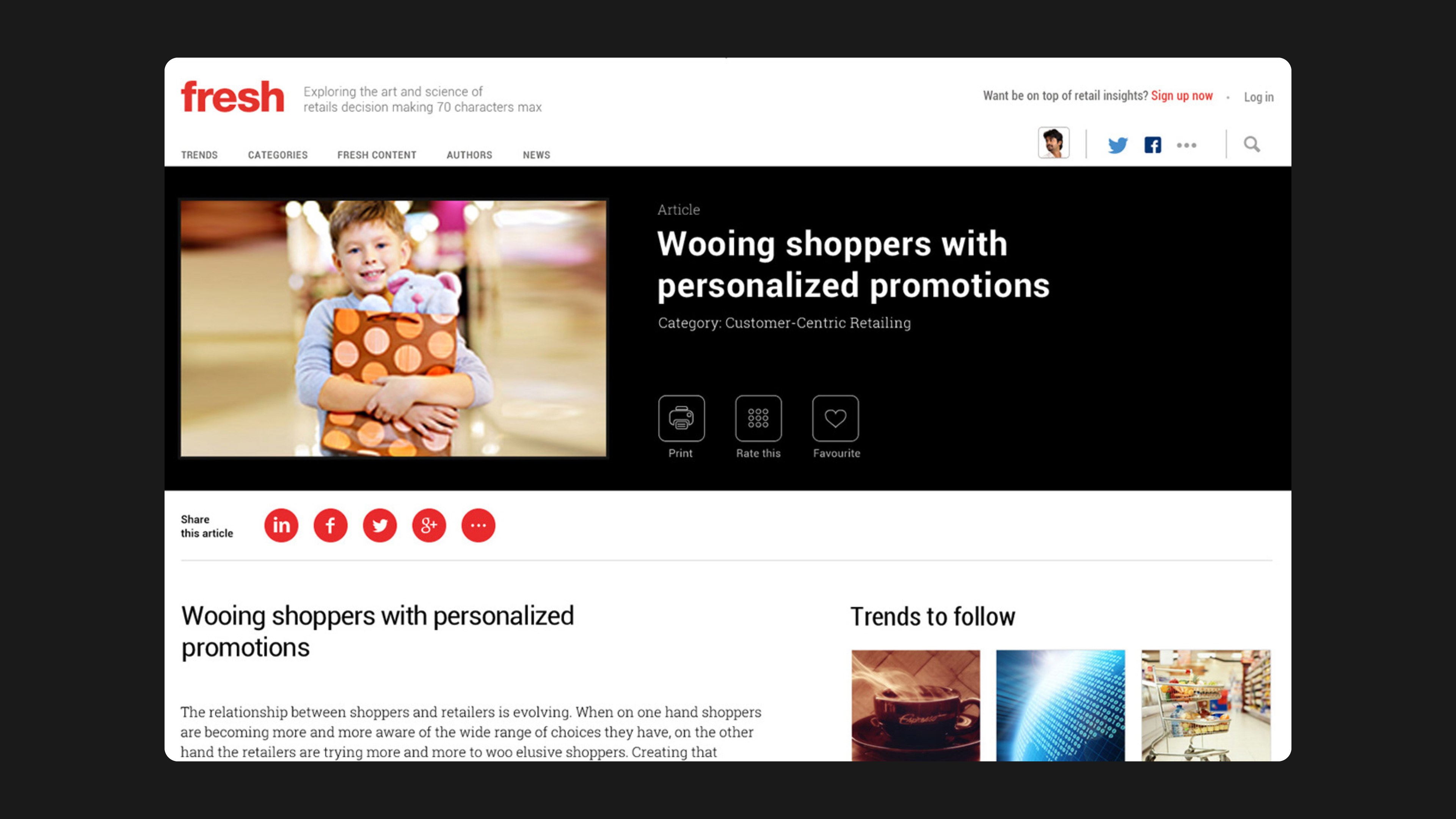
The article page

Articles open with print, rate and favourite actions and share buttons. A side rail suggests trends to follow and categories you might like. Related articles and a moderated comment thread close the page, with an advertising slot in the rail.

The article page

Print, rate and favourite sit in the article header, with trends to follow in the side rail.
In motion

Outcomes

  • 10page templates and components designed

What I took away

  • Personalisation needs visible handles. Follow buttons on trends, categories and authors give readers control and give the system its signals.
  • A shared listing pattern across categories, articles and authors kept a large site easy to learn.
  • The designs are desktop-only. A mobile-first version would be the first thing to revisit.
UI/UX designer
Preetham Lawrence
Have a hard problem worth solving?

Let's solve it together.

preetham.lawrence@icloud.com
+41 76 740 46 30Phone
LinkedIn↗ Writing on Medium↗

Design leader based in Zürich, Switzerland. Open to leadership roles and selected collaborations.

© 2026 Preetham LawrenceIndex