15 / 19 · A personal gift assistant for the web

Gifteehub

Gifteehub is a beta gift assistant that finds ideas across online shops and a community of givers. I designed its mark, palette and illustration style, and the web product from sign-up to product detail.

Role
Designer, brand and web
Client
Gifteehub Inc.
Industry
Retail & commerce
Year
2016
Work
Brand identity, Illustration, Web design

Gifteehub set out to be a personal gift assistant. You describe the person you are buying for: their gender, your relationship, their hobbies and interests. It then finds gift ideas across many online shops, plus recommendations from other people on the platform.

Gift buying is personal, and a search box is a poor way to start. Shoppers often know the person well and the product not at all. The service also depended on its community sharing ideas, so contributing had to feel as easy as browsing.

What is the least a giver needs to tell us before the recommendations feel personal, and how do we make sharing an idea feel just as light?

The product starts from people. Each giftee gets a profile with age, relationship, birthday and interest chips, and recommendations update as you answer quick cards such as "Is Shawn interested in reading?" Interests are picked from photo tiles in one step, and sharing a gift idea is a three-step flow. I gave it a friendly green brand, a gift-box "g" mark and a hand-drawn illustration set to keep it warm.

My role

Designer, brand and web. Designed the Gifteehub mark and palette, an illustration set, and the web flows from sign-up and onboarding to recommendations and product detail.
What made it hard

  • Personal without a long form

    Recommendations needed enough about the recipient to be useful, without a questionnaire that scares people off.

  • Two sources of ideas

    Products from online shops and ideas from community members had to sit side by side and still read clearly.

  • A brand from scratch

    The beta needed a mark, palette and illustration style that felt friendly and giftable.

  • Learning as you go

    The service had to keep refining what it knew about each giftee.

Questions we asked

  1. What does a giver already know about the recipient that a shop doesn't?
  2. Which interests can be picked by sight instead of typed?
  3. How do we ask a follow-up question without interrupting browsing?
  4. What makes someone share a gift idea with strangers?
01

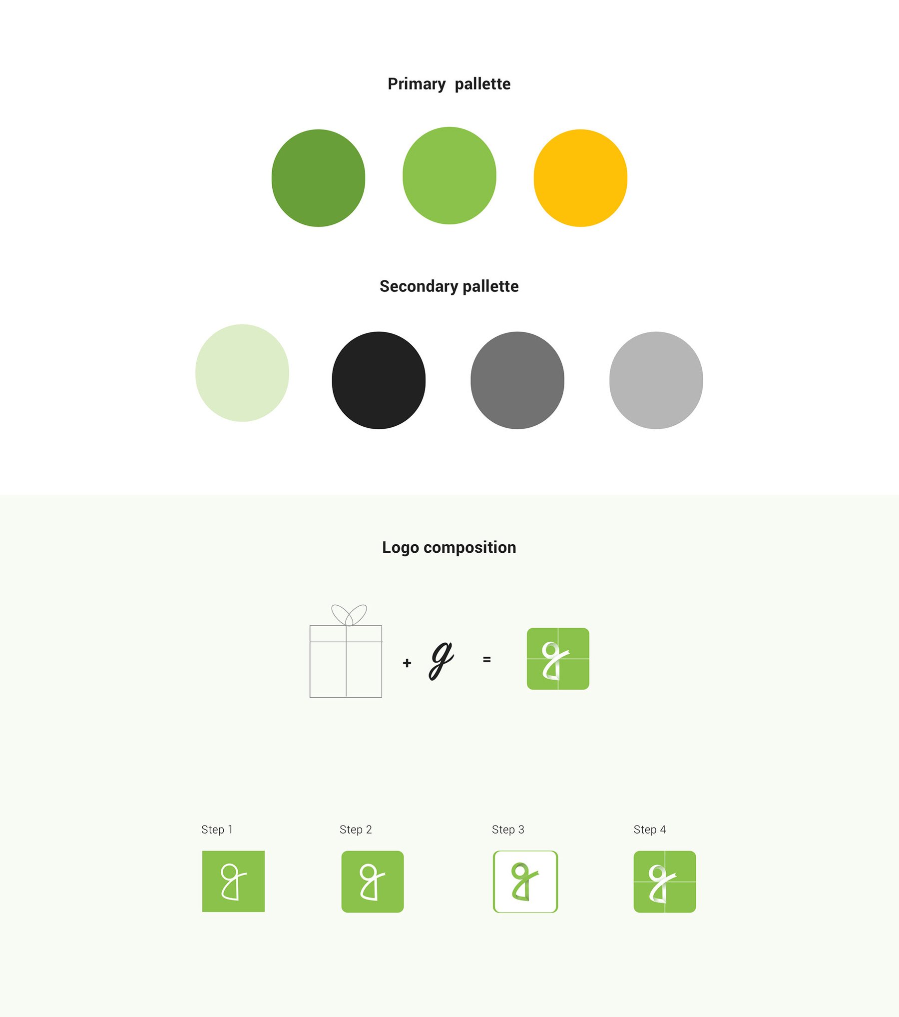
A gift box that becomes a g

The mark combines a gift box and a script g in four construction steps, set beside a handwritten Gifteehub.com wordmark. Two greens and a yellow lead the palette, backed by a pale green, black and two greys, and the lockup works on light, white and charcoal grounds.

A gift box that becomes a g
02

Illustrated infographics

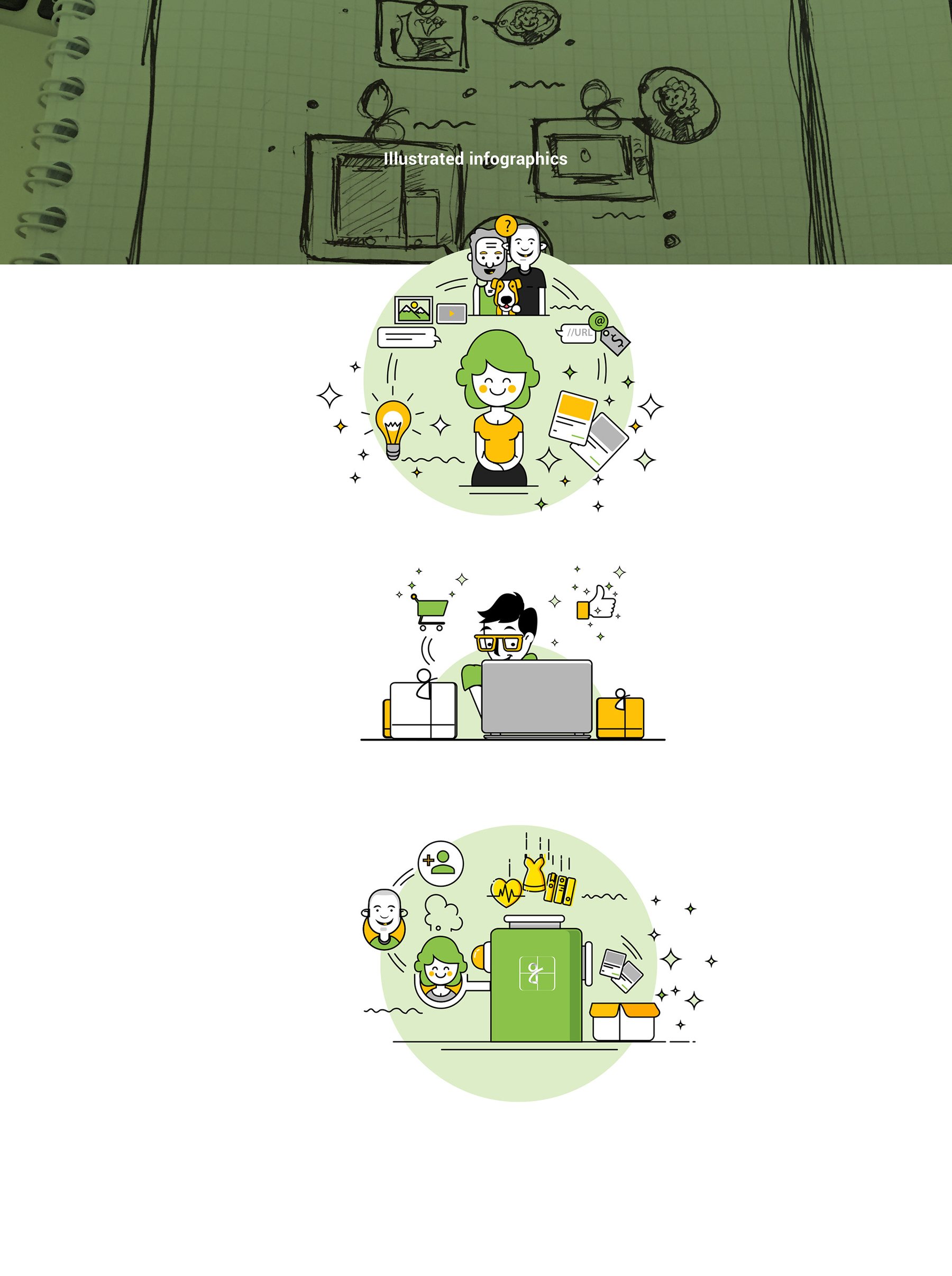
A set of line illustrations with green fills went from pencil sketch to final. They explain the service at a glance: ideas and gifts, shopping online, and a gift surrounded by the people who suggested it.

Illustrated infographics
03

Sign-up and onboarding

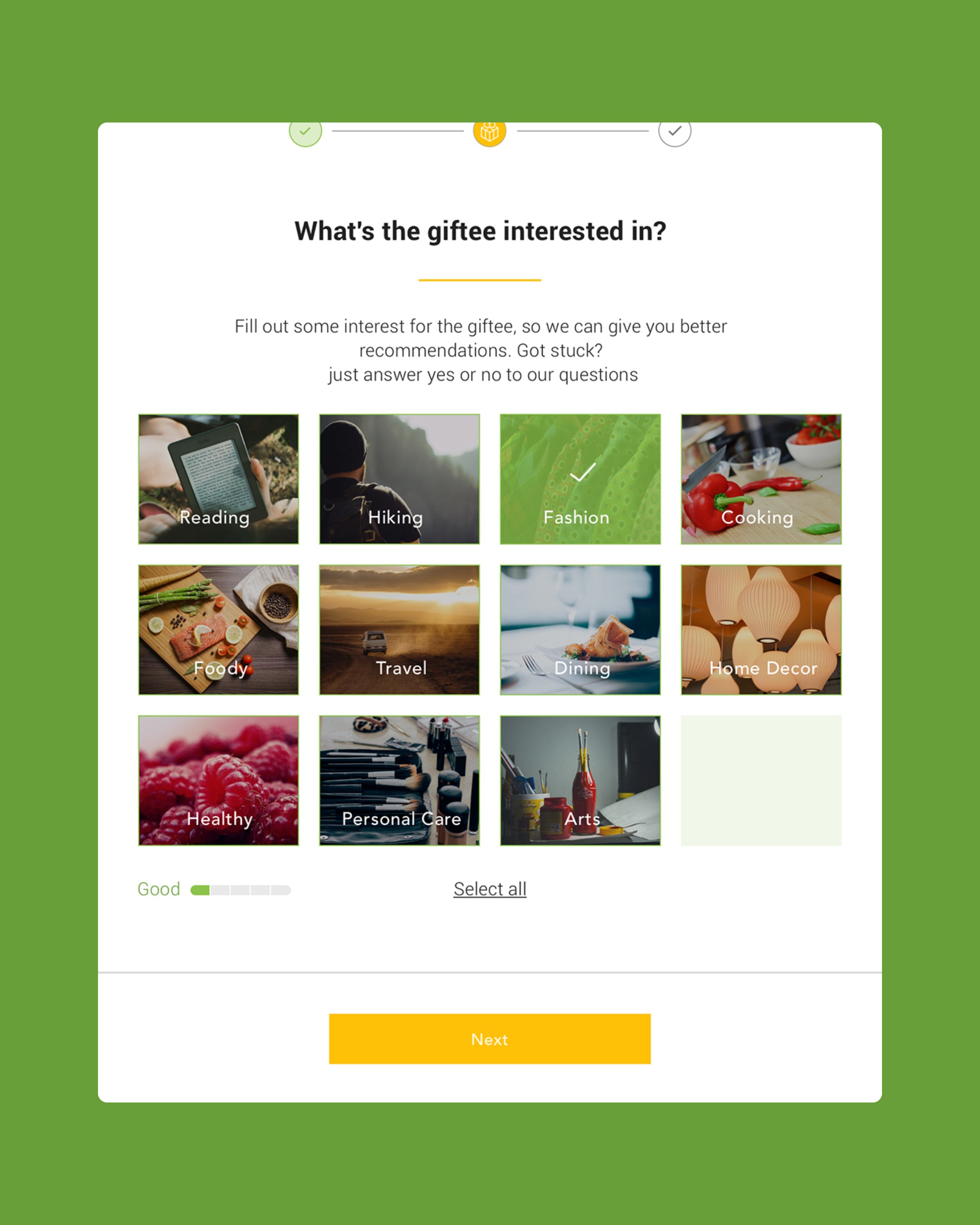
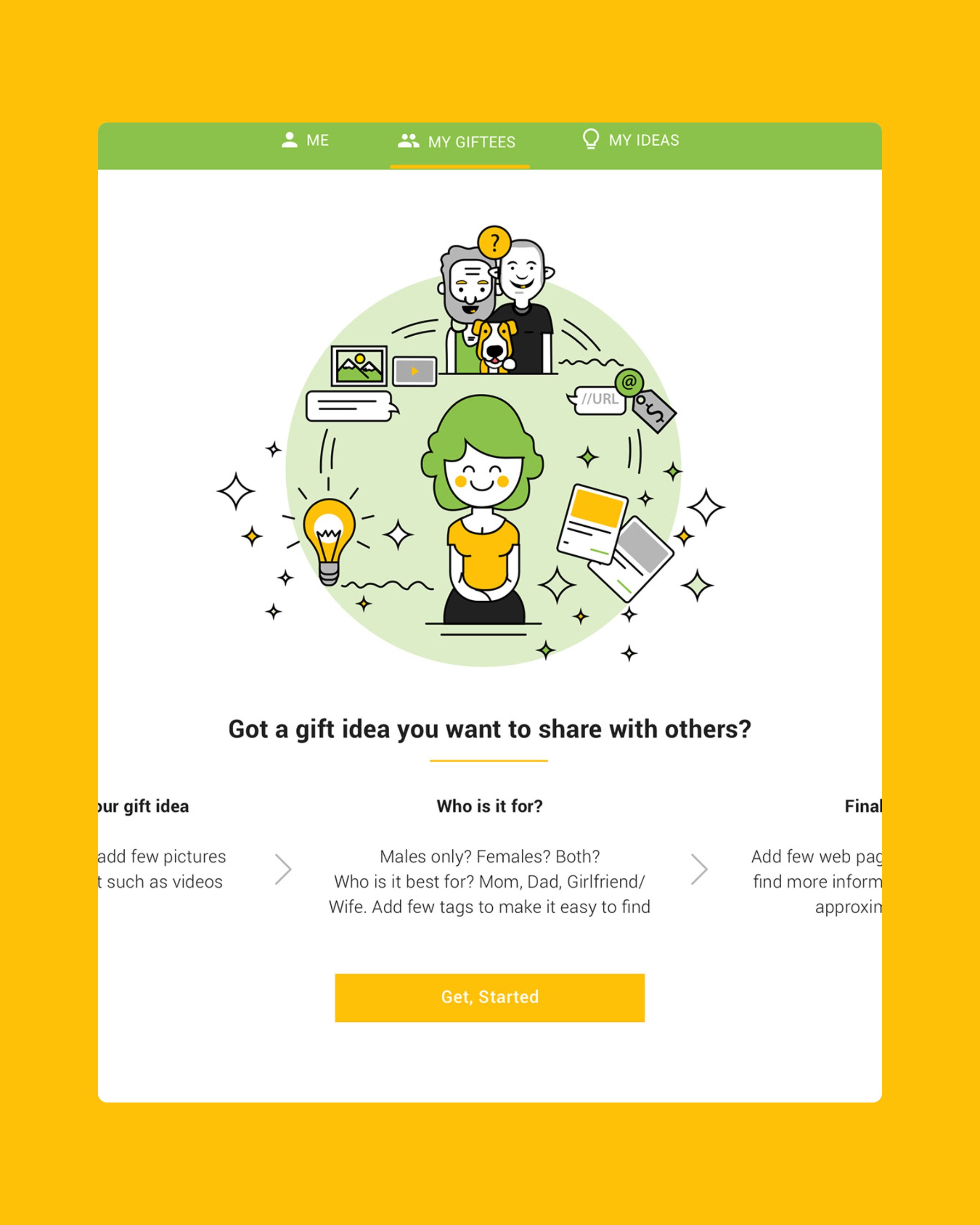
The beta sign-up promises instant gift recommendations from the best online shops and the community, with Facebook or email sign-up and a "maybe later" exit. Sharing an idea takes three steps: describe the gift, say who it suits, add final details. Interests are chosen from photo tiles, with a progress meter and a skip link.

Sign-up and onboarding

Interests are picked from photo tiles, and sharing an idea is previewed as three short steps before it starts.

04

Giftees and recommendations

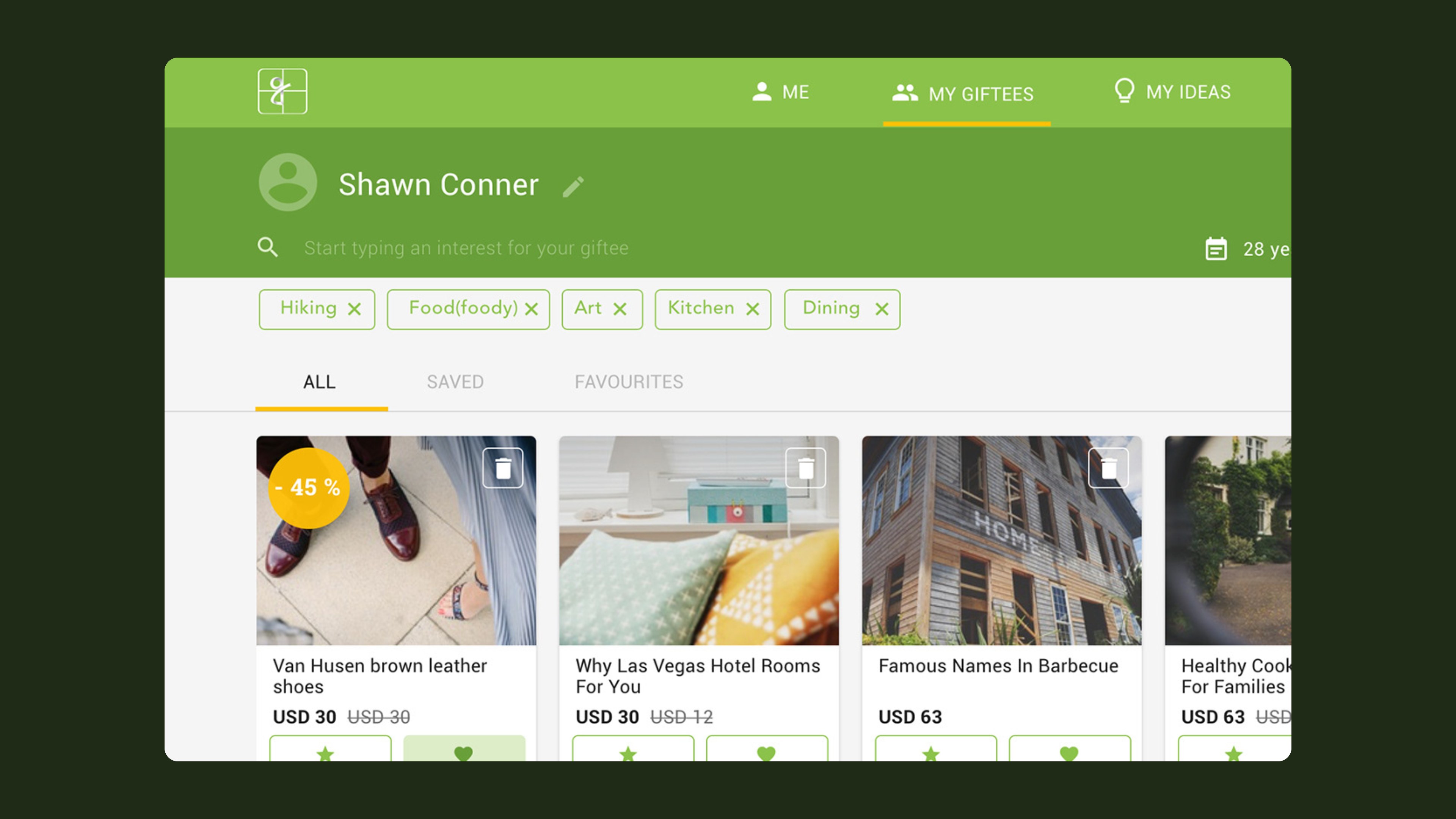
Each person you buy for gets a profile. Interest chips sit under their name, age, relationship and birthday, and a grid of recommendations follows, with discounts, save and favourite actions. Inline cards ask yes, not sure or no about new interests, so the list keeps getting sharper.

Giftees and recommendations

The inline card asks one yes-or-no question and the grid reshuffles around the answer.

05

Product and idea detail

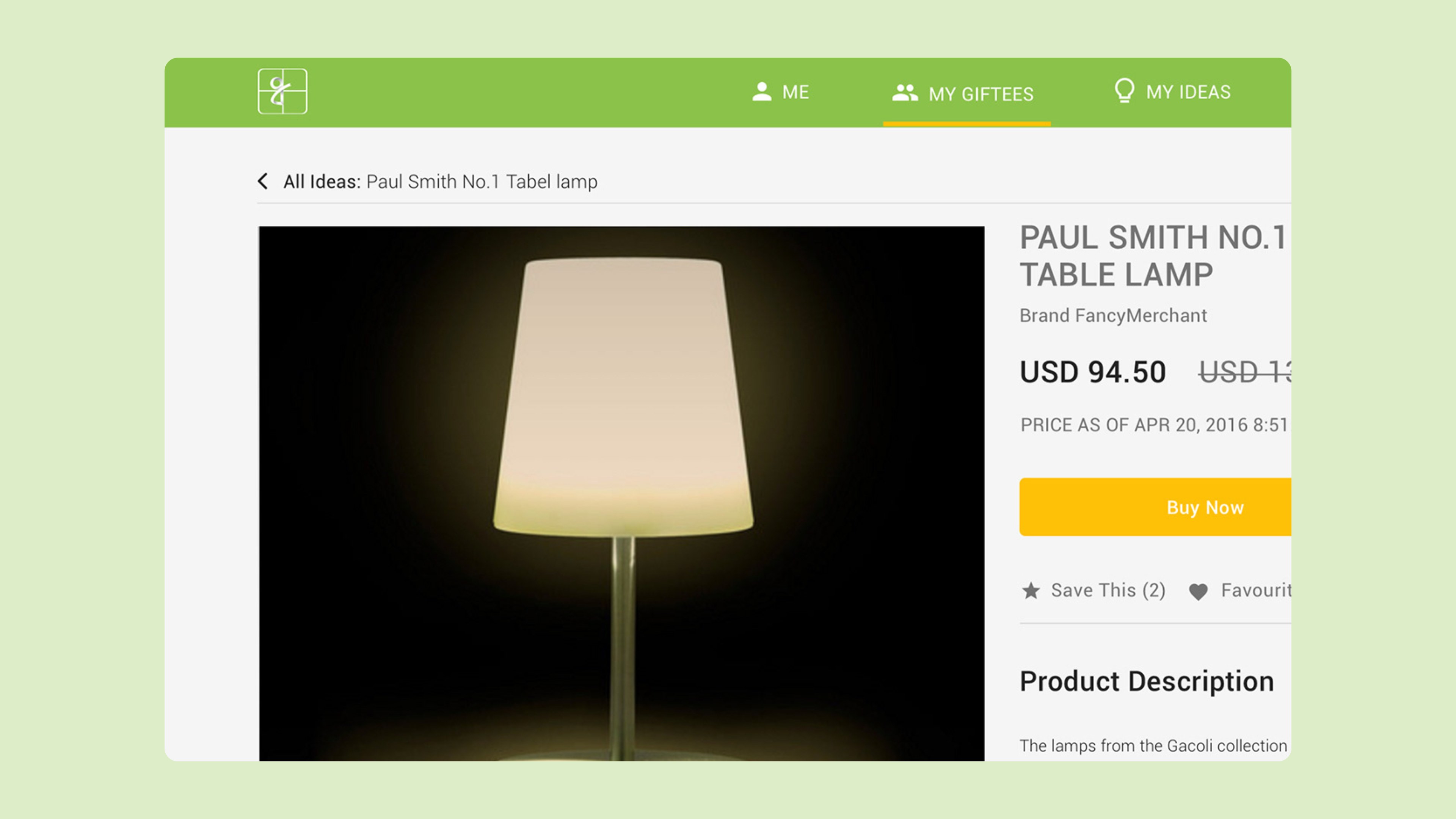
One template handles shop products and community ideas. It holds a gallery, the price with the date it was checked, save, favourite or junk, a full description and two rows of related ideas to keep exploring.

Product and idea detail

One template serves shop products and community ideas, with the date each price was checked.

In motion

Outcomes

  • 1brand system: mark, palette, illustrations
  • 9web screens designed

What I took away

  • Start from the person. Designing for the recipient instead of the product changed every screen that followed.
  • Ask small questions. Quick yes or no cards taught the system more than a long profile form would have.
  • Draw before you have customers. Illustration gave a young brand warmth before it had any real customers to show.
Designer, brand and web
Preetham Lawrence
Have a hard problem worth solving?

Let's solve it together.

preetham.lawrence@icloud.com
+41 76 740 46 30Phone
LinkedIn↗ Writing on Medium↗

Design leader based in Zürich, Switzerland. Open to leadership roles and selected collaborations.

© 2026 Preetham LawrenceIndex