18 / 19 · The ticket counter, on your phone

Ace Ticket

Ace Ticket is a Boston broker selling sports, concert and theatre tickets across the US. I designed an app concept in which every list, card and confirmation borrows the shape of a paper ticket.

Role
UI/UX designer
Client
Ace Ticket, Boston
Industry
Retail & commerce
Year
c. 2015
Work
Interaction design, UI design, Mobile app design

Ace Ticket's customers know the brand from the counter: walk up, pick a game, leave with a printed ticket in hand. From Boston, the broker sells seats to sports, concerts and theatre across the United States.

On a phone, that ritual disappears into generic lists and checkout forms. Fans buying Red Sox or Patriots seats also want to know exactly where they will sit before paying, and many still collect tickets at a physical store.

Could the app feel like buying from the Ace Ticket counter, while making seat choice and pickup clearer than the counter ever could?

I turned every event into a ticket stub, with a large date, perforated edges and a line icon for the kind of event. Seat selection pairs the venue map with a photo of the view from the chosen section. Store pickup gets its own map with hours and game-day notes. Bought tickets land in Apple Passbook, so they cannot be lost.

My role

UI/UX designer. Designed the app's concept and screens, from browsing and search through seat selection, store pickup and digital tickets.

What made it hard

  • A brand built on a counter

    The app had to carry the feel of a paper ticket without turning into a skeuomorphic toy.

  • Confidence before purchase

    Premium seats are expensive. Buyers need to see the section, row and view before they commit.

  • Online and offline in one flow

    Many customers pick up at a store, so locations and opening hours had to sit inside the buying journey.

  • Two platforms

    The concept was planned for iOS and Android, from one visual language.

Questions we asked

  1. What does a ticket counter give a fan that a list view takes away?
  2. How much venue detail does a buyer need before tapping Buy?
  3. Where should store pickup appear: at checkout, or from the menu at any time?
  4. Once paid, where should the ticket live so it is never misplaced?
01

A sheet of tickets

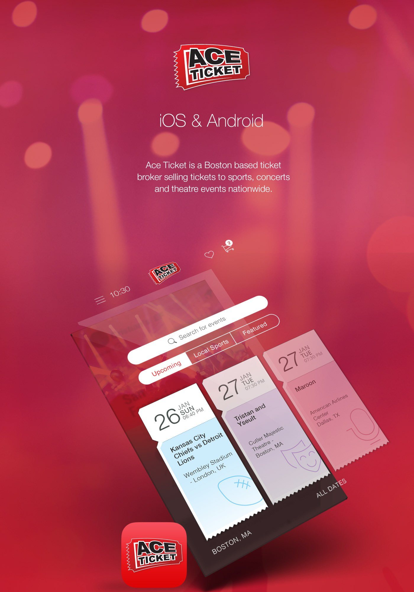
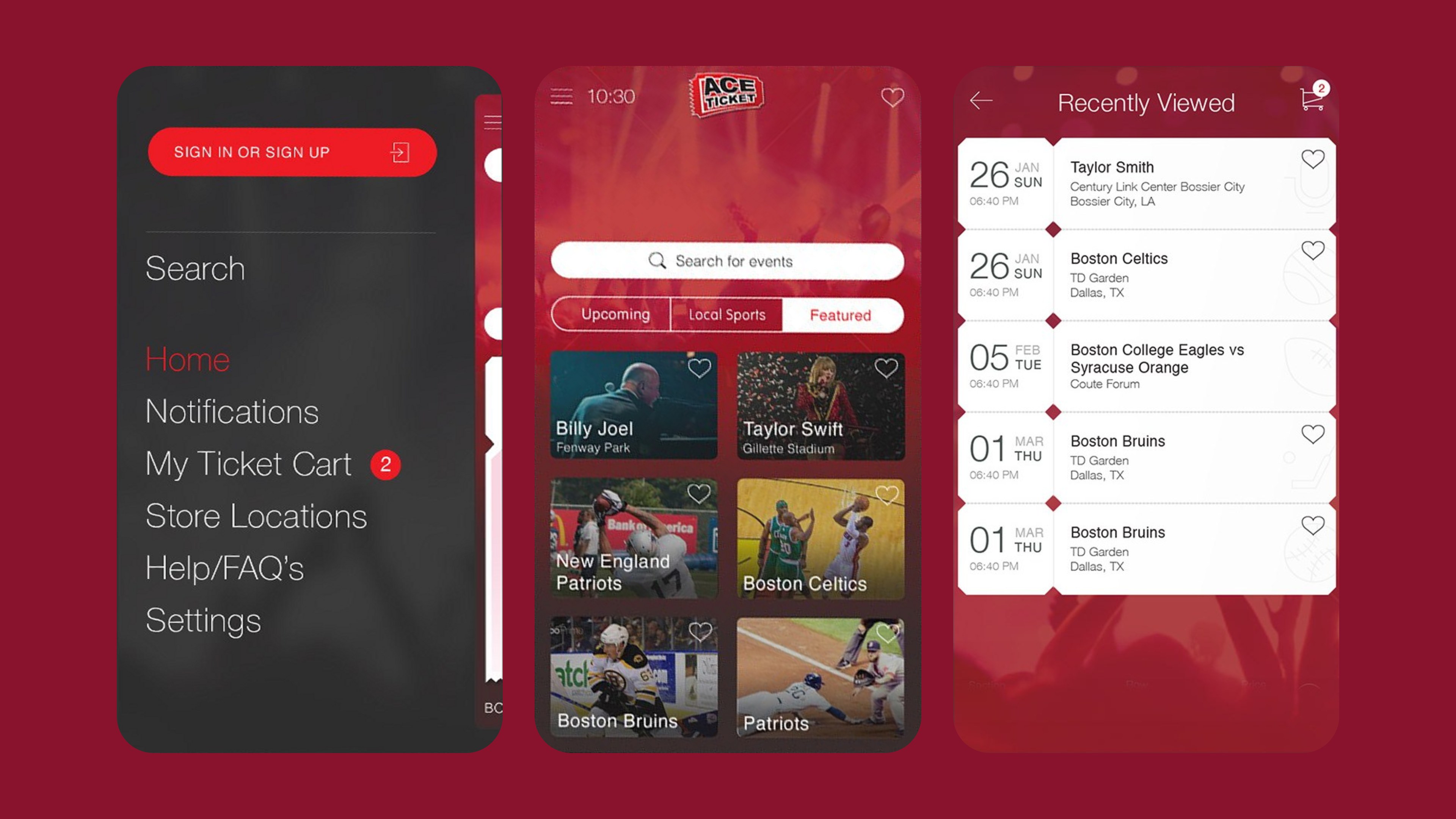
The home screen lays out upcoming events as torn-off ticket stubs: date numeral, event, venue and a quiet line icon for football, theatre or music. Tabs split Upcoming, Local Sports and Featured, with Boston as the default location. Recently viewed events stack like a strip of tickets bought at the window.

A sheet of tickets

The original concept board: event cards lifted off the home screen as paper ticket stubs.

02

Browse, search and navigate

A featured view swaps stubs for photo cards that can be saved as favourites. Search opens with suggested events in Boston. A dark sidebar holds sign-in, the ticket cart, store locations, help and settings.

Browse, search and navigate

Sidebar, featured cards and the recently viewed strip share one red, ticket-led language.

03

See the seat before you buy

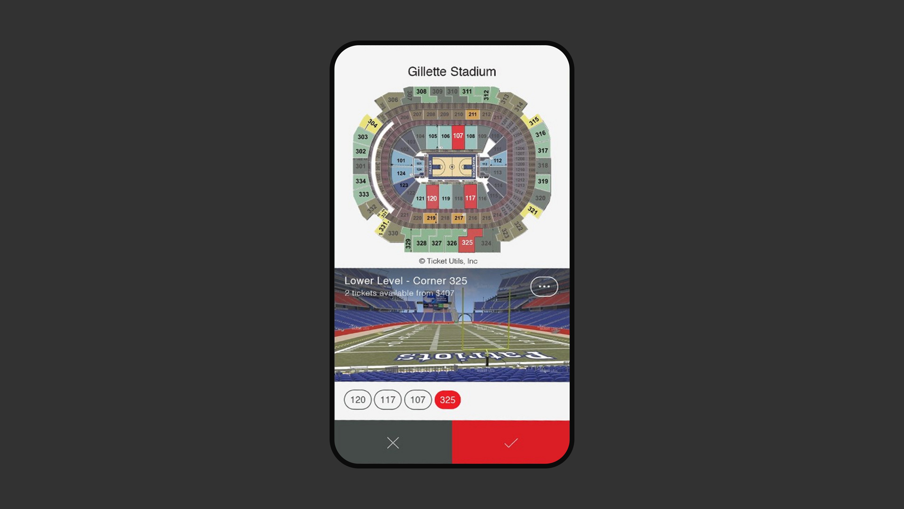
Seat selection runs in three steps. First comes a list of sections with row, quantity and price, then an interactive map of Gillette Stadium. Last is a photo of the view from the chosen section. Quantity and price sit on one picker beside a single Buy Tickets button.

See the seat before you buy

Picking a section on the venue map brings up the view from those seats.

04

Pickup and digital tickets

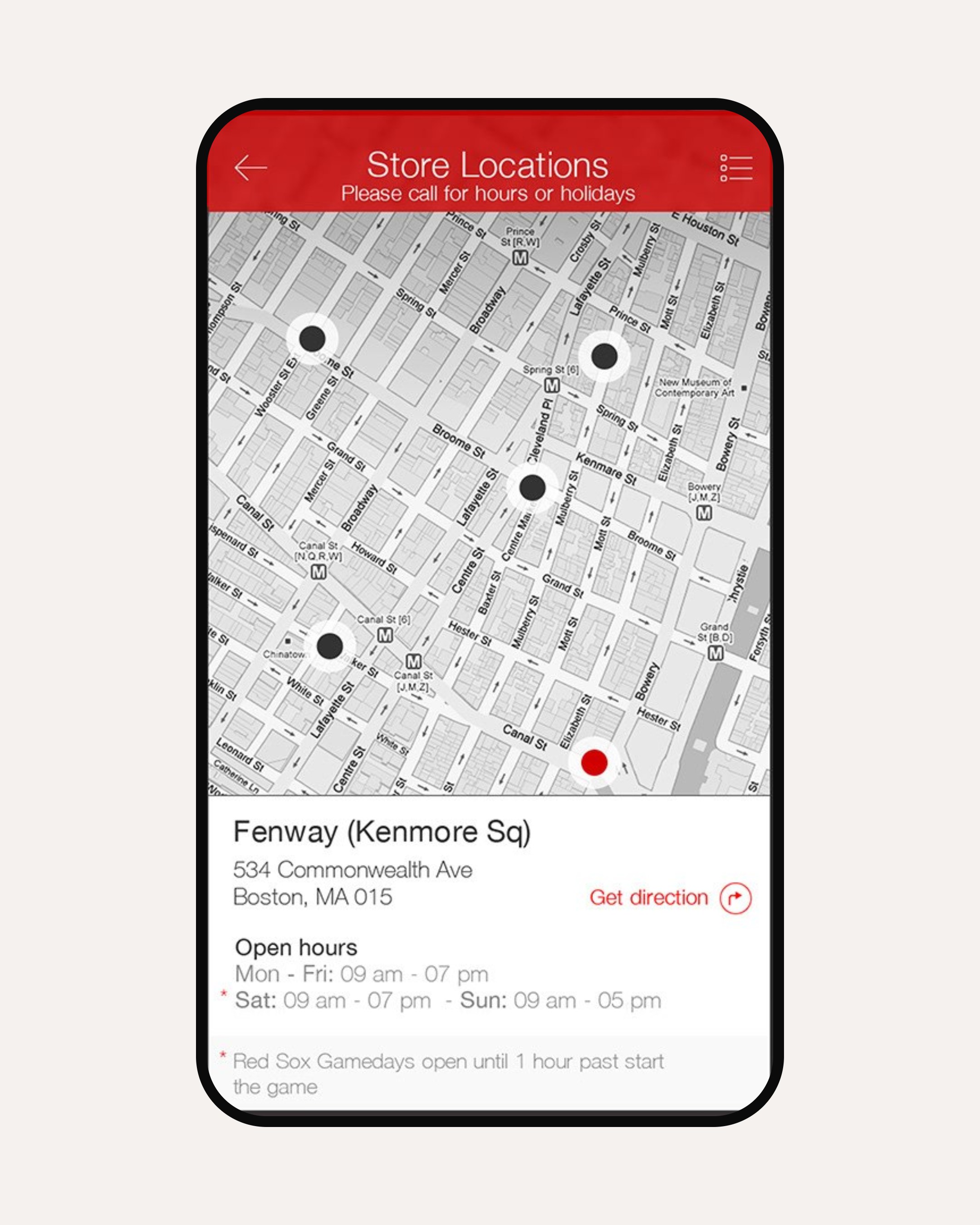
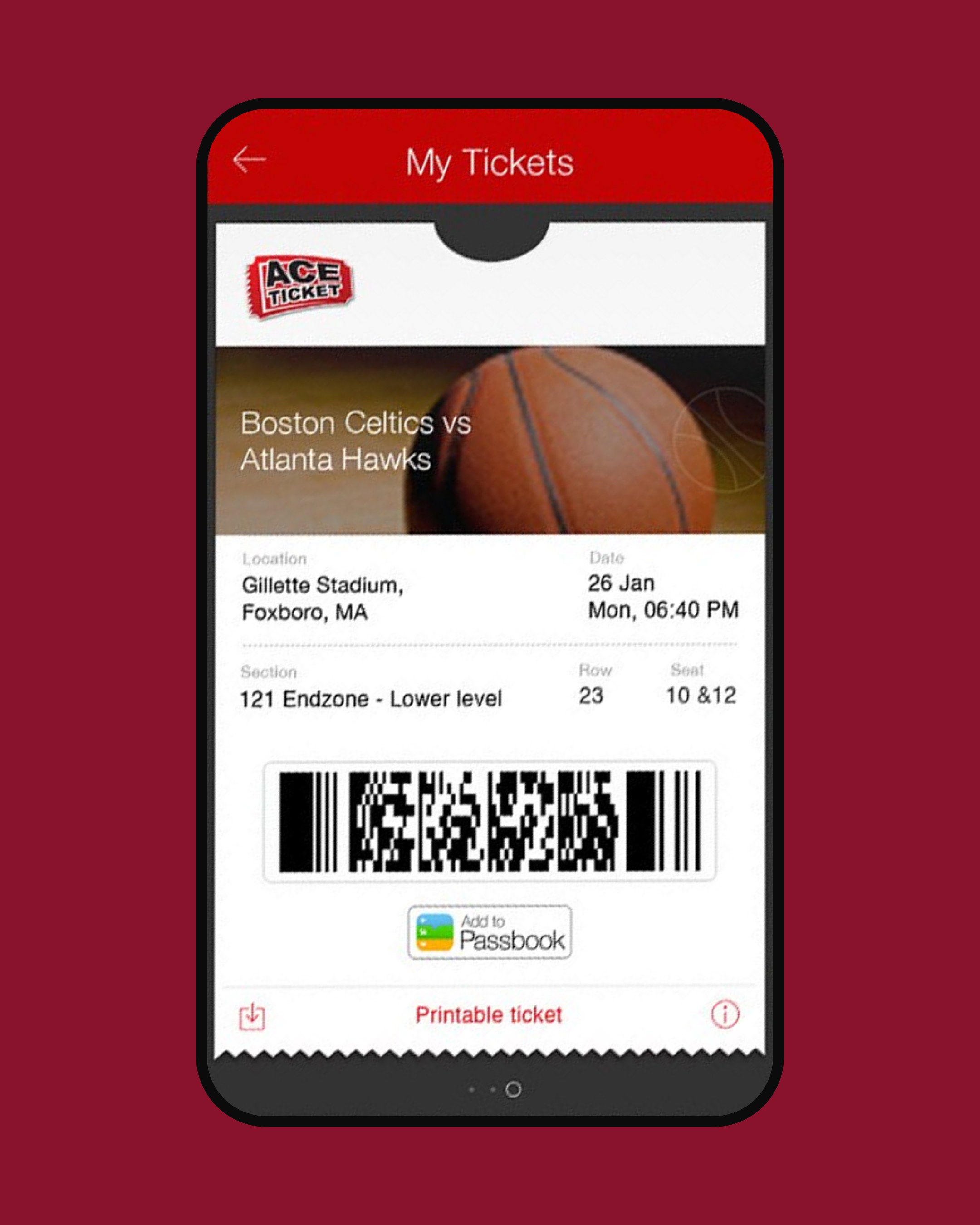
A greyscale map shows Ace Ticket stores, with addresses, opening hours and game-day notes such as late opening on Red Sox days. Bought tickets appear in My Tickets with a barcode and an Add to Passbook button, plus a printable version.

Pickup and digital tickets

Store hours carry game-day notes, and the bought ticket goes straight to Passbook.
In motion

Outcomes

  • 2platforms planned (iOS and Android)
  • 8key flows designed, from browsing to Passbook

What I took away

  • Borrow a familiar object. The ticket stub set the layout, the type scale and the tone.
  • Answer the big question in place. Showing the view from the seat answers the buyer's biggest question when it matters.
  • Test the concept. Today this would need user testing and real outcomes to back it.
UI/UX designer
Preetham Lawrence
Have a hard problem worth solving?

Let's solve it together.

preetham.lawrence@icloud.com
+41 76 740 46 30Phone
LinkedIn↗ Writing on Medium↗

Design leader based in Zürich, Switzerland. Open to leadership roles and selected collaborations.

© 2026 Preetham LawrenceIndex