05 / 19 · Consumer-grade buying for Novartis labs

Buying Engine

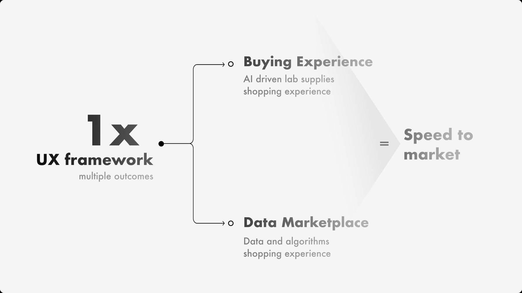
Novartis scientists use the Buying Engine to order lab consumables, equipment and supplies. I led an 8-month redesign whose first release needed no backend changes, and its framework then carried a second product, the Data Marketplace.

Role
Lead Designer
Client
Novartis
Industry
Healthcare & life sciences
Year
2020–2022
Work
UX design, Information architecture, UI redesign

A Novartis scientist ordering lab supplies might fill one cart from Merck and Thermo Fisher, with separate shipping addresses and cost centres. Their lab manager also needs to track inventory and spend. Both work in the same internal buying platform.

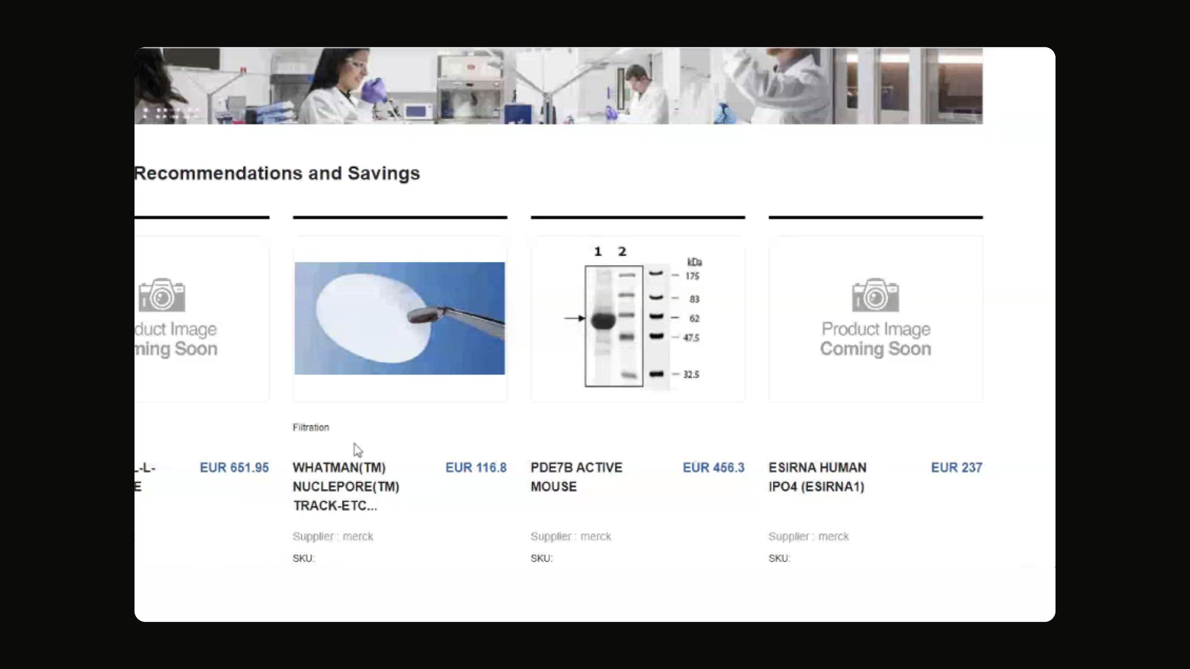
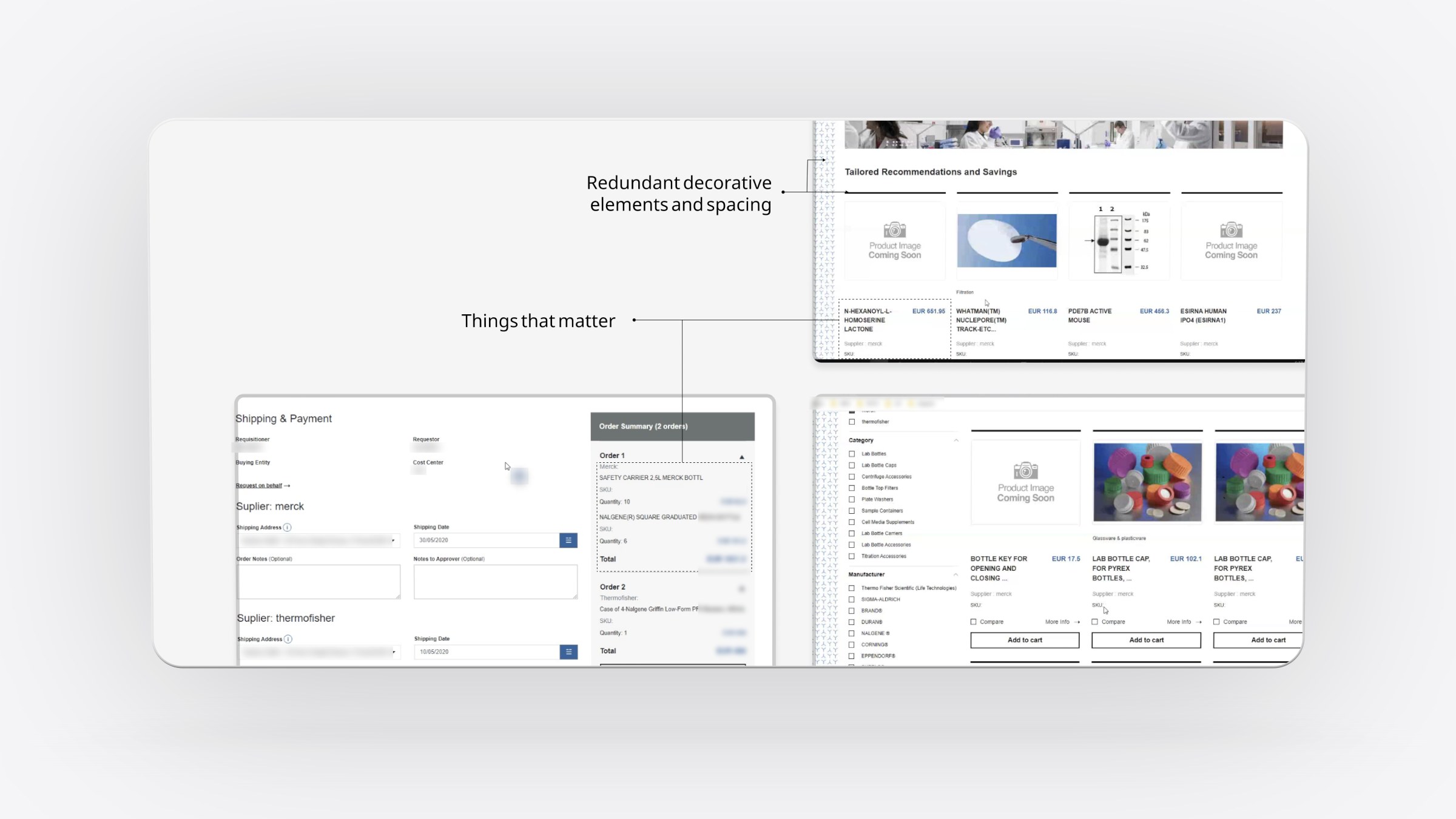
The platform had grown cluttered. Decorative brand elements competed with prices and product names, spacing changed from page to page, and a weak information architecture made products hard to find. Many product cards showed only an image placeholder. Managers had no structured way to watch inventory or costs, and any fix had to land without waiting for backend changes.

Could we give lab buyers the ease of a consumer shop, deliver it quickly on the existing backend, and build something the next product could reuse?

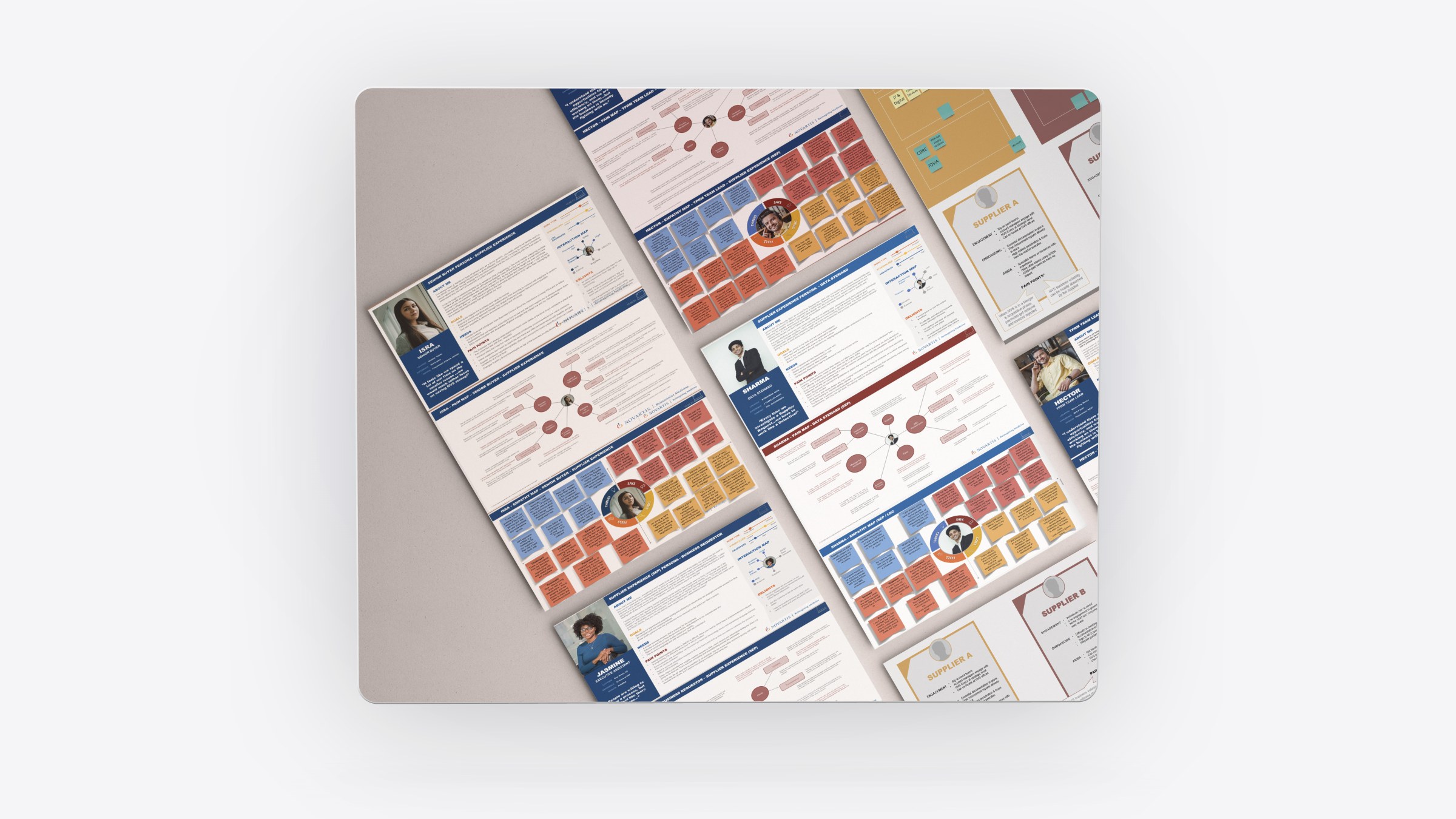
We started from evidence: earlier research, new interviews, workflow maps of where orders stalled, and prototypes in formative testing. The first release changed only the front end. It brought a cleaner UI, consistent layout, better categories and filters, and an analytics dashboard for managers. The second cut clicks to checkout and sped up large datasets. The same information architecture, patterns and components then became the base of the Novartis Data Marketplace.

My role

Lead Designer. Led the redesign over about 8 months. That covered interviews to confirm pain points, workflow mapping, sketches and prototypes for formative testing, two delivery iterations and the reusable framework behind the Data Marketplace.
What made it hard

  • No backend changes

    The first release had to improve the experience entirely in the front end, which kept engineering risk low but limited what could change.

  • Multi-supplier orders

    One cart can split into several orders, each with its own supplier, shipping address and price conversion.

  • Findability

    Thousands of products with inconsistent data and missing images needed a structure people could browse and filter.

  • Two audiences

    Scientists want to order fast. Managers need visibility of inventory and spend. Both live in the same product.

Questions we asked

  1. What do buyers look at first when they scan a product: price, title or supplier?
  2. Where do multi-supplier orders break down in checkout?
  3. Which manager tasks are still done by hand outside the platform?
  4. What can we change today without touching the backend?
01

What users saw

We annotated the legacy screens to separate redundant decoration from the things that matter: product name, price, supplier and the next action. Interviews confirmed the same problems users had raised in earlier research.

What users saw

The legacy audit: decoration and spacing on one side, the product facts buyers need on the other.

02

Sketches first

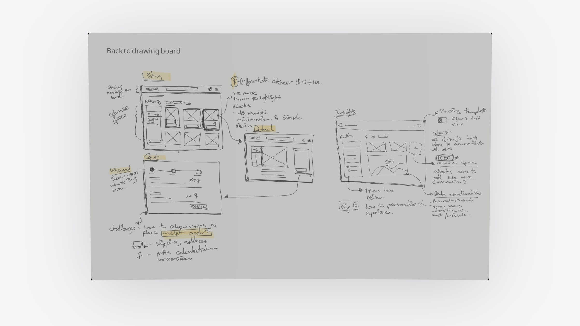
Sketches covered the listing, detail, cart and an insights view. The cart became a step-by-step wizard to handle several orders, shipping addresses and price conversions. The insights view reused the listing template with filters, a grid and traffic-light colours for status.

Sketches first

Listing, detail, a wizard cart for multi-supplier orders, and an insights view built on the listing template.

03

Before and after

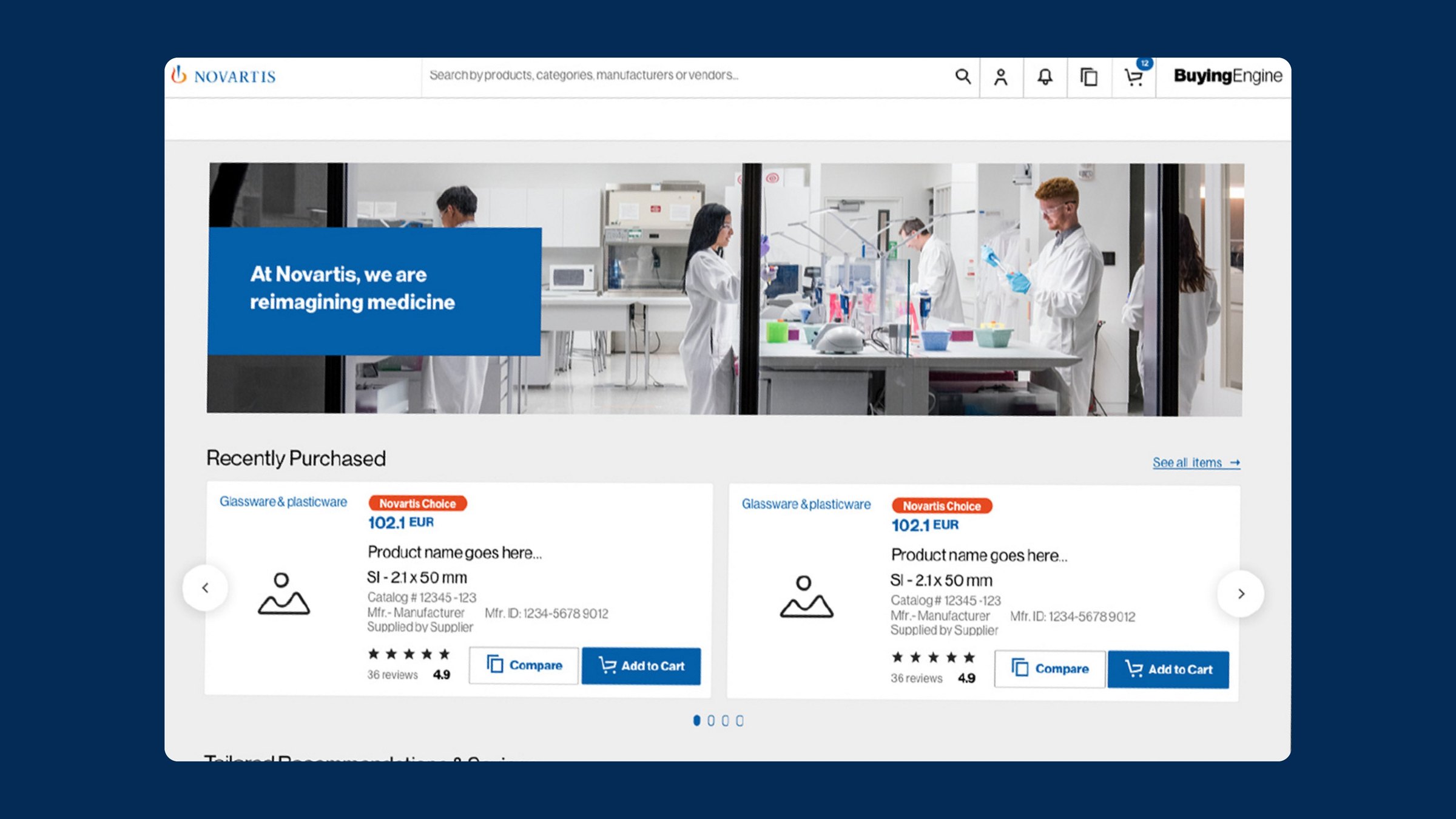
Iteration one cleaned the interface, standardised spacing and layout, improved categories and filters, and added a manager dashboard for orders and inventory. Iteration two shortened the path to checkout and tuned performance for large datasets. Product cards now lead with category, price and a clear Add to Cart.

Before and after
Before and after

The legacy home, then the redesign: category, price and Add to Cart first.

04

One framework, two products

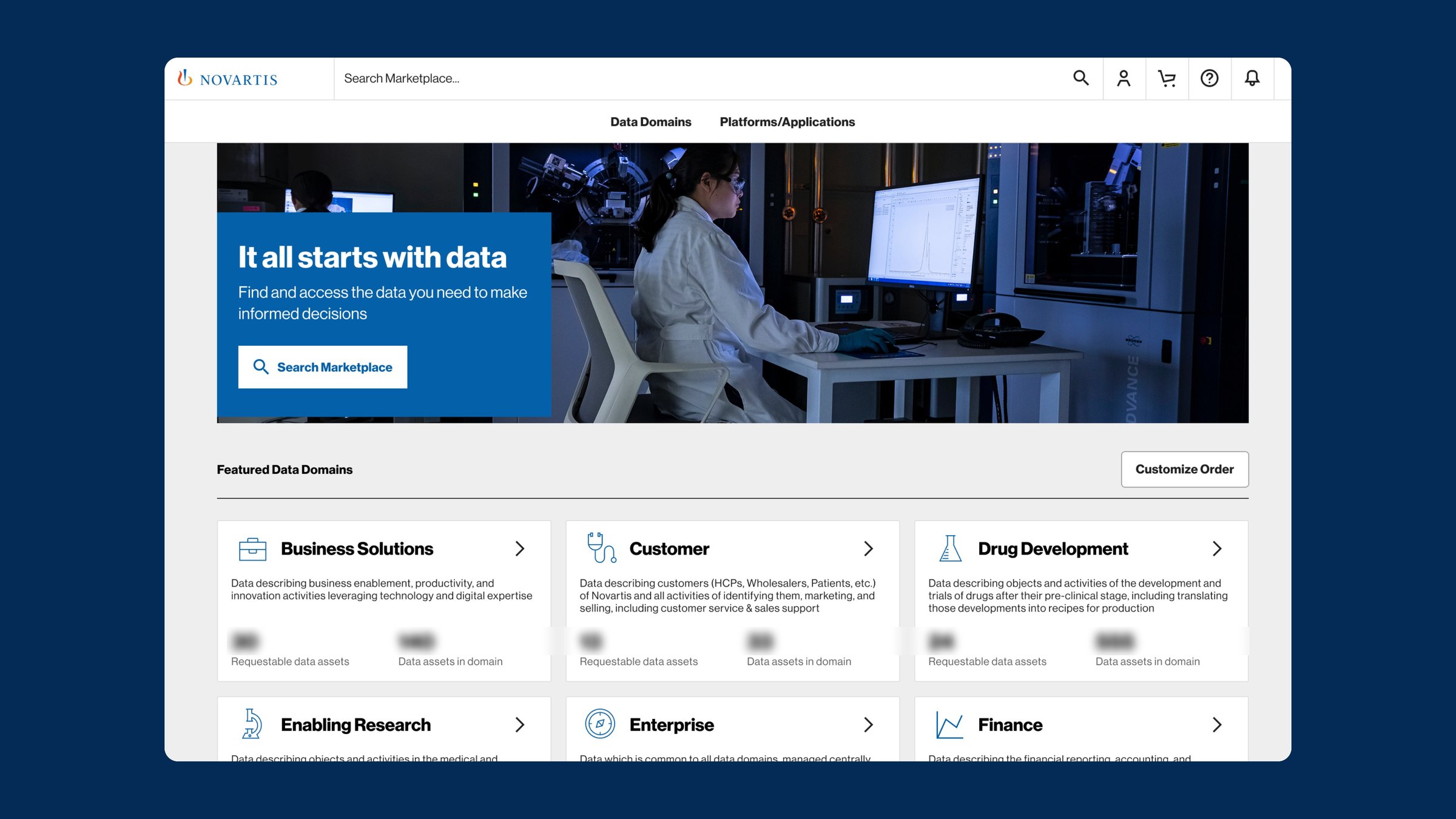
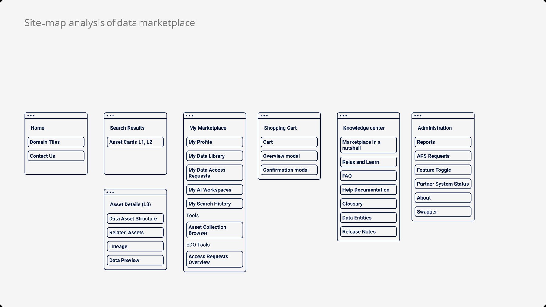
The same information architecture, interaction patterns and components became the base for the Novartis Data Marketplace, where people find and request access to data assets. A site-map analysis mapped the new product onto the existing structure: search, asset details, a personal library, a cart and a knowledge centre.

One framework, two products

The Data Marketplace home, built on the Buying Engine framework.

05

The Data Marketplace

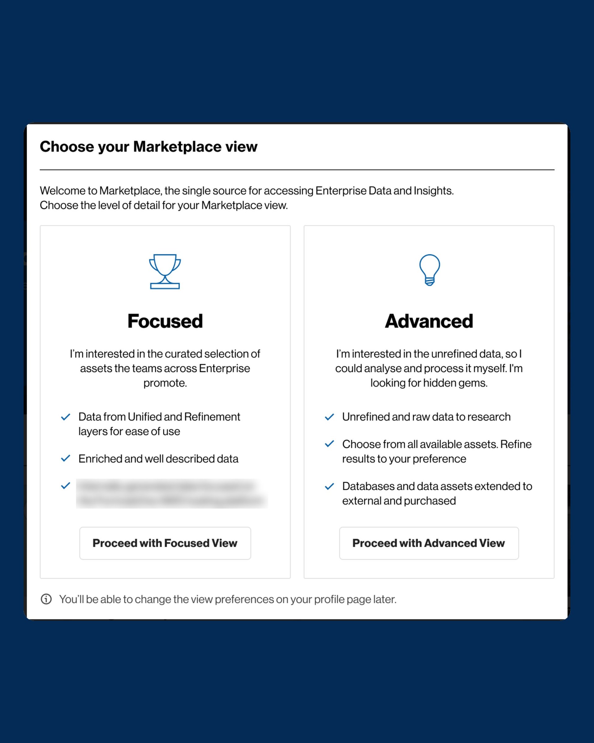
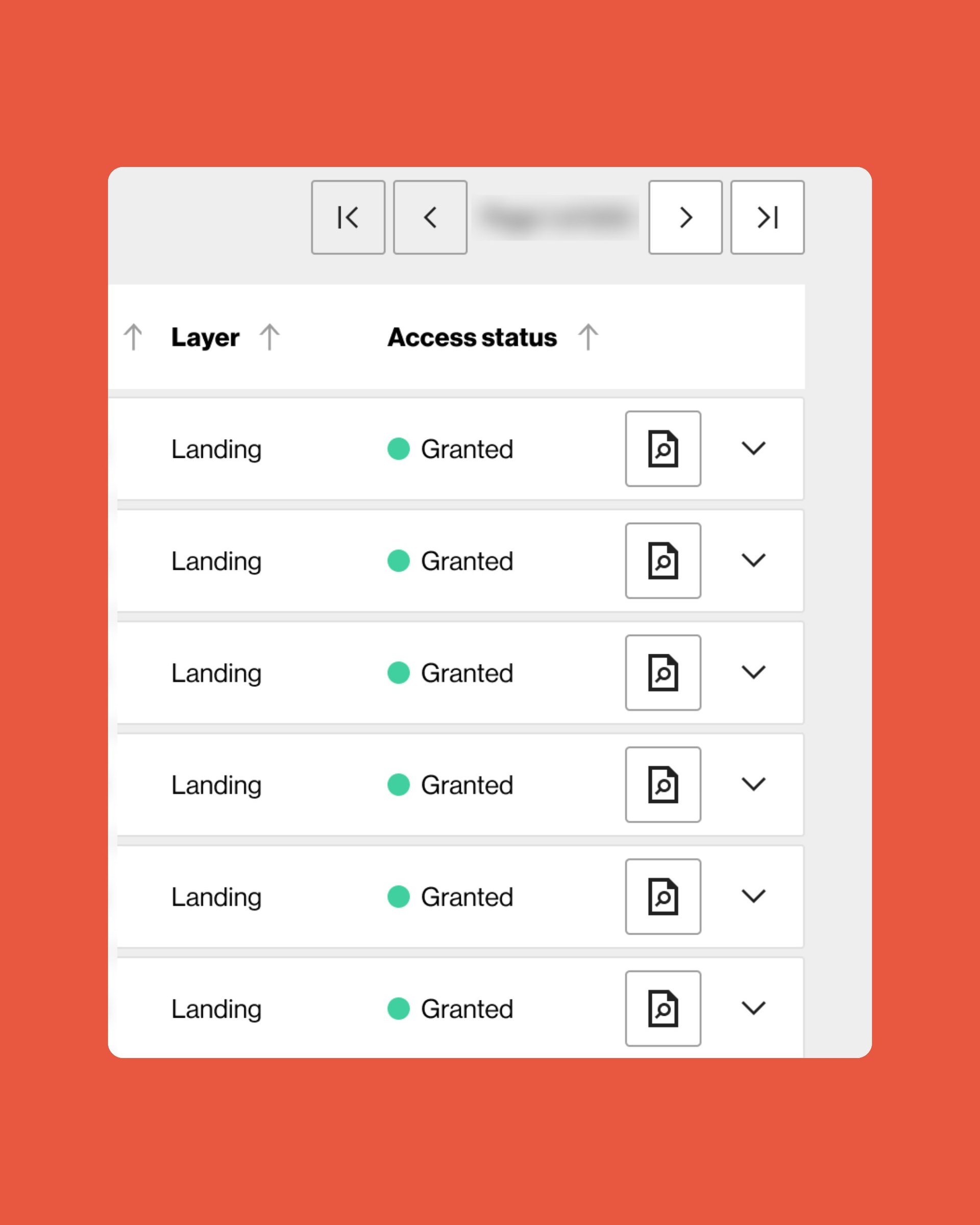
A familiar shopping model lowered the learning curve. Data domains open from a connected mega menu, and a first-run choice sets a Focused or Advanced view. Search results show access status at a glance. The cart collects a business justification and shows which assets come with each security group.

The Data Marketplace

View chooser, search with access status, data-access cart and personal library. Asset and platform names are blurred.

In motion

Outcomes

  • ~8months, lead designer
  • 2delivery iterations
  • 2products on one framework
  • Higher reported user satisfaction after a clearer, more consistent interface
  • Faster order processing and better inventory visibility for managers
  • A reusable design framework that sped up the launch of a second product
  • Increased adoption and lower design and development overhead

What I took away

  • Ship a safe first release. Visible gains with no backend risk made the second iteration easier to fund.
  • Fix the structure before the surface. Clear information architecture did more for speed than any visual polish.
  • Design patterns to be reused. It paid off when a second product needed to ship fast.
Lead Designer
Preetham Lawrence
Have a hard problem worth solving?

Let's solve it together.

preetham.lawrence@icloud.com
+41 76 740 46 30Phone
LinkedIn↗ Writing on Medium↗

Design leader based in Zürich, Switzerland. Open to leadership roles and selected collaborations.

© 2026 Preetham LawrenceIndex