07 / 19 · Where does a new user start?

Andromeda

Andromeda brings together the data Novartis uses to make portfolio decisions. I led a 6–8 month UX audit, research and phased redesign that gave each persona its own way in and lifted the Customer Experience Index.

Role
Lead UX Strategist
Client
Novartis
Industry
Healthcare & life sciences
Work
UX strategy, UX audit & heuristics, Usability testing

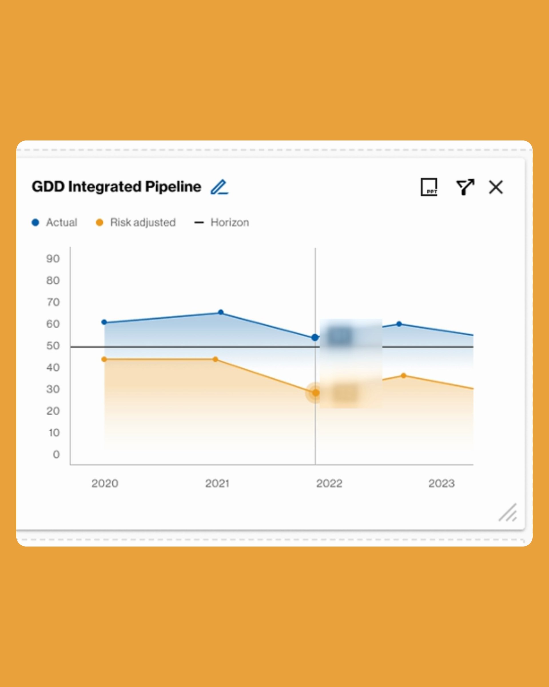
A new Andromeda user opens the platform to check a pipeline stage or a forecast, and meets a wall of dashboards. The platform serves several personas and holds the data behind Novartis portfolio decisions: pipeline stages, targets, forecasts and competitive insight.

The data was rich, but the experience was fragmented. New users did not know where to start and faced a steep learning curve. Navigation was unclear and differed from one persona to the next. Features were chosen without systematic user input, so delivery was slow and aimed at low-impact work.

What would make a platform this dense feel simple, and how could the team prove each change was worth making?

We started with a diagnosis. Existing research, feedback and analytics showed the recurring pain points, and heuristic reviews and moderated tests confirmed them. A North Star vision set the direction, and an impact–effort matrix, owned with the product team, set the order. Five principles aligned product, design and engineering. Releases came in phases, with the information architecture reworked for each persona. The Customer Experience Index rose measurably.

My role

Lead UX Strategist. Led the UX strategy for Andromeda: audit and synthesis of existing research, heuristic evaluation, moderated testing, the North Star vision and five design principles. Set up the prioritisation process with the product team, and the UX stages that took each improvement from design to tested release.
What made it hard

  • Dense data, many personas

    Each persona needed a different way into the same complex portfolio data.

  • No clear starting point

    New users faced a wall of dashboards and a long menu of reports before they found anything useful.

  • Decisions without users

    Features had been prioritised without systematic user input, so effort went into low-impact work.

  • Change without disruption

    A live, business-critical tool had to improve step by step without breaking how people already worked.

Questions we asked

  1. Where do new users get lost, and why?
  2. Which improvements matter most to users and are feasible for the team right now?
  3. How do we give each persona a lean starting point without hiding the depth others need?
  4. What evidence will show that a change actually helped?
01

Too many doors

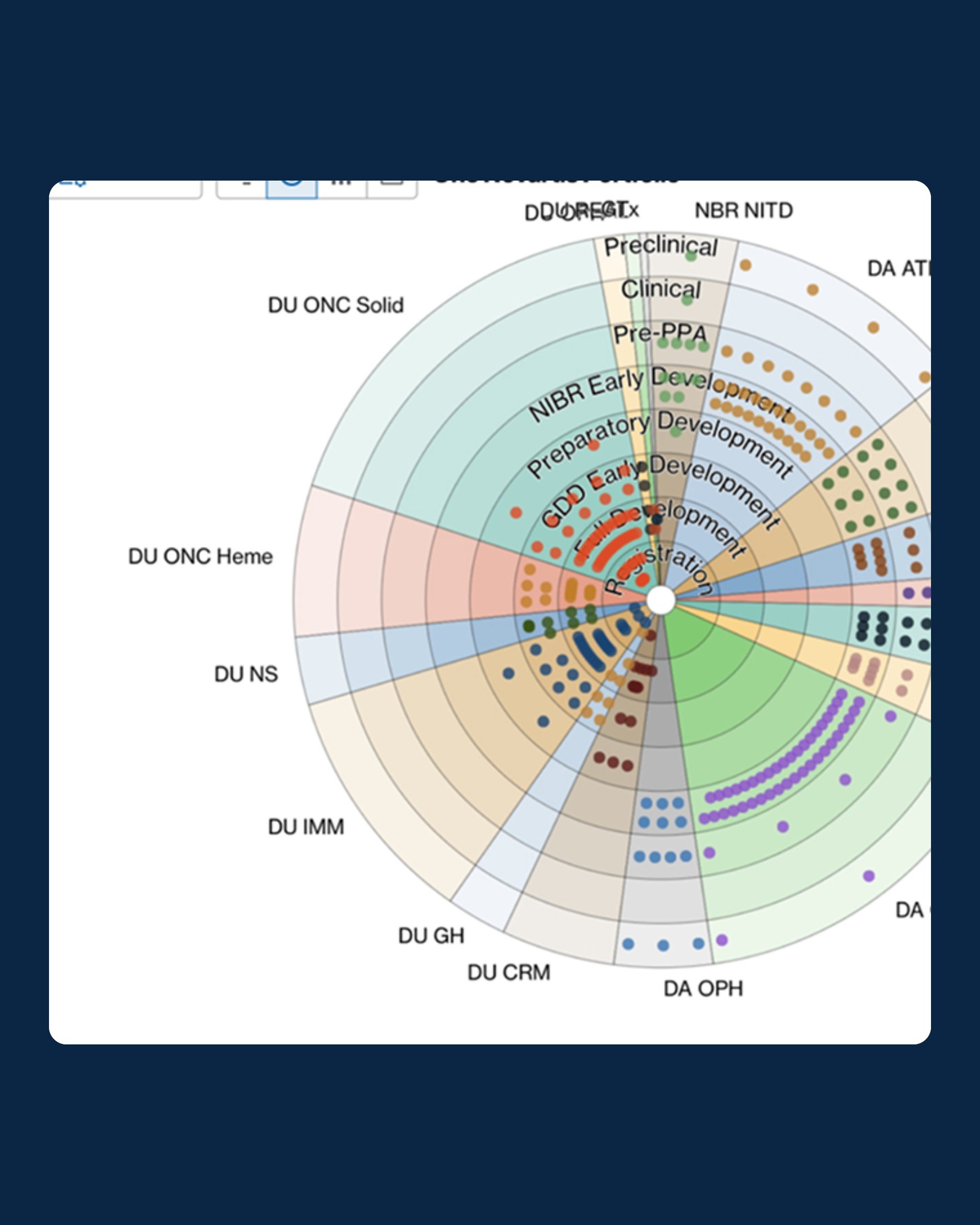
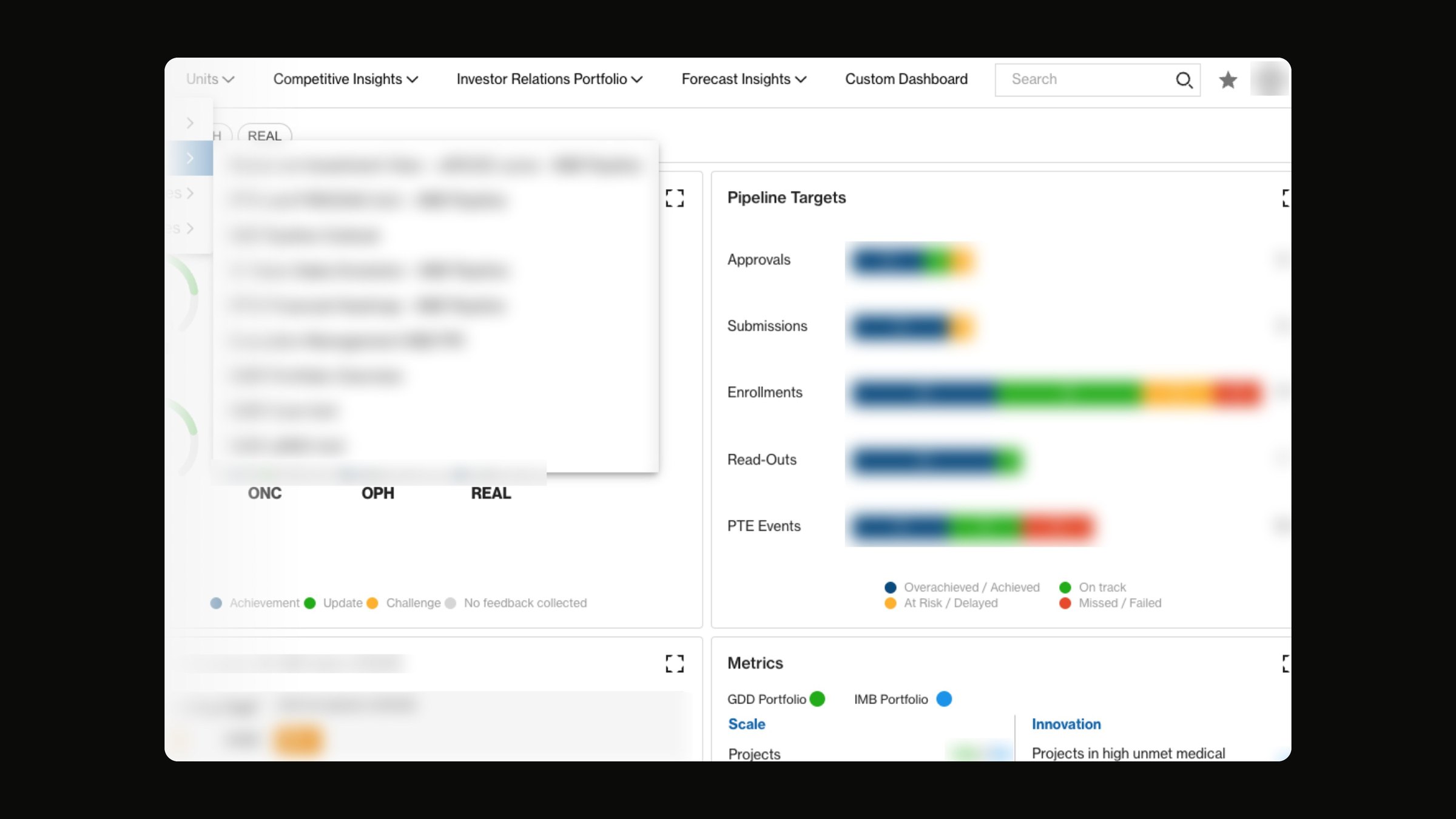
Users struggled to understand where to start. Until 2023, the first screen held dense dashboards, radial charts, tables and a long list of reports. New users faced a steep learning curve before they got any value from Andromeda.

Too many doors

The legacy dashboard put reports, targets and metrics on one crowded first screen; figures are blurred here.

02

Discover and diagnose

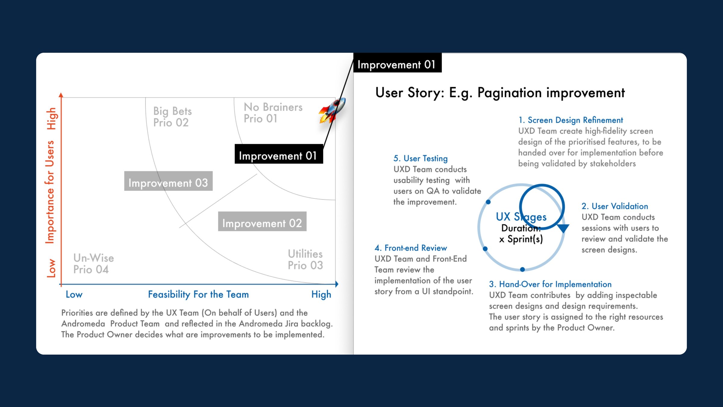
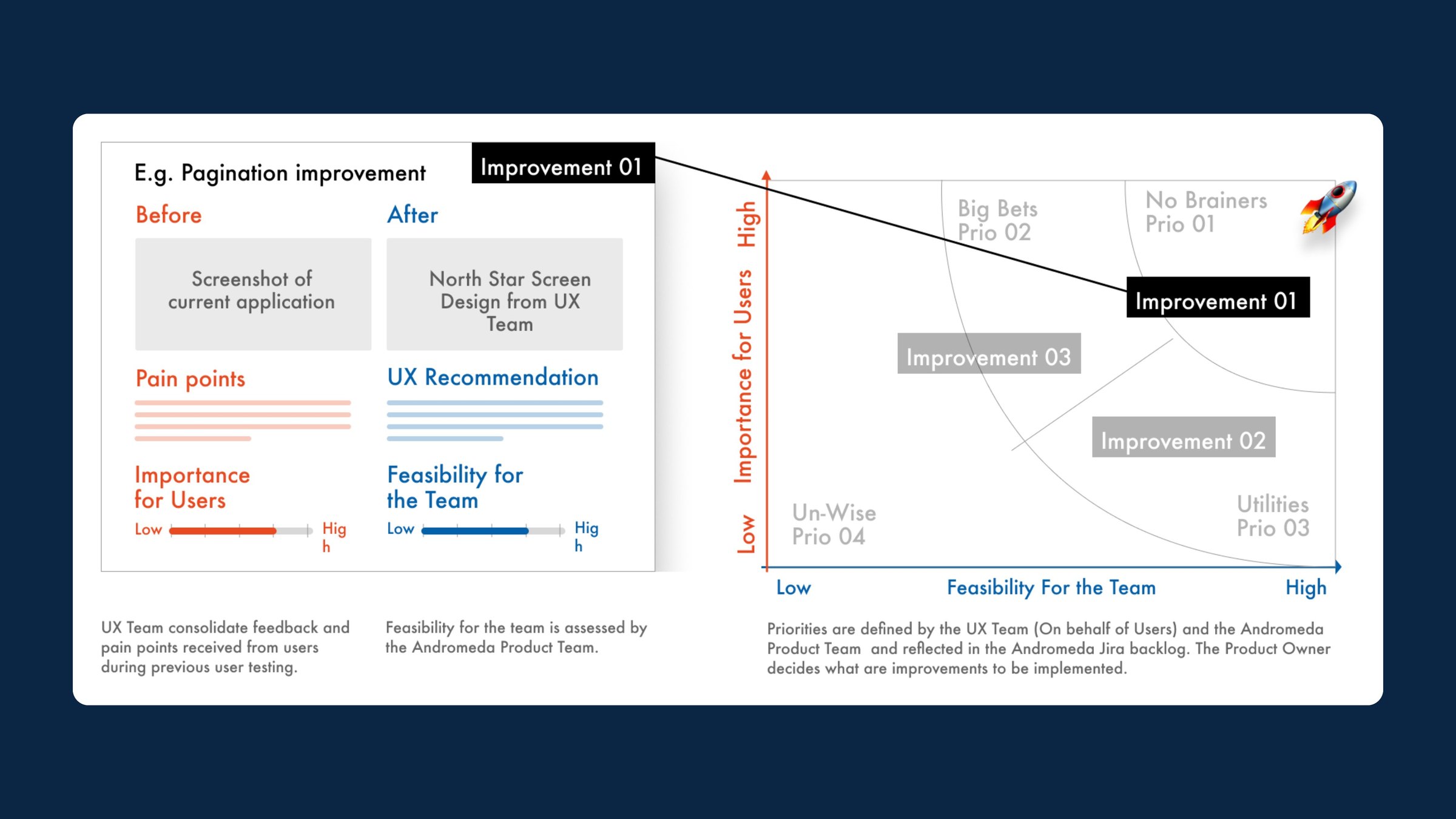
We reviewed existing research, feedback and analytics to find recurring pain points, ran heuristic evaluations and validated our hypotheses in moderated tests. Each improvement got a write-up: pain points, a North Star screen and a UX recommendation. We scored it for importance to users and feasibility for the team. The UX and product teams set priorities together in Jira, and the product owner made the final call.

Discover and diagnose

Each improvement was scored for importance to users and feasibility for the team.

03

Iterate and embed

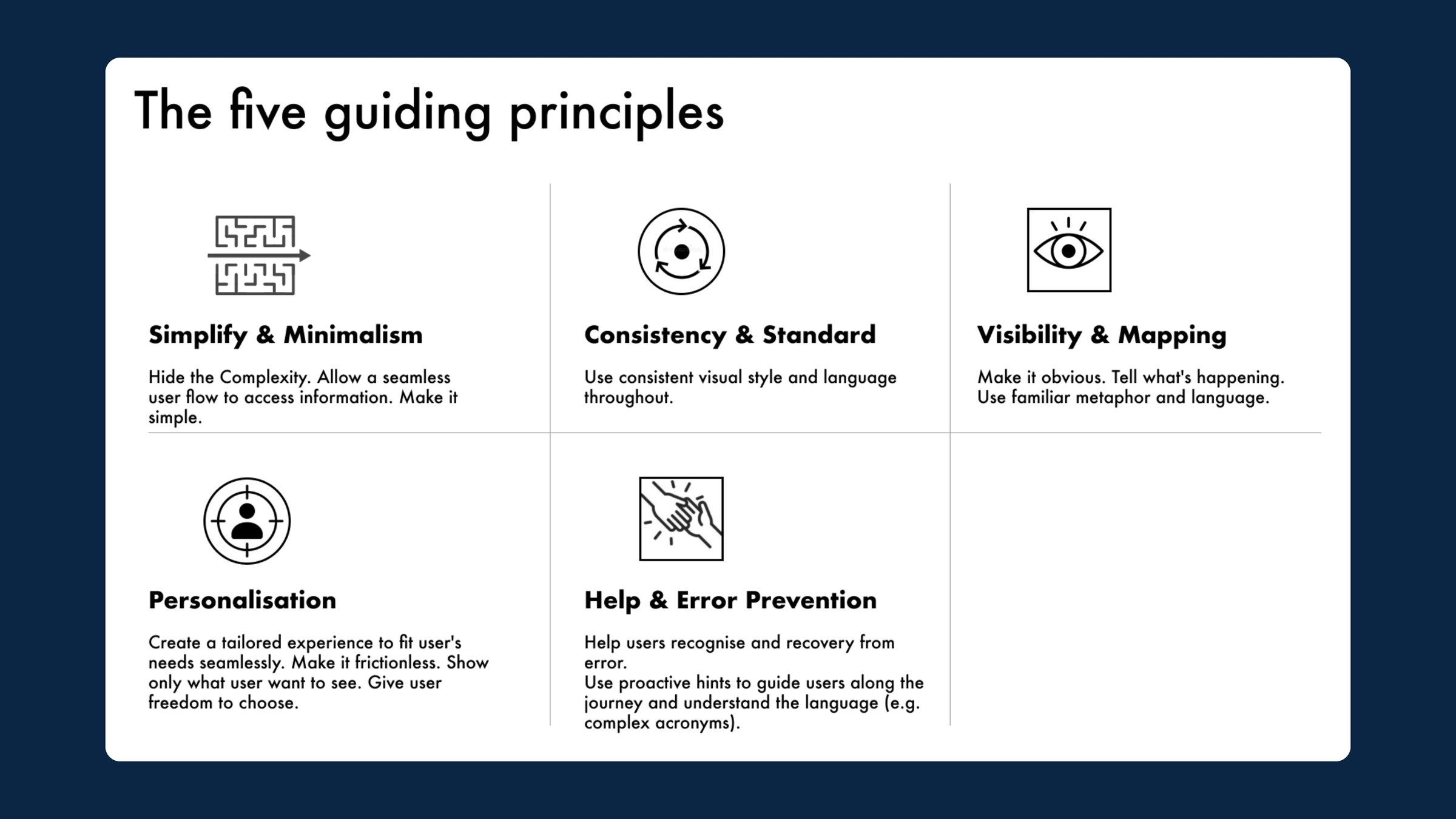
Each prioritised story ran through the same UX stages over one or more sprints. We refined the screens and validated them with users, handed them over with inspectable designs and requirements, reviewed the front end and tested with users on QA. Five guiding principles kept product, design and engineering aligned: simplify, stay consistent, make things visible, personalise, and help users avoid and recover from errors.

Iterate and embed
Iterate and embed

Every prioritised story ran the same UX stages, guided by five shared principles.

04

One portfolio, many ways in

The reworked information architecture gives every persona a lean overview page with personalised recommendations. A data exploration flow folds detail out only when it is needed, and boards and favourites support different mental models. Users can build their own dashboards from ready-made widgets and share them.

A lean overview page with favourites and boards gives each persona its own way in.

05

The redesigned platform

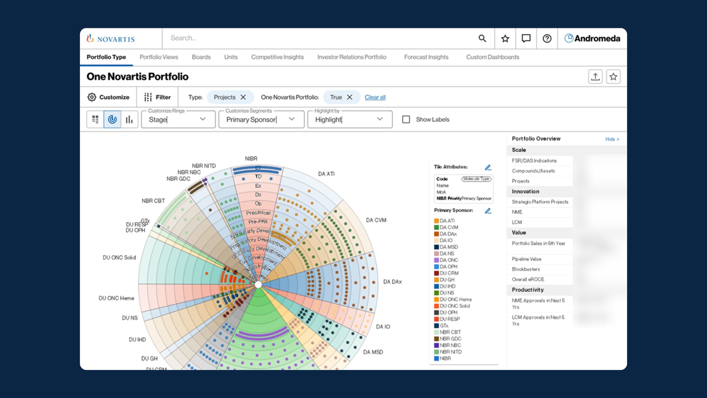
From a search-first home page to radial portfolio views, project timelines, pipeline-target dashboards and a custom-view builder, the screens share one visual language. Analytics and summative testing guided the fine-tuning after each release.

The redesigned platform

Radial portfolio views and a custom dashboard builder share one visual language.

In motion

Outcomes

  • 5guiding principles adopted by product, design and engineering
  • 2phases: diagnose, then iterate and embed
  • 6–8months of engagement
  • Measurable uplift in the Customer Experience Index (CXI)
  • Clearer information architecture, with easier navigation for each persona
  • Every change validated through analytics and testing
  • Design principles embedded into delivery for long-term consistency

What I took away

  • Simplicity drives engagement. Streamlined flows did more for satisfaction than new features.
  • Ship in small phases. Phased releases built momentum that a big-bang redesign rarely does.
  • Share the principles. Five principles and a North Star let product, design and engineering decide consistently without the UX team in every room.
Lead UX Strategist
Preetham Lawrence
Have a hard problem worth solving?

Let's solve it together.

preetham.lawrence@icloud.com
+41 76 740 46 30Phone
LinkedIn↗ Writing on Medium↗

Design leader based in Zürich, Switzerland. Open to leadership roles and selected collaborations.

© 2026 Preetham LawrenceIndex