08 / 19 · Curry, without the hard part

Namma Bowl

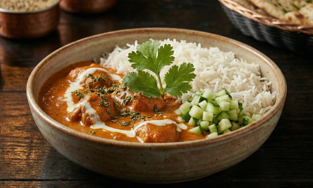
Ready-to-cook Indian curry bases, handmade in Switzerland. Each jar holds a sauce base, a spice blend and a marination blend, so dinner takes three steps and 15 to 30 minutes. I chose the jar and designed the labels, identity and bilingual website.

Role
End-to-end design direction
Client
Namma Bowl, Oetwil am See, Switzerland
Industry
Food & consumer
Year
2025
Work
Product and container design, Packaging and labels, Brand identity
Team
Preetham Lawrence & Sanchitha (Founder)

People across Switzerland love Indian curry, and many would like to cook it at home. My wife grew up with these recipes and wanted to share them. We started Namma Bowl together, with her in the kitchen and me on design.

A good curry takes time. It means toasting and grinding a dozen spices, building the sauce slowly and judging every stage by eye. Ready meals skip all of that, and they also skip the part people enjoy: standing at the stove and making dinner themselves.

Could we take away the hard part of curry while leaving the cooking, and the pride that comes with it, in the customer's hands?

We broke curry into modules. Each jar holds a slow-cooked sauce base, a pre-measured spice blend and a marination blend, and a QR code links to a step-by-step recipe. The customer adds their own protein, simmers and serves in 15 to 30 minutes. I then designed everything that carries the idea: a kraft-capped glass jar, flavour-coded labels, a recipe card and a website that shows three cooking steps at a glance.

My role

End-to-end design direction. Took Namma Bowl from exploration to concept to finished product for my wife's business. I chose the container, designed the labels, recipe card and identity, and designed the bilingual website. Product, packaging and label design were new to me, so I learned them on the project.
What made it hard

  • Three new crafts at once

    Container, packaging and label design were all new to me. Each one brings its own rules: materials, print, legal text and how a jar reads on a shelf.

  • Keep the cooking

    The product had to save time without turning into a ready meal. Customers still cook, so the packaging had to promise help, not a shortcut.

  • Handmade, and trusted

    A small home brand has to look careful and safe to buy from while still feeling homemade.

  • Explain cooking on a screen

    The website had to show how a jar becomes dinner in seconds, in German and English, for people who may never have cooked a curry.

Questions we asked

  1. Which part of making curry is the hard part, and which part do people want to keep?
  2. What container shows off the sauce and still feels like it came from a family kitchen?
  3. How do three flavours look like one family on a shelf and still stay easy to tell apart?
  4. How little does the website need to say before someone understands how to cook with a jar?
01

Exploration

We started with the food itself: what goes into a curry, which steps take the longest and which ones people enjoy. I explored formats, names and visual directions in Figma before committing to anything.

The single-line bowl mark and the flavour palette that every later piece draws on.

02

Curry, made modular

The idea that held up was to package curry as modules. A jar carries the slow-cooked sauce base, a pre-measured spice blend and a marination blend. The customer brings the protein (chicken, paneer or tofu) and the stove. Dinner takes three steps and 15 to 30 minutes, and it still feels like cooking.

Protein, base, pot: the three steps the whole product is built around.

03

Container and form

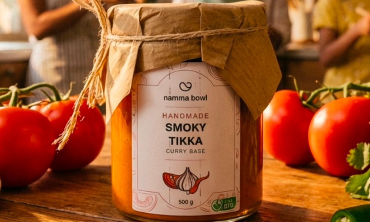
A straight-sided clear glass jar lets the sauce colour do the selling: green for Green Goddess, orange for Royal Butter, deep red for Smoky Tikka. The lid hides under a square of crumpled kraft paper tied with natural twine, so every jar looks wrapped by hand.

The three launch films side by side, each jar bursting into its own ingredients.

04

Labels and packaging

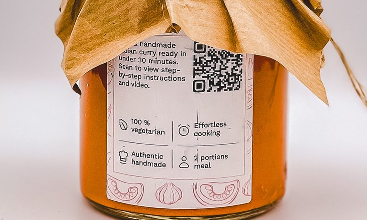
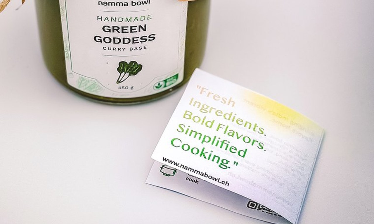
The front label is a white card with a stacked logo, HANDMADE in the flavour colour, a bold flavour name and one hand-drawn ingredient. Faint line drawings of ingredients frame the edges. The back label explains the product in one sentence, adds four simple claims and puts the recipe QR where you hold the jar. A recipe card under the twine promises fresh ingredients, bold flavours and simpler cooking.

Labels and packaging

The back label puts the recipe QR where you hold the jar; the recipe card rides under the twine.

05

Website: curry-making, simplified

nammabowl.ch tells the product story as you scroll. Tomatoes, onions, cashews and spices fall through warm orange space, fill an empty jar and become a finished Royal Butter jar. Product pages say what is inside, how much it serves and how long it takes, then show the three cooking steps as simple drawings. The site is German first, with an English toggle, and set in Inter Tight on warm paper white.

A product page on desktop, and the home page and a product page on a phone.

06

Coming together

Jar, label, card, social posts and site share one system: a single-line bowl mark, near-black type, one saturated colour per flavour and fresh ingredients around the jar. A shopper can follow the same jar from an Instagram post to the product page to the kitchen counter.

Coming together
Coming together

From loose ingredients to a finished jar, one system throughout.

In motion

Outcomes

  • 3curry bases in one label system
  • 3steps from jar to dinner
  • 2site languages, German and English

What I took away

  • Learn the craft on the job. Years of digital design helped me less with paper, glass and print than with the system thinking that ties them together.
  • Find the idea first. Once curry was modular, the jar, the labels and the website each had one clear job.
  • Keep one test. Working with my wife as the client tied every decision to one question: does this make her recipes easier to cook at home?
Design: product, packaging, brand, website
Preetham Lawrence
Founder
Sanchitha
Have a hard problem worth solving?

Let's solve it together.

preetham.lawrence@icloud.com
+41 76 740 46 30Phone
LinkedIn↗ Writing on Medium↗

Design leader based in Zürich, Switzerland. Open to leadership roles and selected collaborations.

© 2026 Preetham LawrenceIndex