09 / 19 · Moving India's agri-input trade forward

Agrim

Agrim is a B2B marketplace for India's 400,000+ agri-input retailers and the manufacturers who supply them. I led the rebrand from A-One to Agrim: a bilingual identity, the brand manual and the first mobile app flows.

Role
Creative Lead / Design Director
Client
A-One Wholesale, Hisar, Haryana
Industry
Agriculture
Year
2020
Work
Brand identity, Naming & bilingual lockups, Brand guidelines

A family-run shop in Haryana buys seeds, agro-chemicals, tools and fertiliser through layers of super stockists and wholesalers. India has 400,000+ such agri-input retailers. A-One Wholesale, grown out of a 22-year-old seed business in Hisar, set out to put them and manufacturers on one mobile-first platform.

The name A-One read as generic wholesale and gave the platform no story. Its user is a Haryana shop owner who trusts the people he already knows, reads Hindi first and gets 20–30% counterfeit stock through the existing chain. A brand that looked like a Silicon Valley start-up would lose him on day one.

How might we build a brand modern enough to earn investor and manufacturer trust, yet local enough that a village retailer reads it as his own?

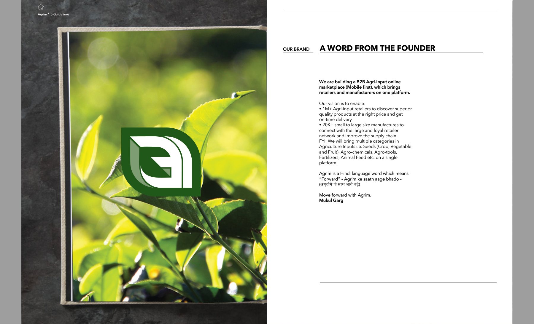
We renamed the platform Agrim, Hindi for "forward", and built a mark from two ideas: the Devanagari vowel अ for communication, and a leaf for agriculture. A parallelogram slice cuts through it to signal forward motion. The system ships in English and Hindi lockups, with a green-and-purple palette and a brand manual the founding team could run with.

My role

Creative Lead / Design Director. Led the rebrand from A-One to Agrim end to end. That covered the logo exploration, the final identity system and its construction, the 1.0 brand manual, merchandise concepts and the first mobile app flows.
What made it hard

  • Two scripts, one mark

    The symbol had to hold up beside both Latin and Devanagari wordmarks without favouring either.

  • Trust before beauty

    Retailers fear liability from bad stock. The identity needed to signal credibility and quality assurance before style.

  • No design team in-house

    The guidelines had to be clear enough for non-designers to apply on catalogues, signage, merchandise and the app.

  • From print to a 375pt screen

    The mark had to work at app-icon size, in push notifications and in OTP emails as well as on a tote bag.

Questions we asked

  1. What does a retailer in Hisar already trust, and what would make him suspicious?
  2. Can one symbol carry both language and agriculture without becoming a cliché leaf logo?
  3. Which colour does the work of black in this brand, and which one is reserved for action?
  4. How do we let local campaigns co-brand without diluting the core mark?
01

Exploration

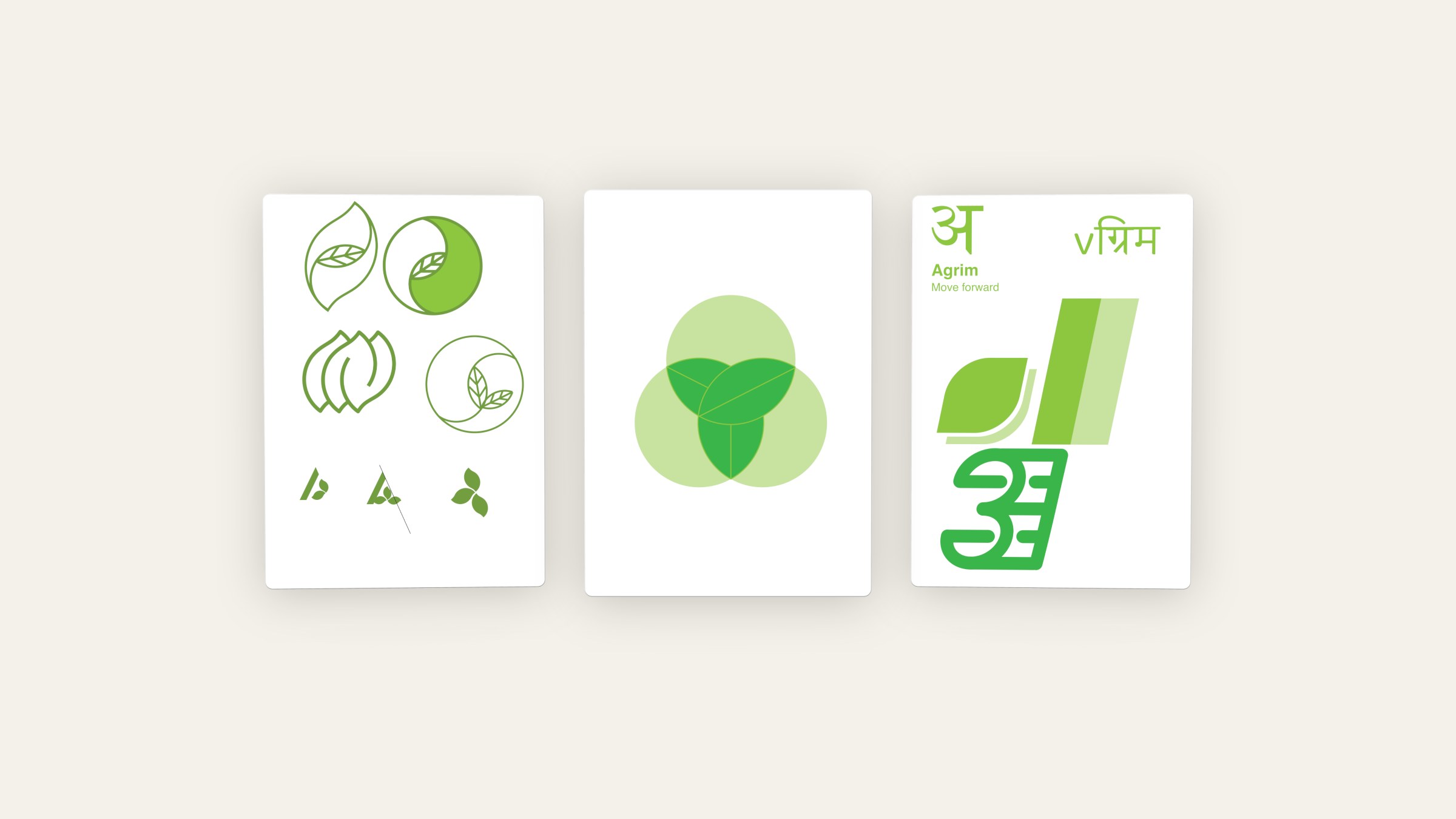
27 boards of exploration: wordmark weights, leaf and seed symbols, three-circle trefoils, and the first experiments that fused the Devanagari अ with a leaf. Every route was drawn on a construction grid so the strongest could be refined, not redrawn.

Exploration
Exploration

Leaf, trefoil and Devanagari routes, each drawn on a construction grid.

02

The mark

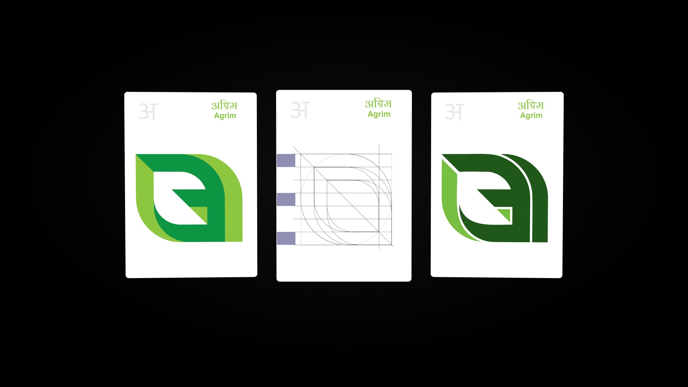
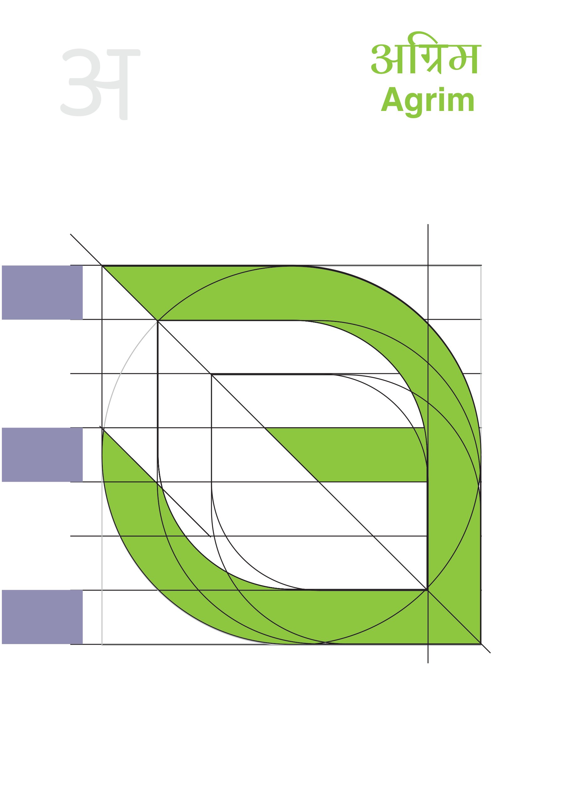
The final symbol is composed on a precise parallelogram grid. अ and the leaf share one silhouette, and the diagonal slice reads as a step forward. White on a dark field is the preferred form; Agrim Green takes over on light grounds.

The mark

From the parallelogram construction to the two greens and the dark-green colourway.

03

Bilingual lockups

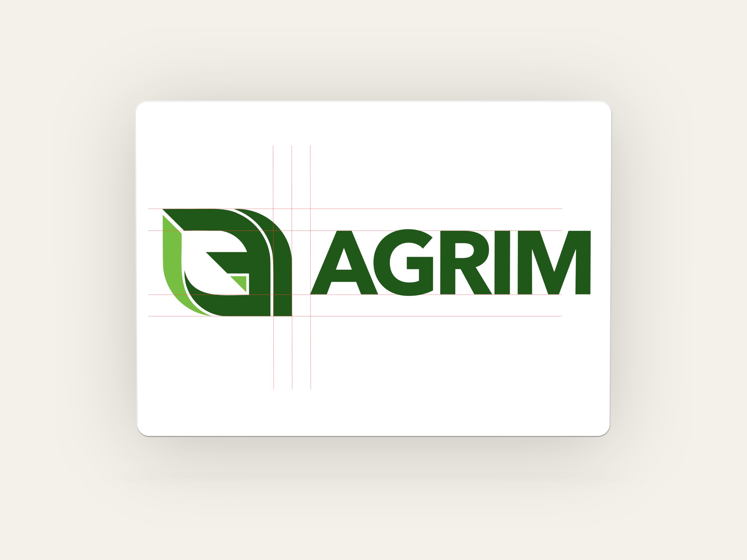
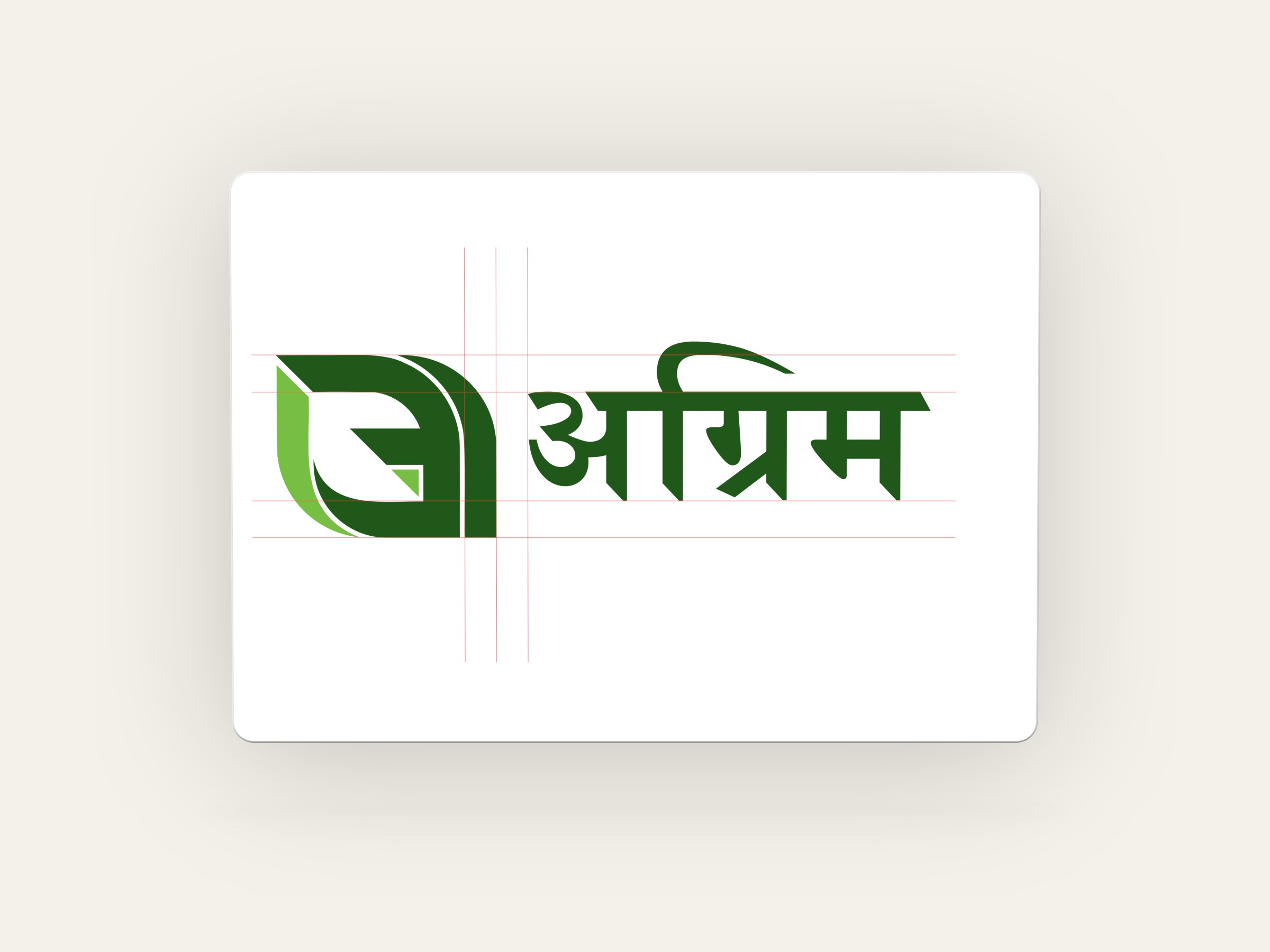
Horizontal and vertical lockups in English and Hindi, built on the same x-height spacing rule. The localised version is an addition to the system, used to connect with local audiences rather than replace the English mark.

Bilingual lockups
Bilingual lockups

English and Hindi lockups share one x-height spacing rule.

04

Agrim 1.0 brand manual

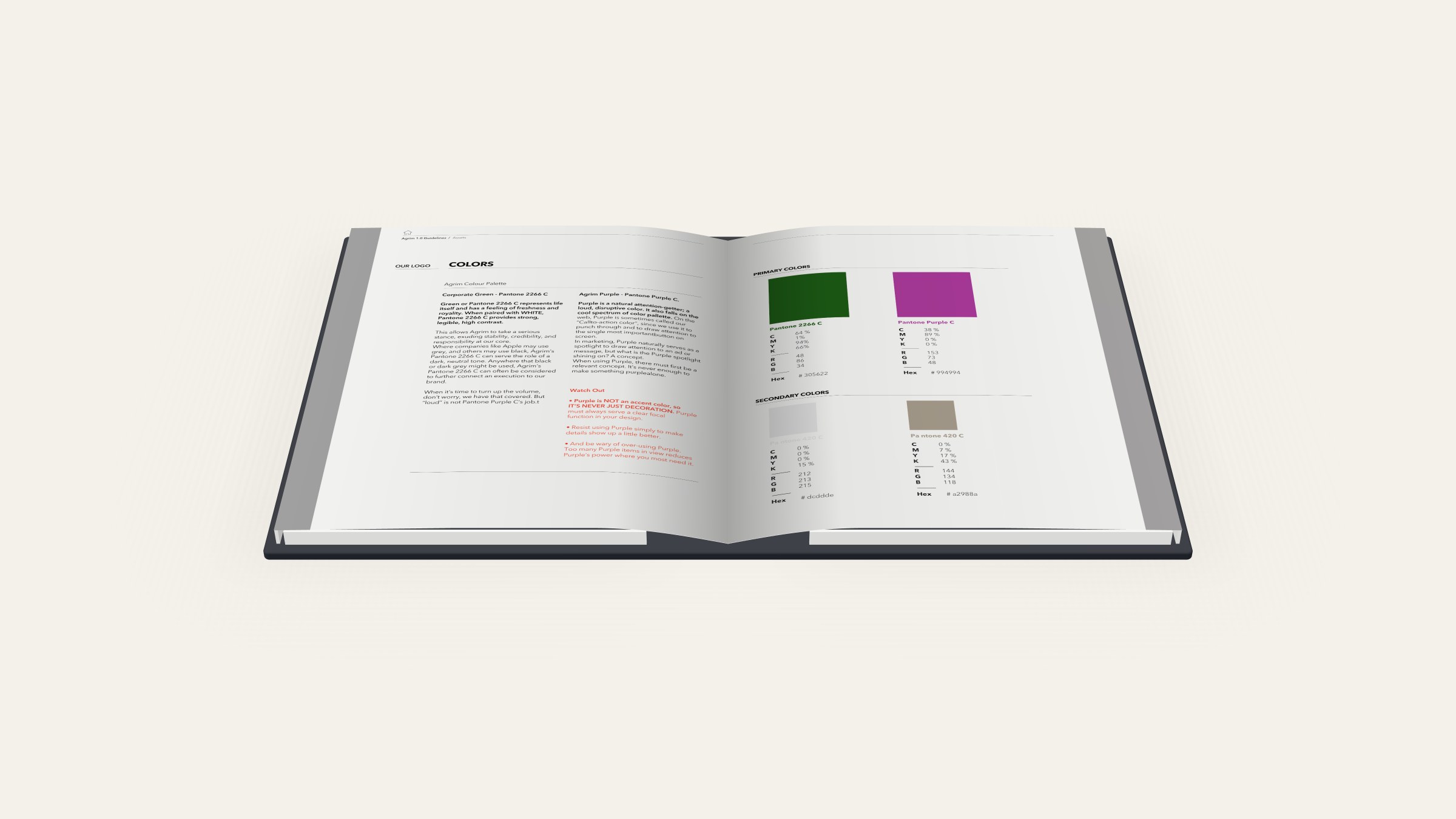
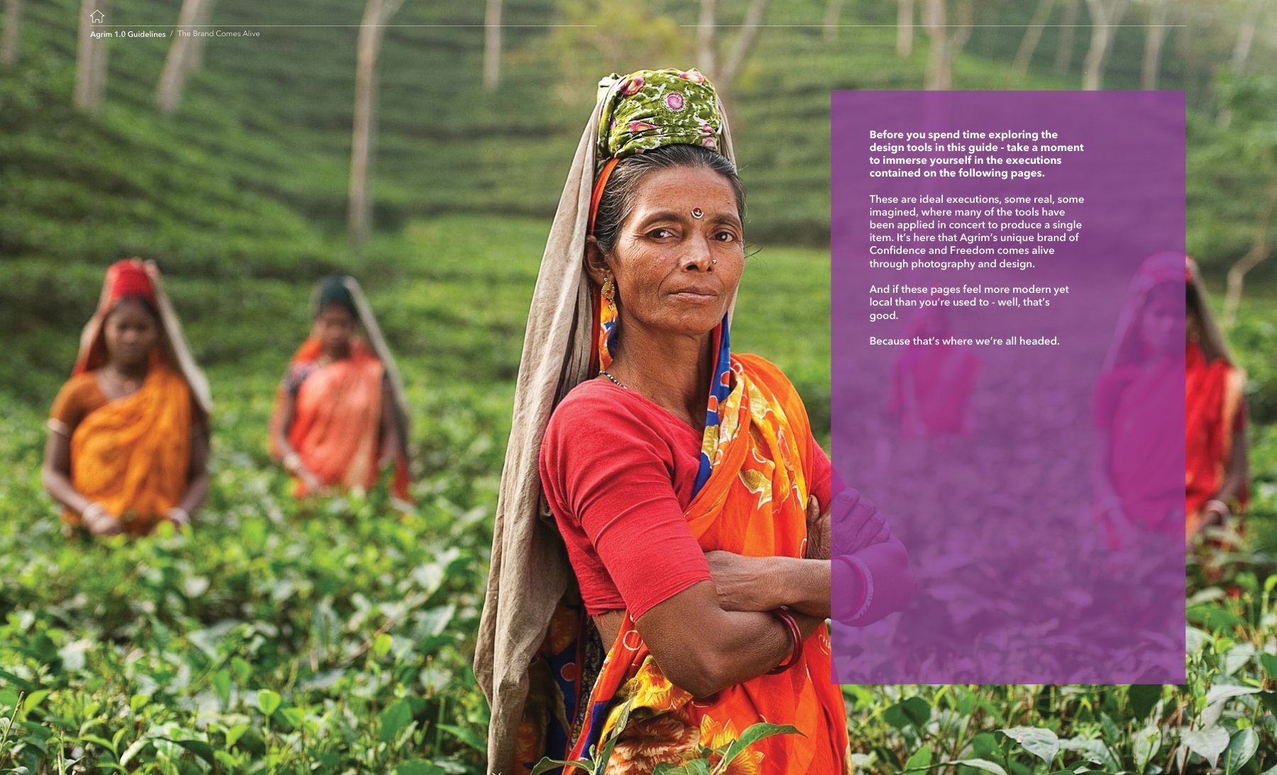
A manual written for a founder-led team. Pantone 2266 C does the work black does for other brands. Purple C is reserved for the single most important action on a screen and is never decoration. Avenir Next Demi Bold carries the voice. Photography stays close to real farms and real faces.

Agrim 1.0 brand manual

The colour spread gives purple one job: the primary action.

05

The brand in the world

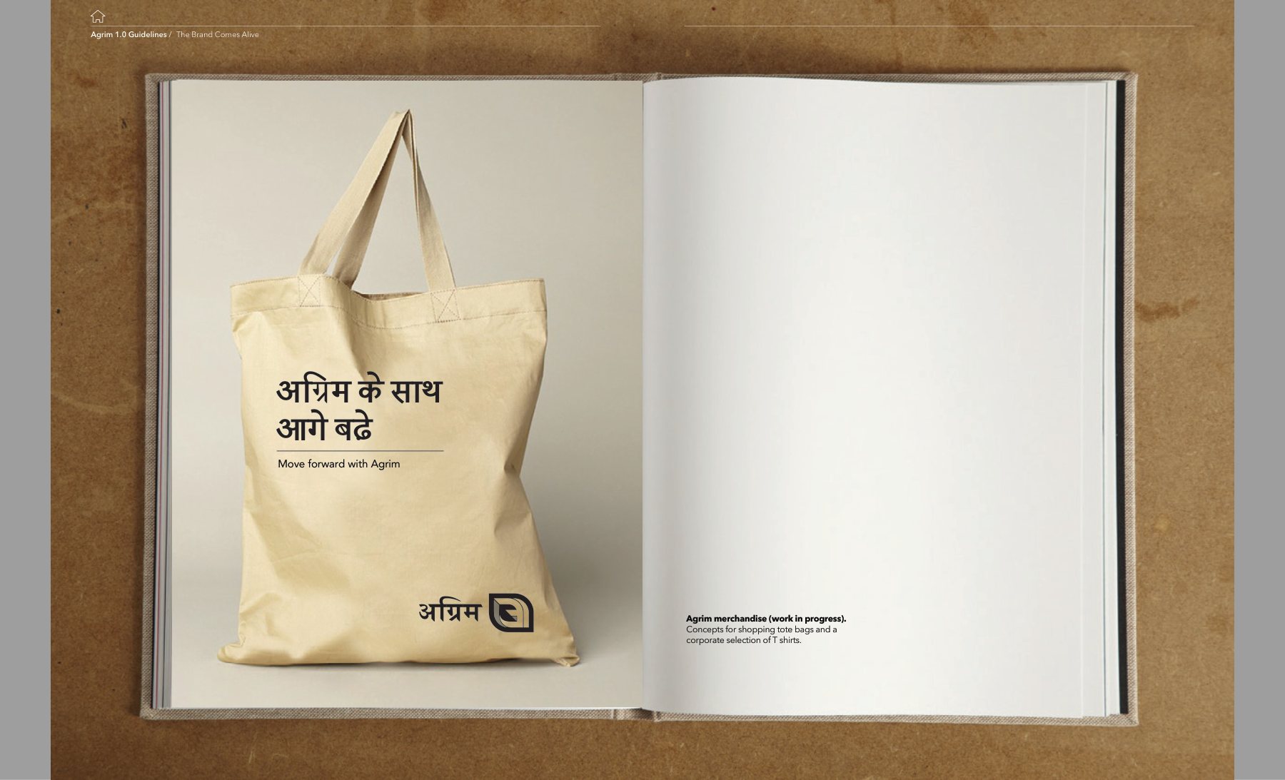
Merchandise concepts carry the line अग्रिम के साथ आगे बढ़े, "Move forward with Agrim", onto totes and team T-shirts, so the promise travels into the mandi as well as the app.

The brand in the world
06

Mobile-first onboarding

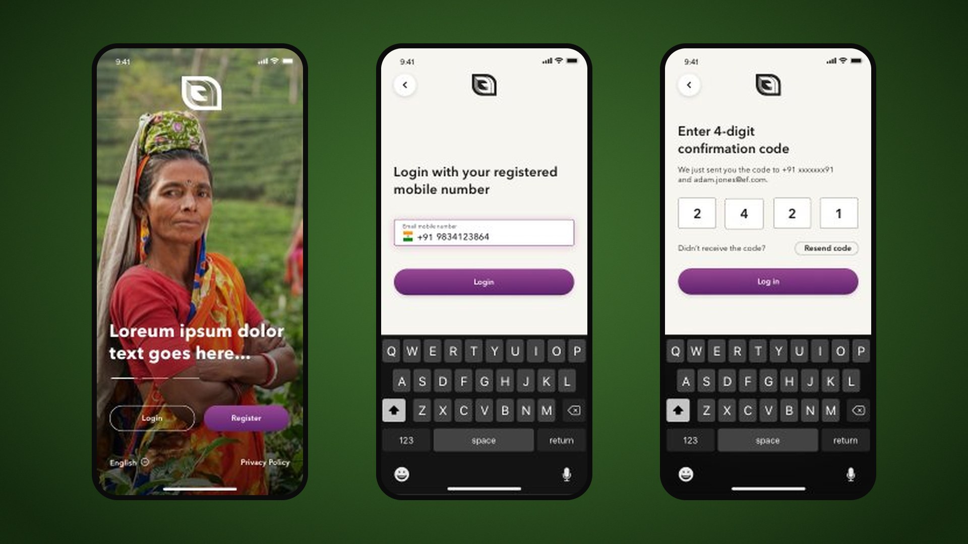
The first iOS flows: full-bleed farm photography, a language picker (English, Hindi, Arabic), phone-number login with OTP, two-step registration with company and address, plus branded SMS, email and push templates. Purple is used only on the primary action, exactly as the manual prescribes.

Mobile-first onboarding

Welcome, login and OTP: purple only on the primary action.

In motion

Outcomes

  • 27logo routes explored
  • 2scripts in one system
  • 1action colour, used on purpose

What I took away

  • Local and modern are not opposites. The Devanagari vowel did more for trust than any stock photo.
  • Write the guidelines for the people who will use them. Here that meant founders, not designers.
  • Give the loudest colour one job. Purple marks only the primary action, so the product stays calm.
Creative Lead / Design Director
Preetham Lawrence
Founder
Mukul Garg
Have a hard problem worth solving?

Let's solve it together.

preetham.lawrence@icloud.com
+41 76 740 46 30Phone
LinkedIn↗ Writing on Medium↗

Design leader based in Zürich, Switzerland. Open to leadership roles and selected collaborations.

© 2026 Preetham LawrenceIndex