A daughter in another city needs a physiotherapist to visit her father. Portea brings that kind of care home: doctors, physiotherapists, nurses, diagnostics, medicines, trained attendants and rented medical equipment, delivered to the patient's door.
Most of the people opening the app are patients, or relatives booking for them, often while unwell or worried. A long, complicated journey would push them back to the phone line, and the business still needed the app to sell services.
What would make booking care at home feel as familiar as checking in at a hospital desk?
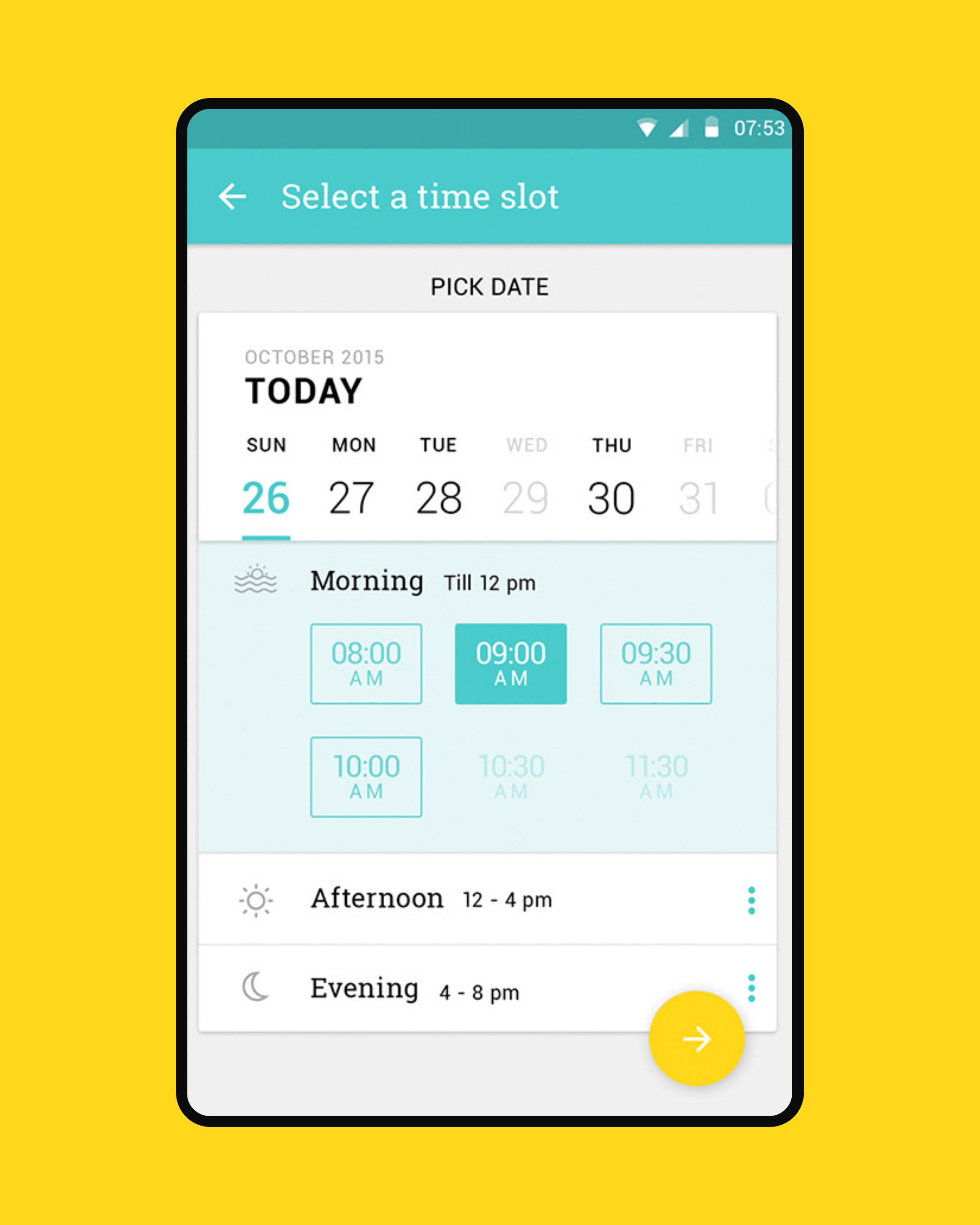
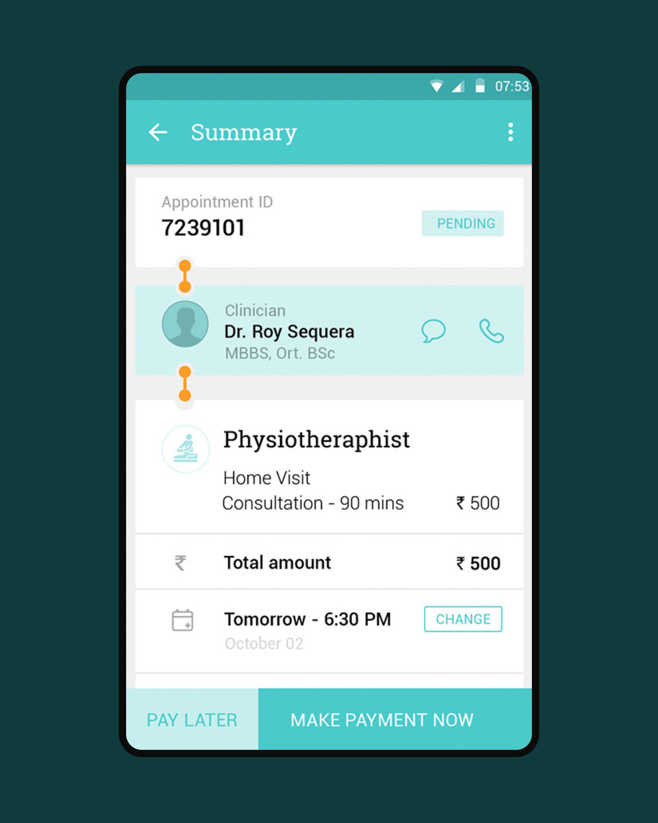
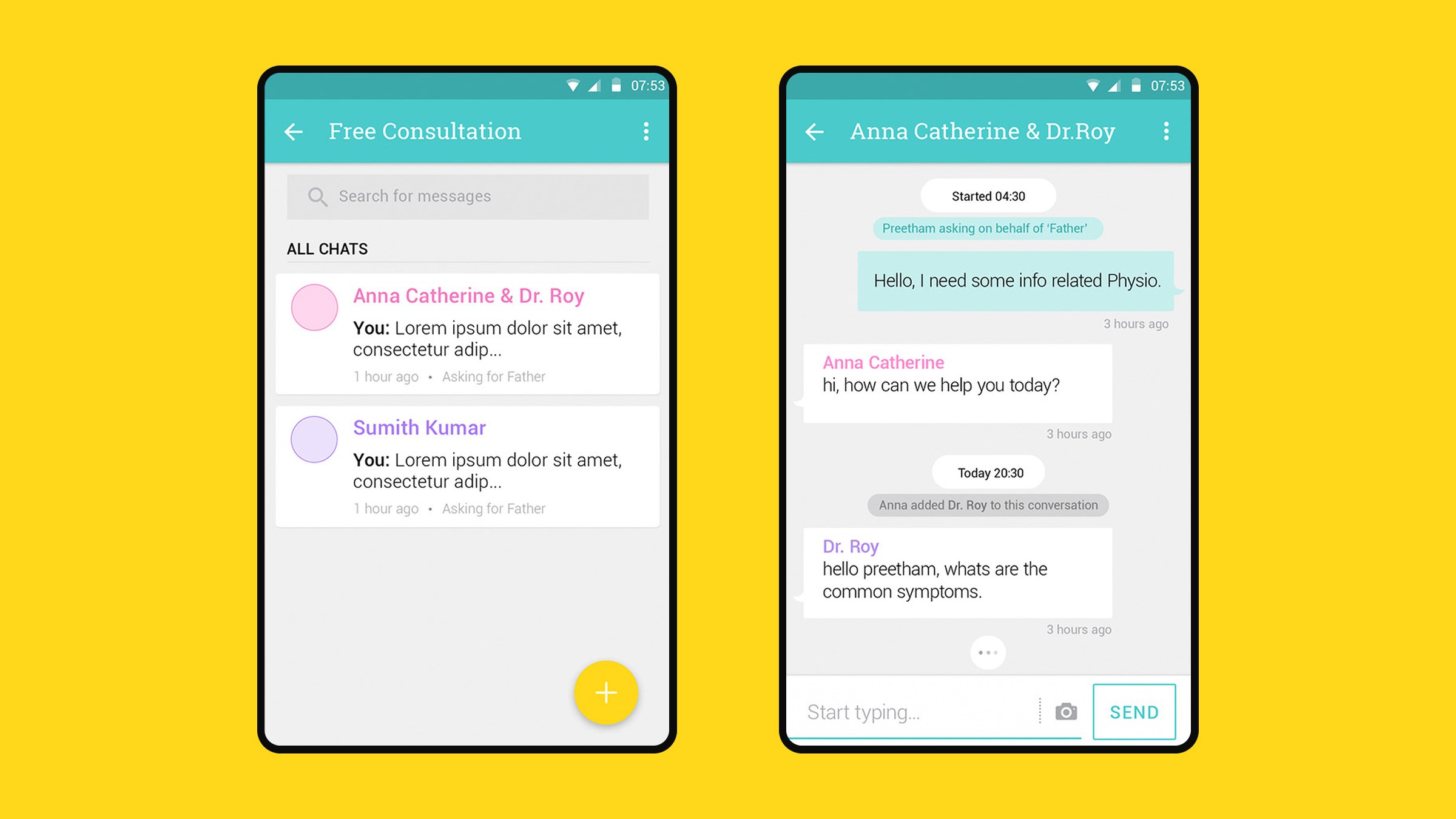
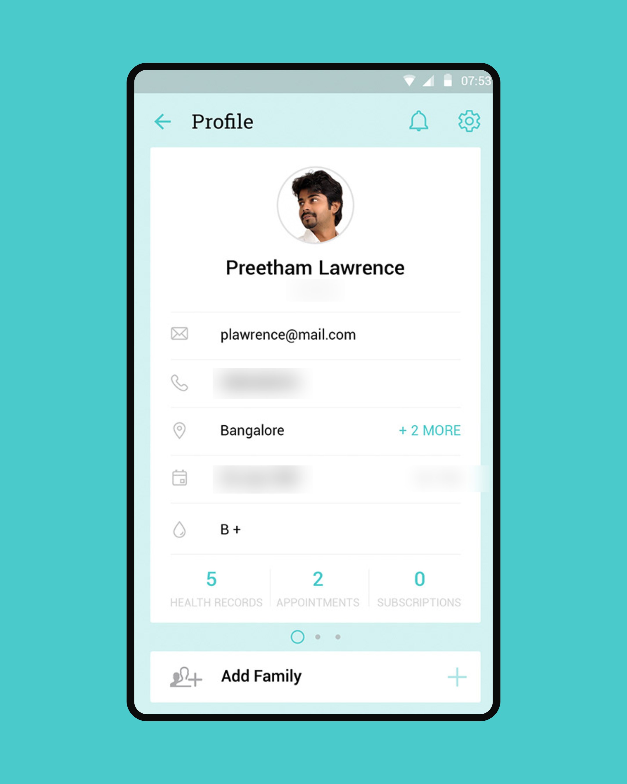
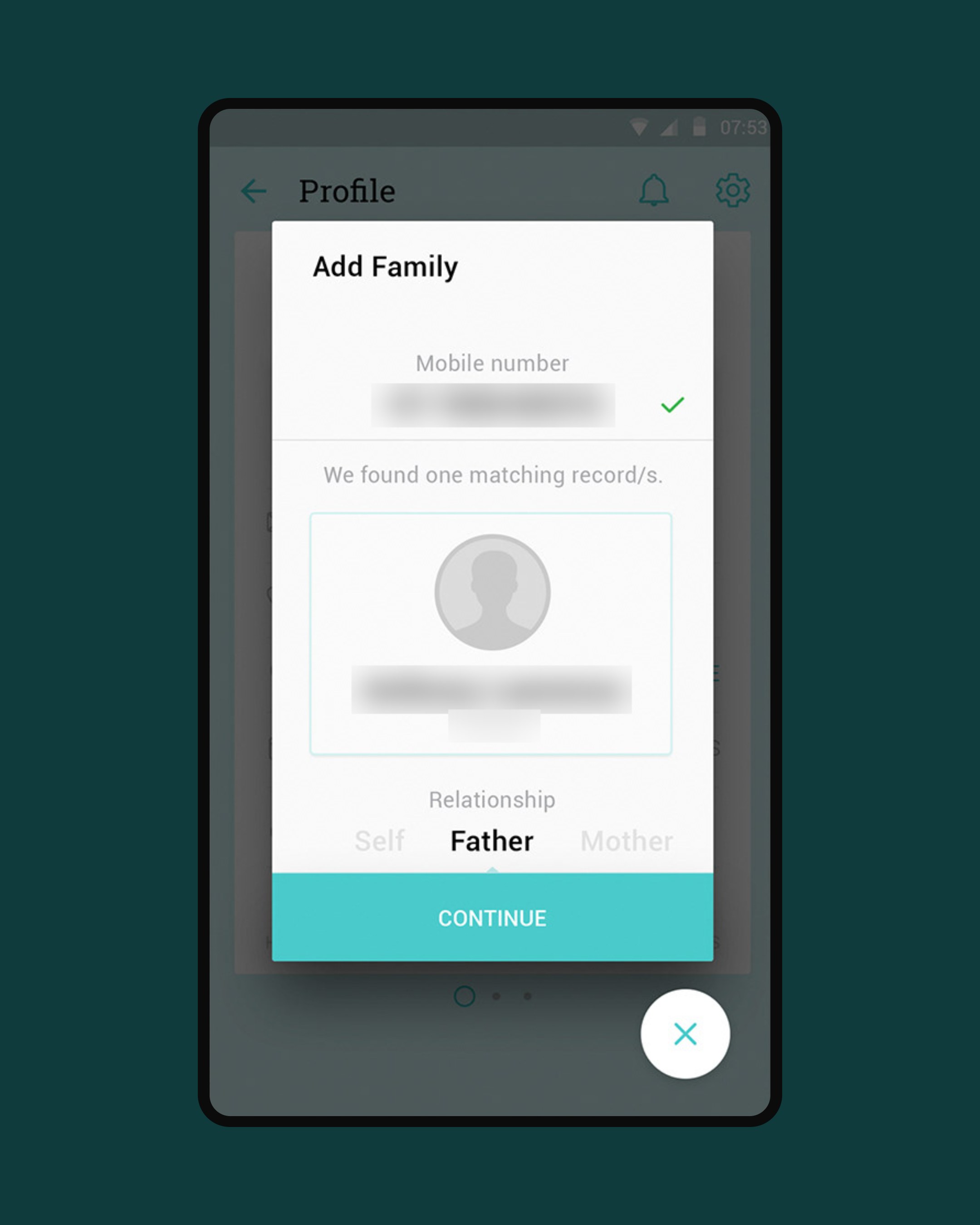
I built the whole app on one idea: the patient registration card that hospitals across India already use. Services, equipment, bookings, subscriptions, health records and profiles all appear as cards, so every screen reads the same way. Steps are kept to a minimum, floating actions keep booking in reach, and chat lets a family member ask a clinician for free before they buy.
My roleProduct designer. Designed the Android app experience: the card-based concept, home and navigation, the services and equipment catalogues, the four-step booking wizard, chat, order tracking, health records and family profiles.
01
The registration card
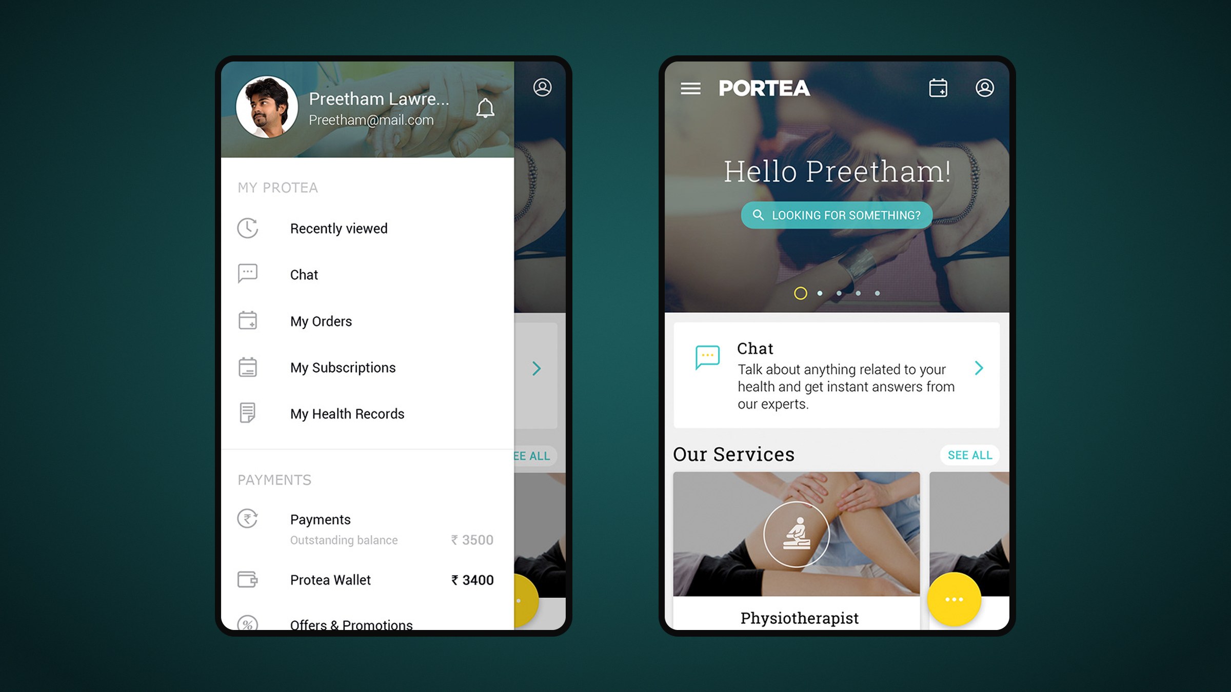
The home screen is a gateway to every part of the app, built to Google's Material Design guidelines. A greeting and search sit over a photo carousel, a chat card invites questions, and services follow as cards. A yellow floating button opens chat, call, payment and camera. Swipe right for the sidebar: recently viewed, orders, subscriptions, health records, payments and wallet.
The sidebar slides over the home screen and gathers orders, records and payments in one list.
02
Services and equipment
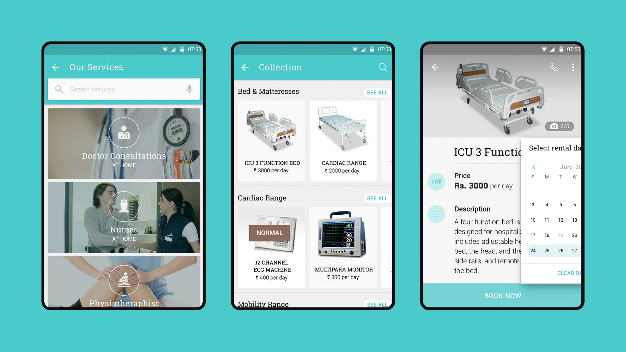
A catalogue of photo cards presents doctor consultations, nurses and physiotherapy at home, with search. Detail screens leave breathing room for price, description and key features, with a price list for single visits and packages. The same pattern lists rentable equipment such as ICU beds, ECG machines and monitors, priced per day, with a date-range picker.
Services and rentable equipment share one photo-card pattern, from catalogue to detail.
05
Orders, tracking and records
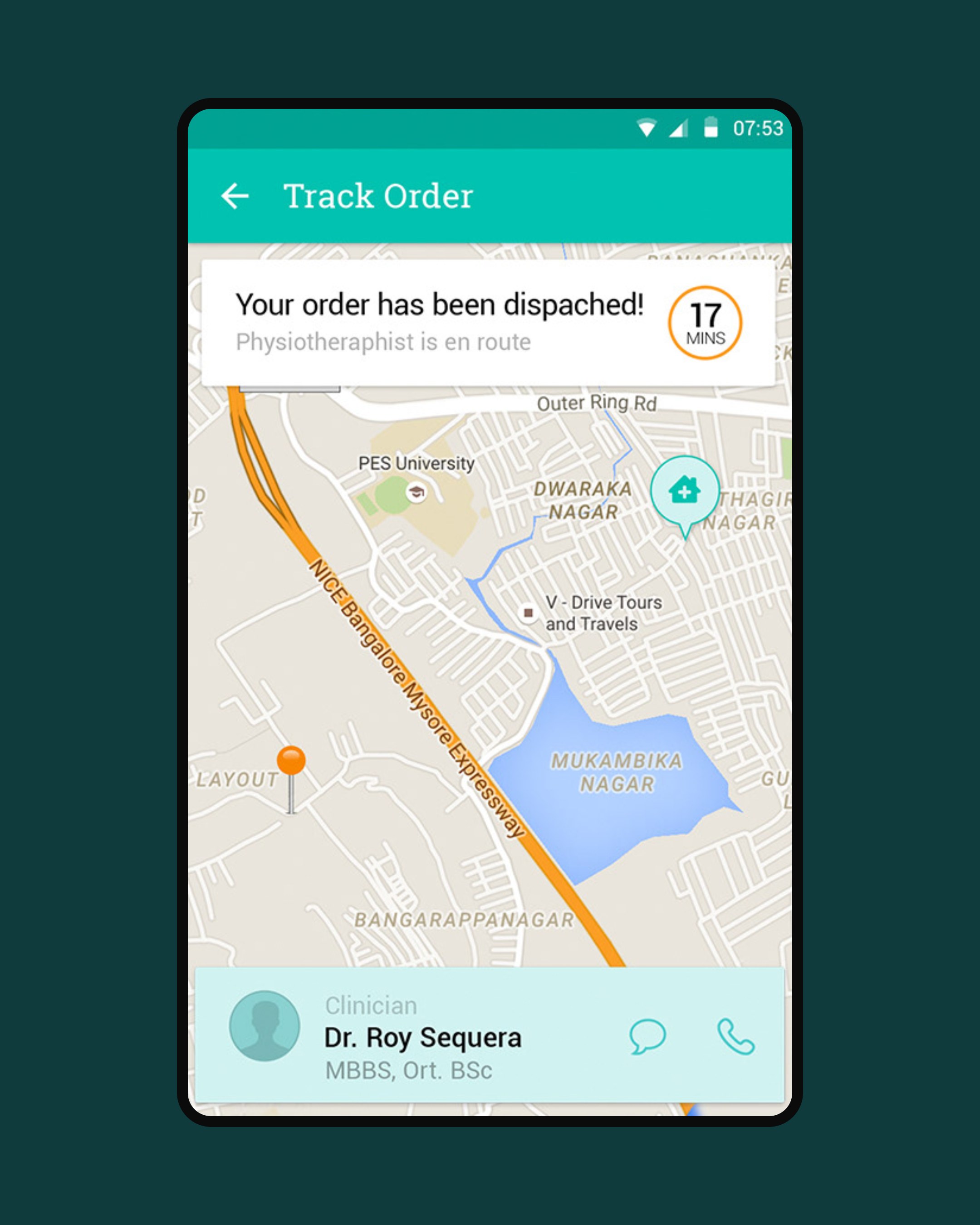
Subscriptions stack as a deck of cards with a status trail from session to delivery. A live map shows how far away the clinician is, who is coming, and buttons to call or chat. Health cards keep each episode, with tabs for case file, vitals and treatment.
A live map shows who is coming and when; subscriptions and health cards follow the same card form.