10 / 19 · When is it safe to run?

Engine 1

Engine 1 turns insulin on board, blood glucose, food and effort into one verdict: go now, eat first, or wait. I designed the iOS app end to end for Boston Technology Corporation, and it shipped on the App Store.

Role
Lead product designer
Client
Engine 1, a project initiated by Boston Technology Corporation
Industry
Healthcare & life sciences
Year
2015
Work
Product design, UI design, Interaction design

For someone with Type 1 diabetes, a 20-minute run is a calculation. Insulin still active in the body, carbs eaten, current blood glucose and planned effort all decide whether exercise is safe or ends in a hypo.

That data lived in separate places: a meter, an insulin log, a food diary, a running app. Nothing brought it together at the moment someone was lacing up, and behind every simple answer sat a lot of calculation that the person should never have to see.

Could four streams of medical data become one answer that someone reads at a glance: go now, eat first, or wait?

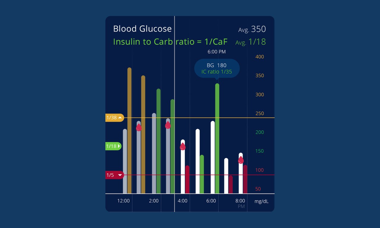
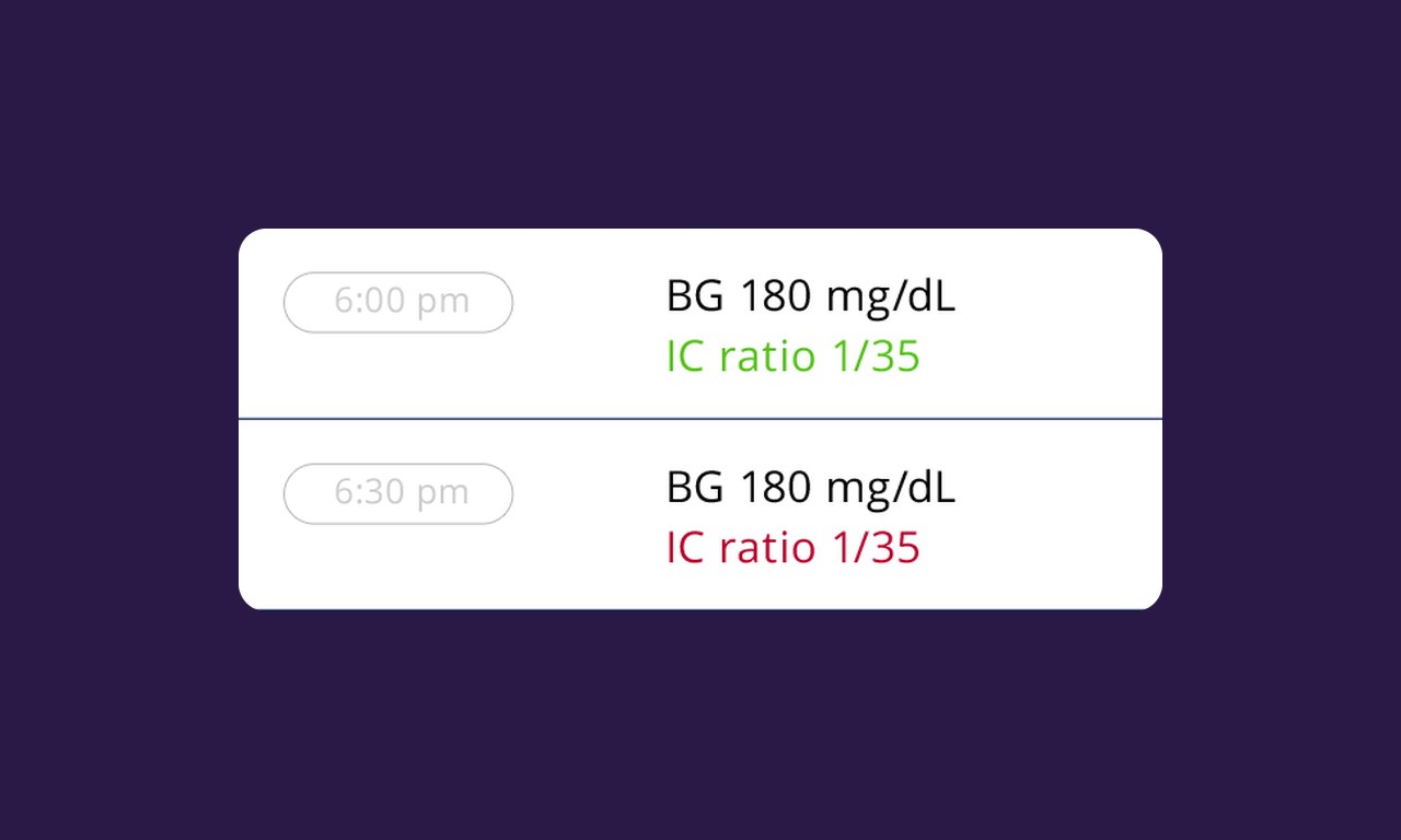
I put the decision first. The home screen leads with a plain verdict, such as "Good time" or "Not recommended", above one scrolling timeline of insulin on board, food to eat and food to carry. Everyday objects carry the data: a traffic signal for the insulin-to-carb ratio, a bottle for hydration, a rack of cards for the health log. Logging, trendlines and a live run tracker that prompts refuelling sit behind it.

My role

Lead product designer. Brought in by Boston Technology Corporation to design the Engine 1 iOS app end to end. That covered the concept and interaction model, onboarding, the workout-readiness home screen, health logging, trendlines, the live run tracker and settings.
What made it hard

  • Clinical data, everyday language

    Units, mg/dL and insulin-to-carb ratios had to sit underneath a verdict anyone can understand mid-stride. Help tips explain terms like RPE in place.

  • Time is the real axis

    Insulin peaks and fades. The UI had to show where you are now and where you will be in 30 minutes, all from one scroll gesture.

  • Logging fatigue

    Blood glucose, insulin and food entries had to take seconds, or people stop doing them. A barcode scanner cuts food logging to a scan.

  • One-handed, on the move

    Phones were getting bigger and people use this one while exercising, so the menu and log buttons moved to the bottom of the screen.

Questions we asked

  1. What is the single sentence someone needs before a workout?
  2. Which everyday object makes insulin, food or water easy to read?
  3. How few taps can it take to log a meal or a bolus?
  4. What should the app say mid-run when glucose starts to drop?
01

Onboarding

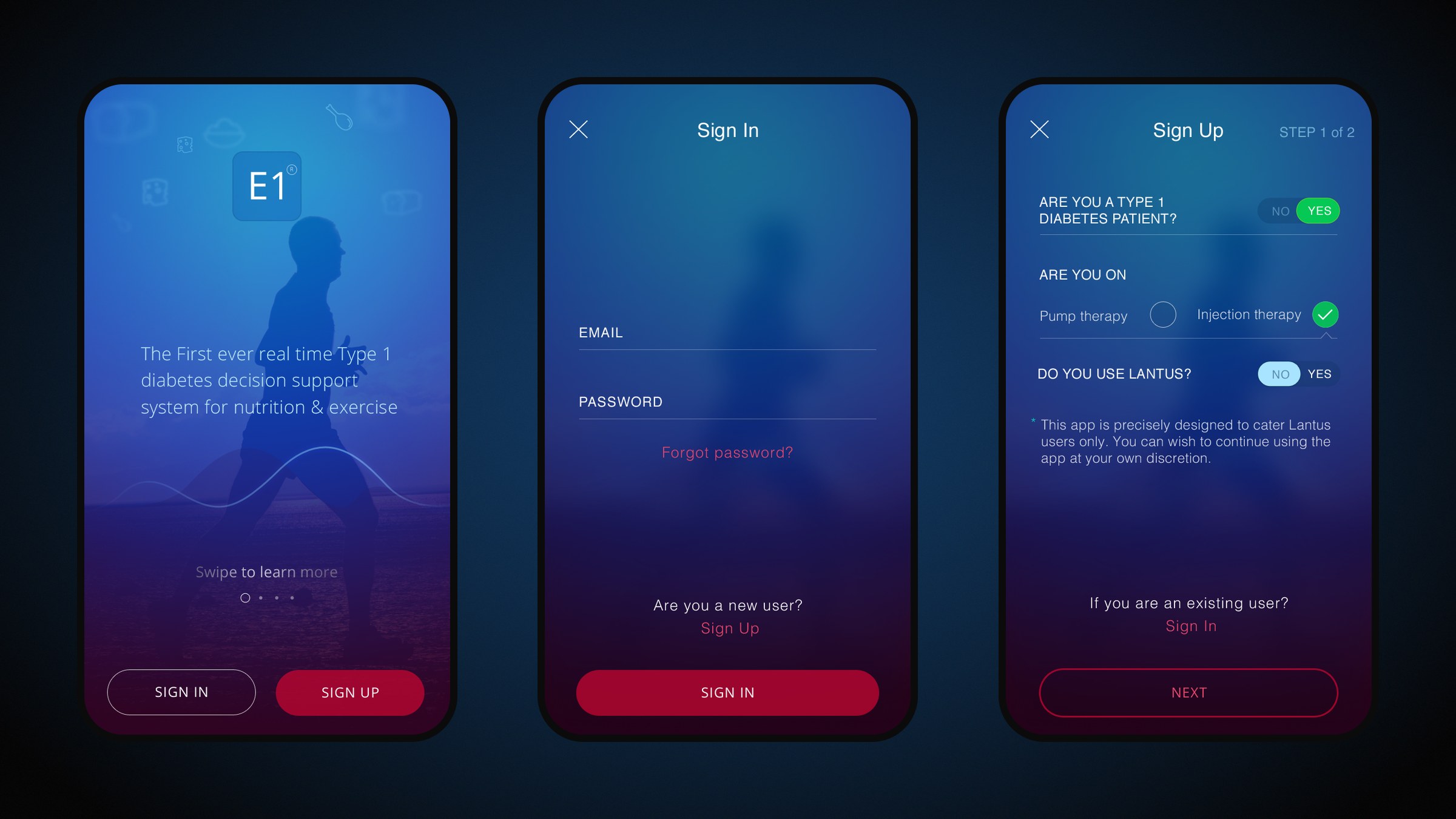
A calm, dark onboarding sets up therapy type (pump or injections), long-acting insulin, body metrics and fitness level, so readiness forecasts are personal from the first session.

Onboarding

Sign-in, the intro and the Type 1 therapy check share one dark, calm palette.

02

The readiness verdict

The home screen answers one question. The verdict sits at the top, and the colour shifts from blue (go) to magenta (not recommended). Insulin on board, food to eat and food to carry update in real time as you scroll forward in time. The same state can be read as bubbles, a stacked timeline or concentric rings.

From "Perfect time" in blue to "Not recommended" in magenta.

03

Navigation within thumb reach

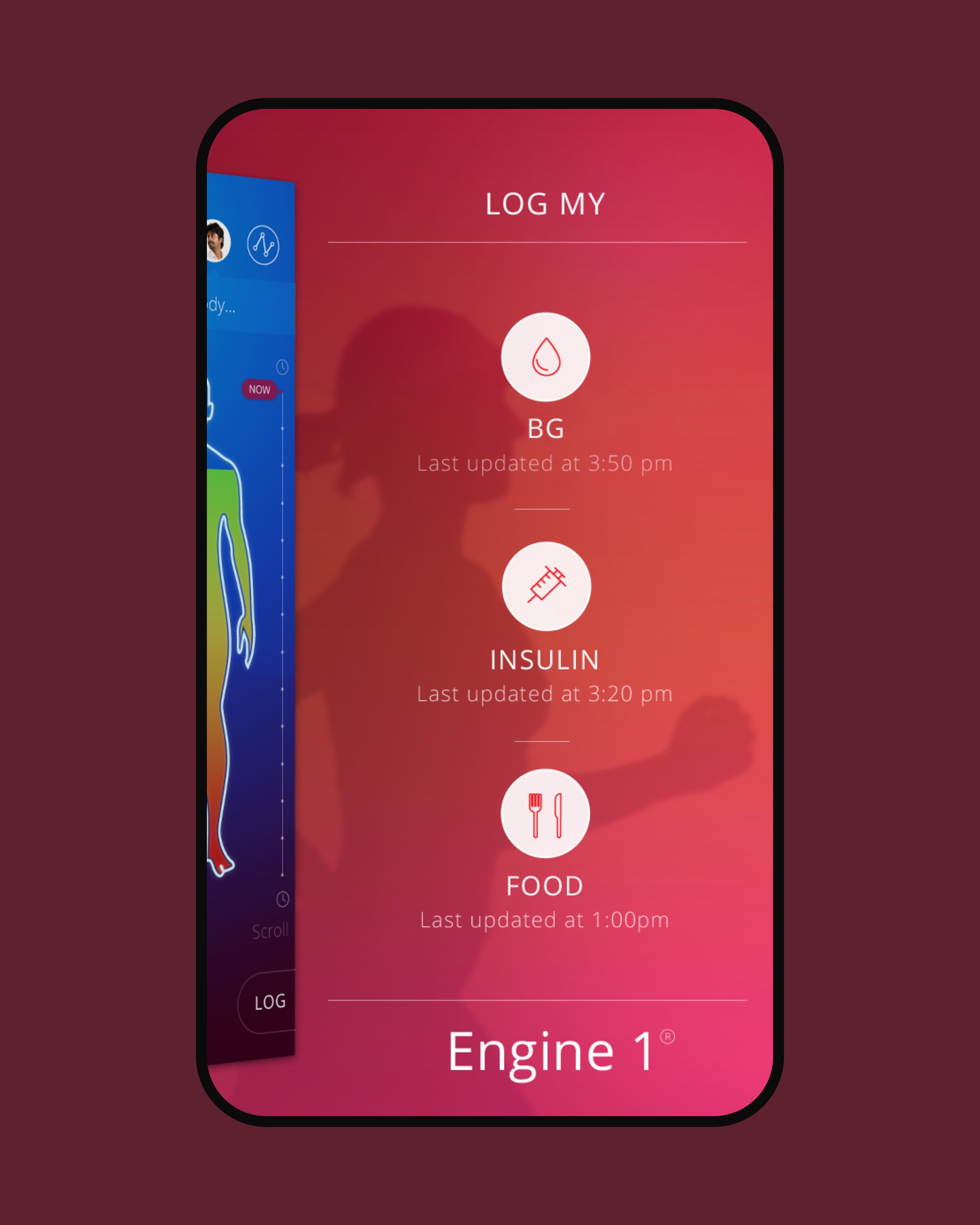
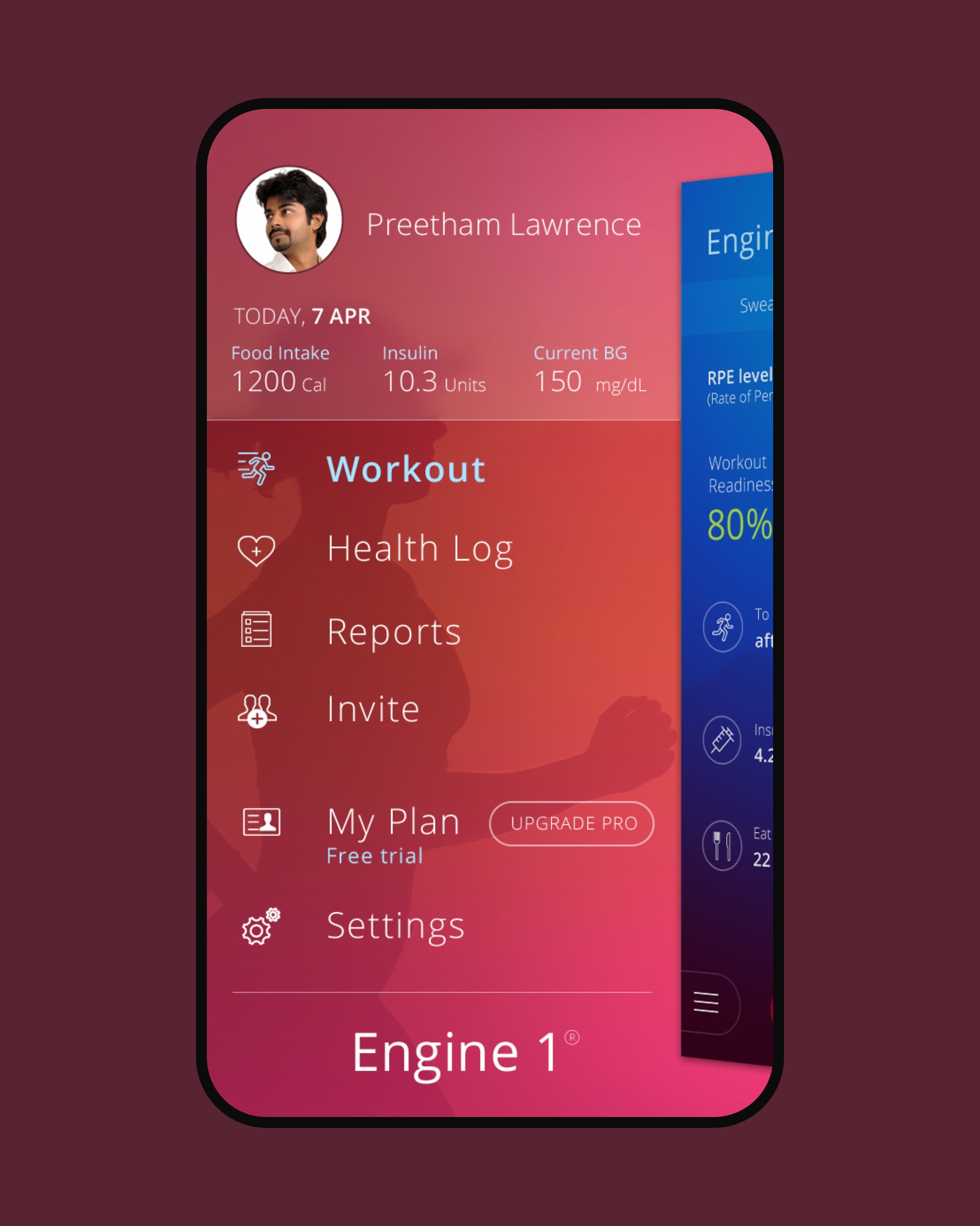
The usual top-left hamburger moved to the bottom of the screen, beside the Workout and Log buttons. Tap or swipe right for the menu, swipe left to add a log. The sidebar carries the day's food, bolus and last glucose reading, plus caretakers, invites and the Pro plan.

Navigation within thumb reach

Swipe right for the menu, left for a new log; both sit within thumb reach.

04

Log in seconds

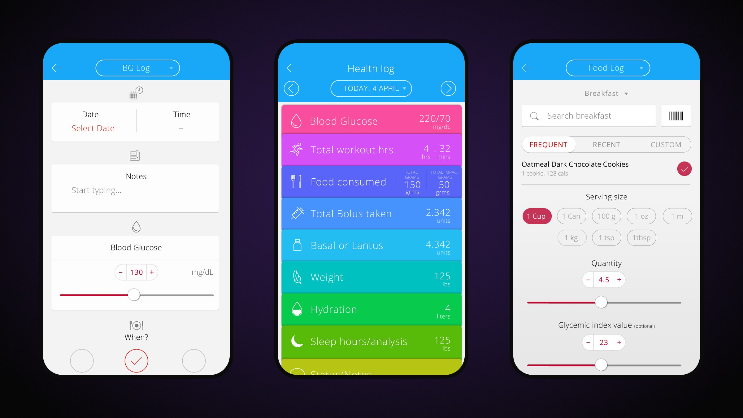
Simple forms log blood glucose, insulin and food with steppers and sliders. A barcode scanner reads food from certified vendors. The health log is a rack of colour-coded cards you pull out to see detail, and hydration fills a bottle.

Log in seconds

BG and food forms either side of the colour-coded health-log rack.

06

On the run

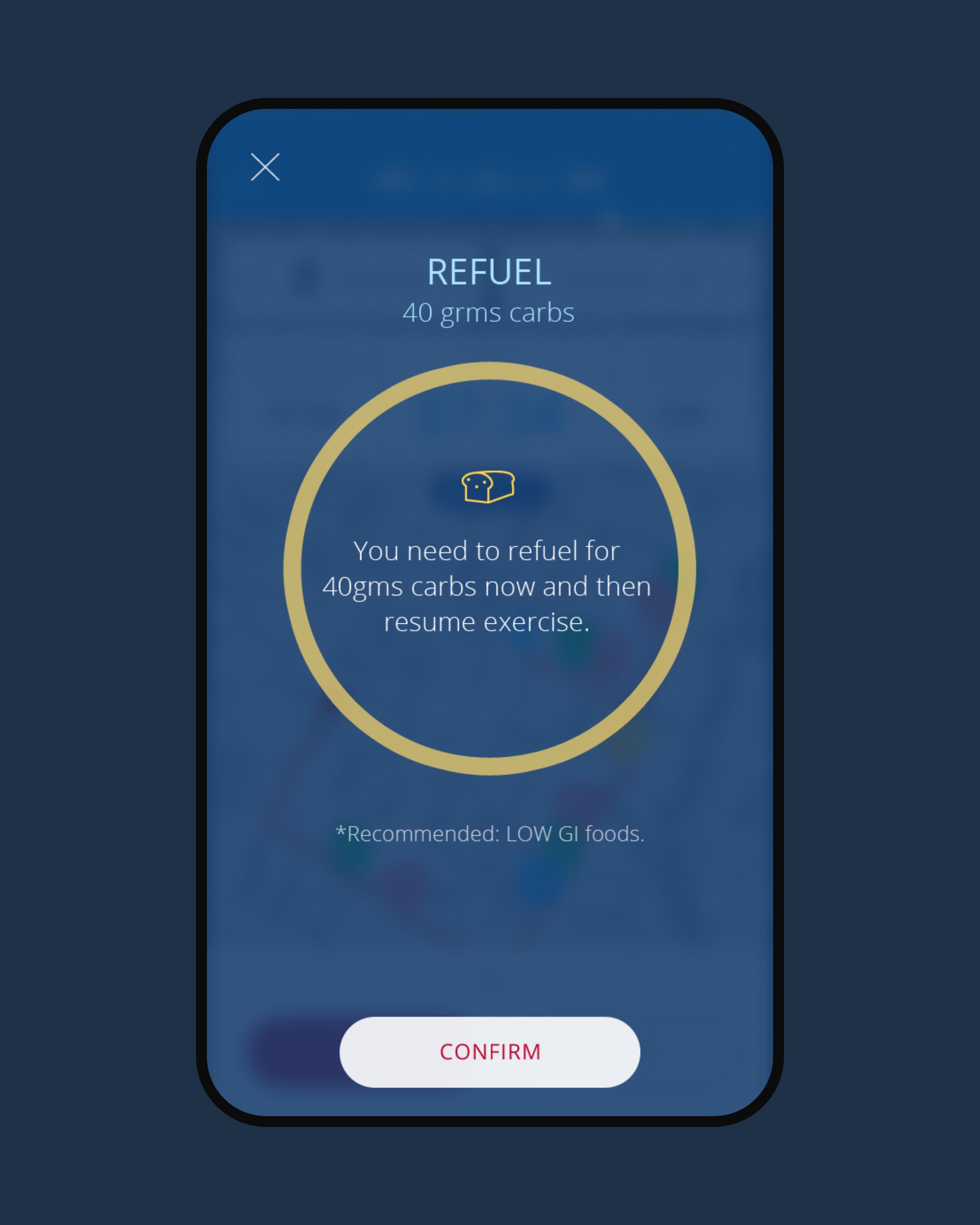
Before a run, the workout screen pairs heart-rate monitors, offers live sharing and says what to eat now and what to carry. During it, a breadcrumb trail pins distance, glucose and carbs to the map, and a toggle switches to live BPM. A refuel prompt says how many grams of carbs to take before carrying on.

On the run

The breadcrumb map pins glucose and carbs to the route; the refuel prompt interrupts only when needed.

In motion

Outcomes

  • 4→1data streams turned into one verdict
  • 3ways to read the same state
  • 48screens in the v2.0 system
  • Shipped on the US App Store as Engine1 (id1022329944)

What I took away

  • Lead with the decision. The data is there to back it up, not to be read first.
  • Borrow from real life. A bottle, a traffic signal and a rack of cards explained more than any chart legend.
  • In health, colour is copy. Blue and magenta had to mean the same thing everywhere.
Lead product designer
Preetham Lawrence
Project initiated by
Boston Technology Corporation
Have a hard problem worth solving?

Let's solve it together.

preetham.lawrence@icloud.com
+41 76 740 46 30Phone
LinkedIn↗ Writing on Medium↗

Design leader based in Zürich, Switzerland. Open to leadership roles and selected collaborations.

© 2026 Preetham LawrenceIndex