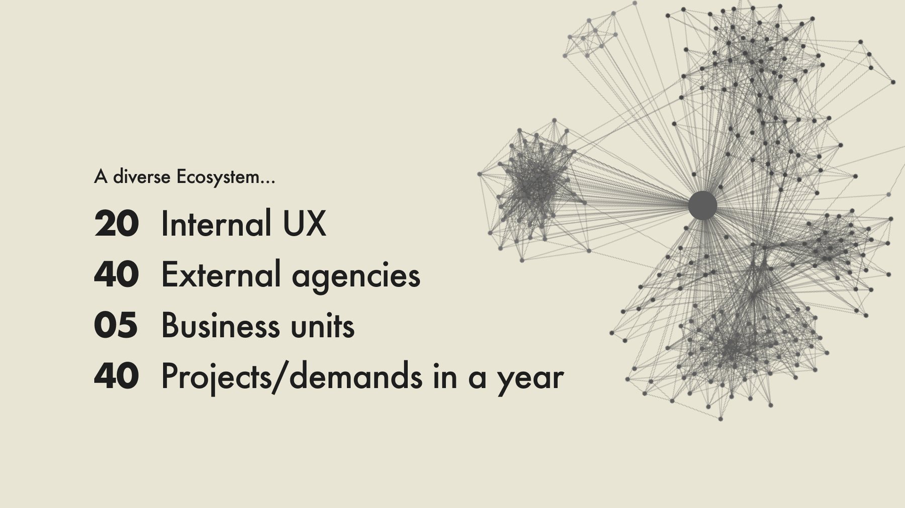
More than 60 designers, some in-house and some at agencies, build for Novartis: web apps, CMS sites, mobile apps and product brands such as Cosentyx and Entresto. Together they deliver around 40 to 50 projects a year in Angular, React, Vue and more.
There was no single source of truth for tokens, components or patterns, so delivery was slow and the experience uneven. The first enterprise system, WADS, shipped in 2021 but proved too rigid. Designers felt boxed in, developers waited on the core team for every change, and migrations took months.
Could one design system serve every brand and every tech stack without becoming the bottleneck the last one had been?
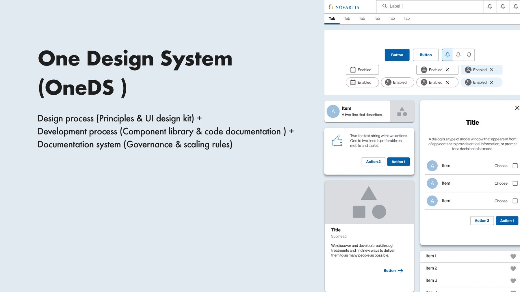
We rebuilt it as OneDS, using the move to Figma as a clean start. Two token layers separate the theme from the core, so a product can switch from Novartis to Cosentyx without breaking design files. Components follow Material and ship as MUI 5 packages for React and Angular, installed through private NPM packages. OneDS was adopted across design and engineering, and migrations dropped from months to weeks.
My roleProduct Owner, Lead UX. Owned the product and UX for OneDS over about 12 months: architecture, tooling, governance, the adoption programme and the business case to leadership. I worked across the design and engineering communities and with business leaders.
01
Learning the hard way
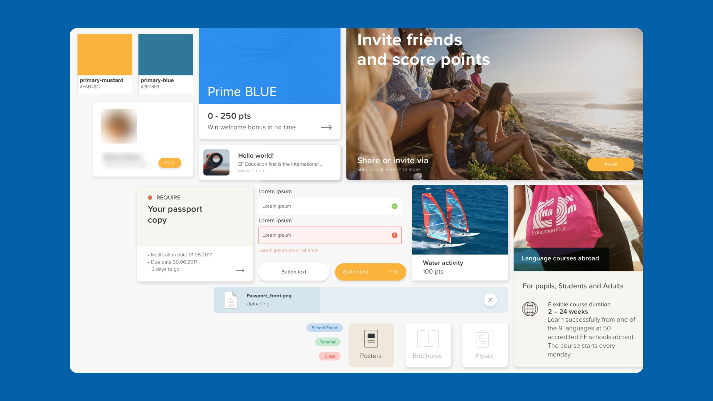
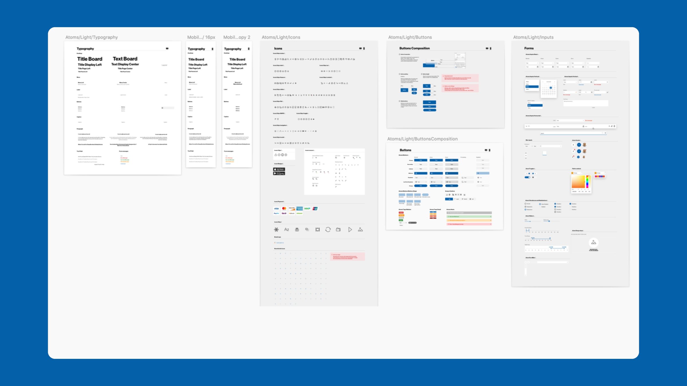
My first system was an unofficial cross-platform UI kit in Sketch at EF, with basic accessibility standards. It improved consistency but met leadership resistance, which taught me early that design systems are about people first. The first enterprise attempt, WADS in 2021, combined a Sketch and Abstract kit with Stencil.js web components and Storybook. It was too rigid for designers, and developers depended on the core team for every customisation.
The EF kit and the WADS-era Sketch atoms library: consistent, but owned by one team.
02
Themes plus platforms equals components
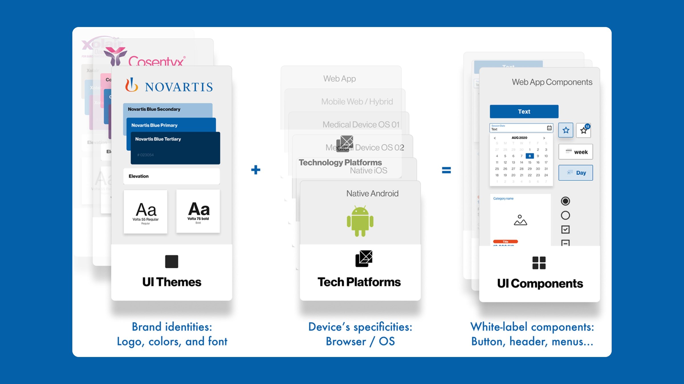
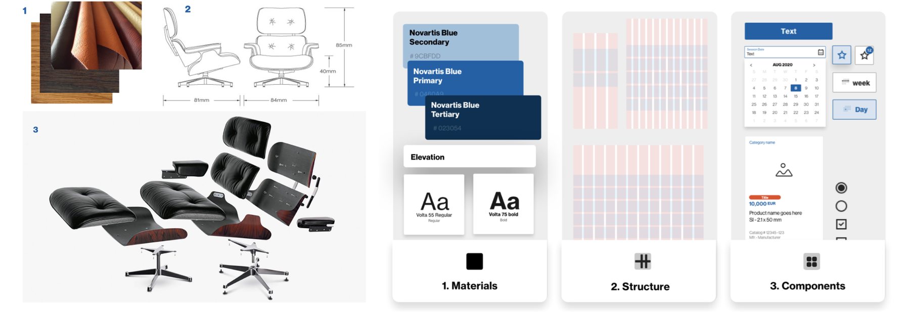
OneDS starts from a simple equation. Brand themes carry logo, colour and type. Tech platforms carry the specifics of each browser and OS. White-label components sit where the two meet. Like a well-made chair, the system is built from materials, structure and components, and each layer can change without breaking the others.
Brand themes and tech platforms meet in one set of white-label components.
03
Two token layers, any theme
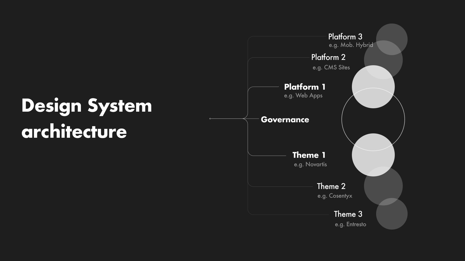
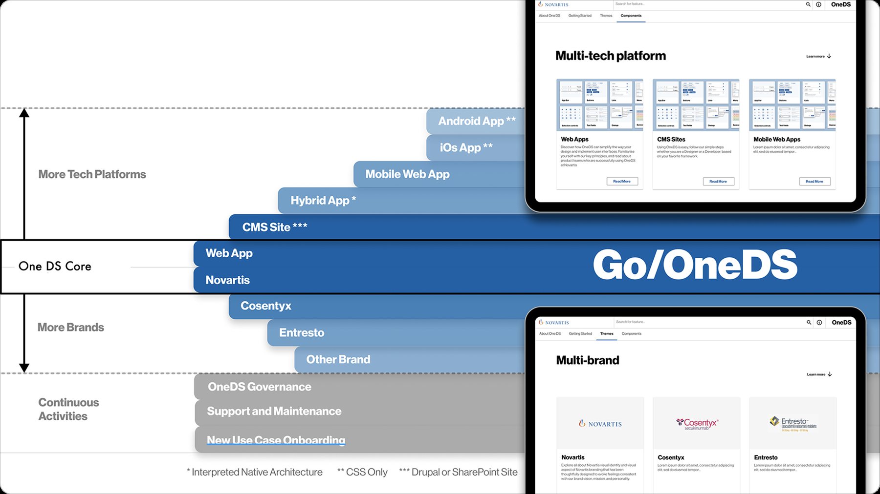
Governance sits at the centre, linking platforms and themes. A theme layer on top of core tokens lets the same web-app components switch from Novartis blue to Cosentyx magenta without touching design files. New platforms such as CMS sites and hybrid apps, and new brands such as Entresto, plug in through the same structure.
The same header, tabs, buttons and chips, re-skinned from Novartis to Cosentyx through the theme token layer.
04
Production-ready in code
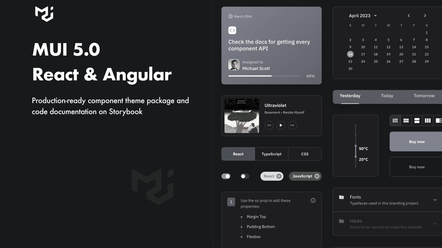
Components are modular and compatible with MUI 5, packaged as themes for React and Angular and documented in Storybook. Private NPM packages, CLI installers and automation scripts took the setup work out of getting started. The roadmap grows the core outward to more platforms and more brands, with governance, support and new use-case onboarding running all the time.
The Go/OneDS documentation site, where each brand theme gets its own page.