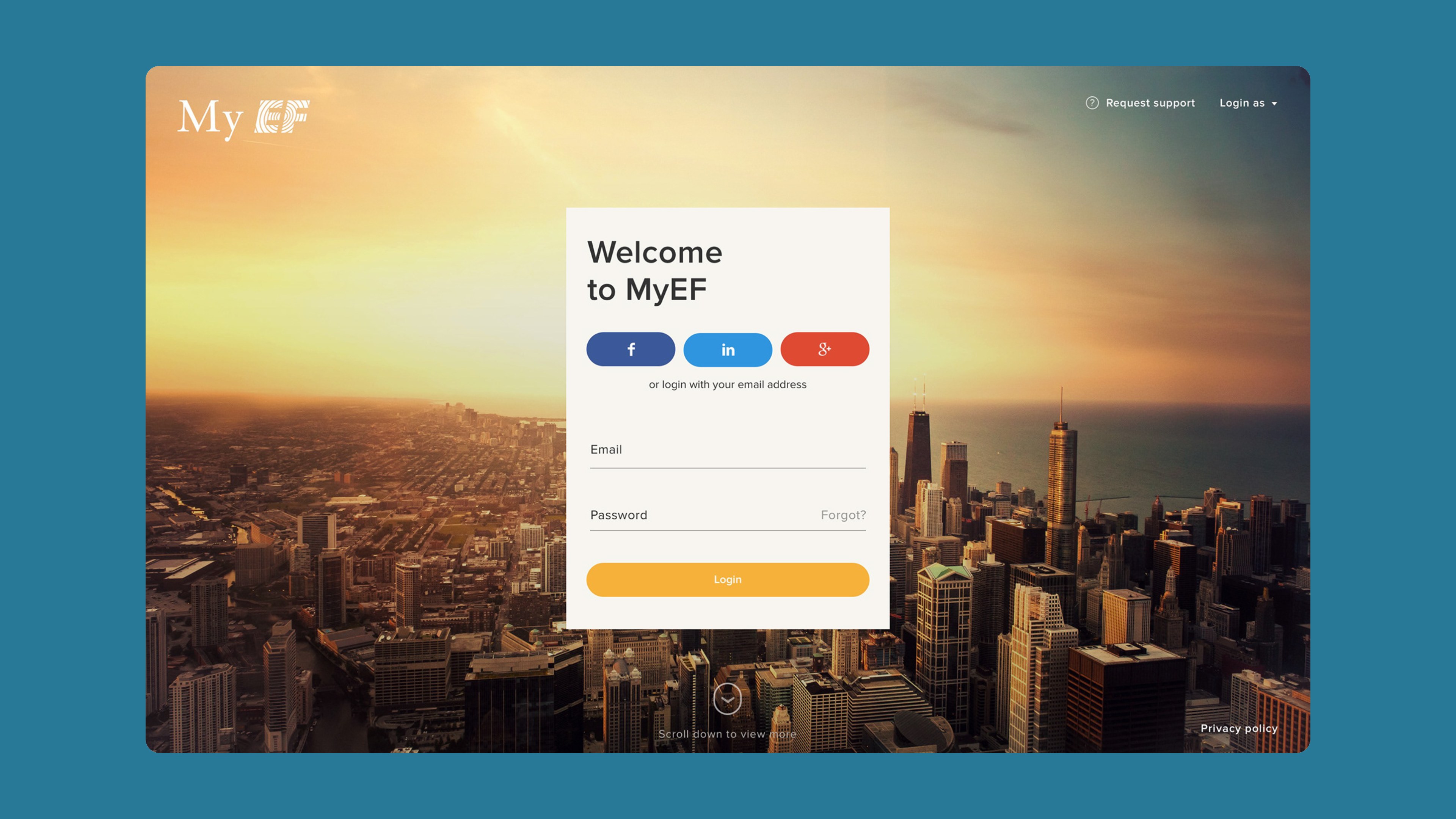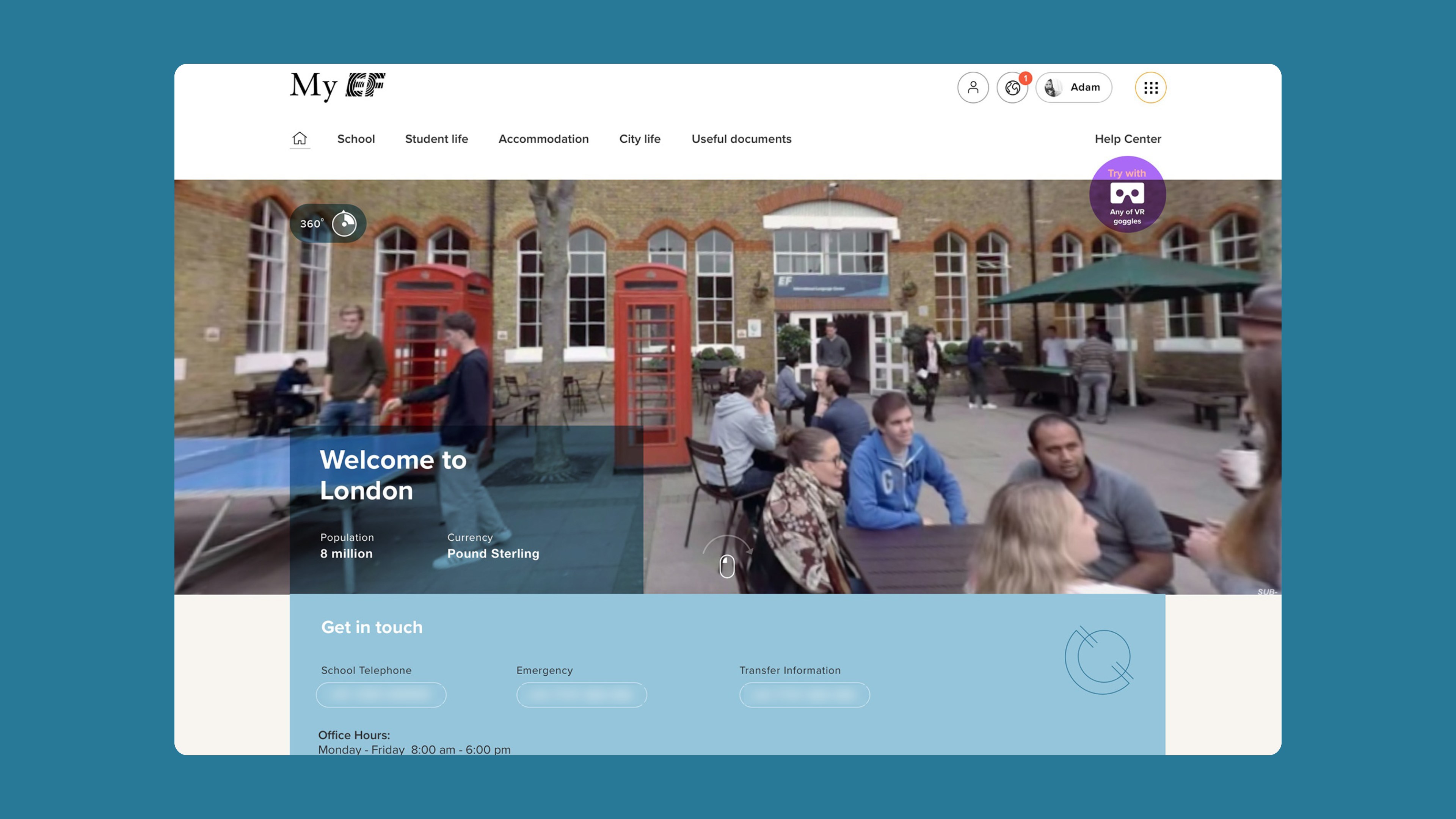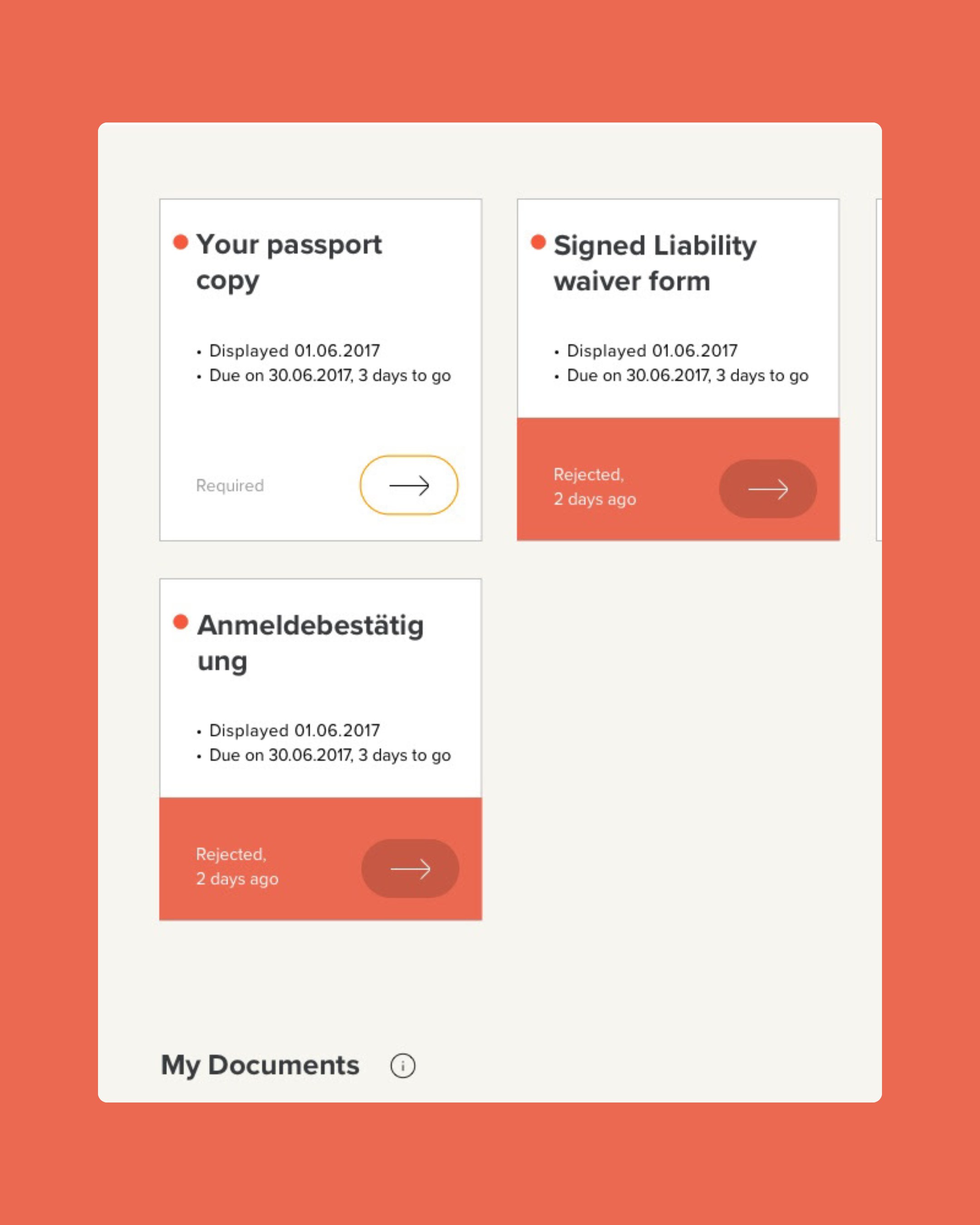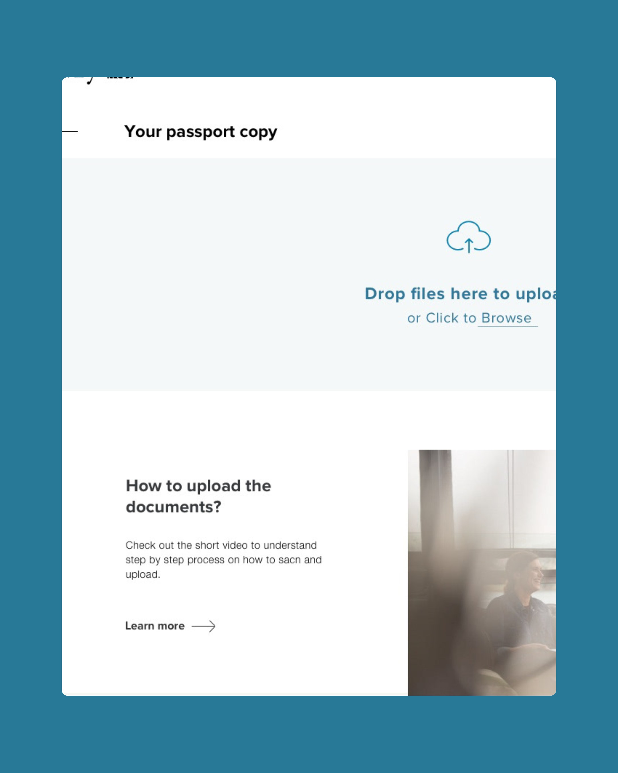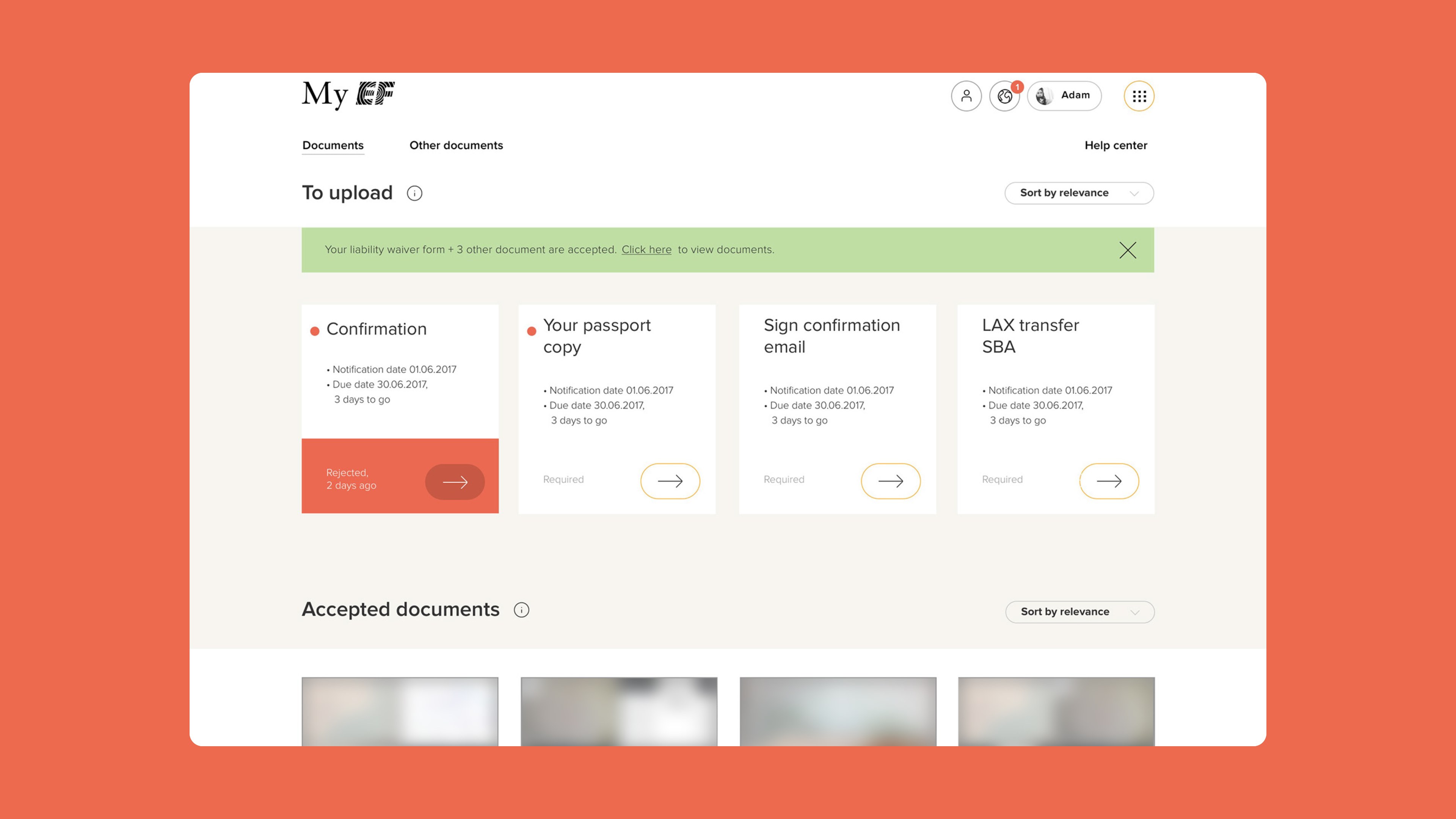
A student about to travel with EF Education First opens My EF before leaving home. There they meet classmates, read about their school and city, and handle the paperwork for the trip: visa forms, passport copies, transfers and accommodation.
The portal had grown into an outdated ecosystem. Branding was inconsistent, features sat in separate corners, and a student counting down to a first trip abroad had to hunt for the one document still missing. Every new screen added to the drift, because there was no shared source for styles.
What would a student need to see first, and what foundation would keep dozens of screens consistent as the product scaled?
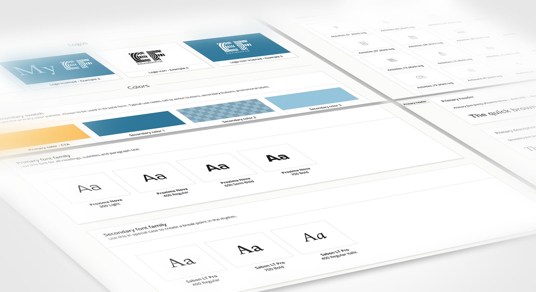
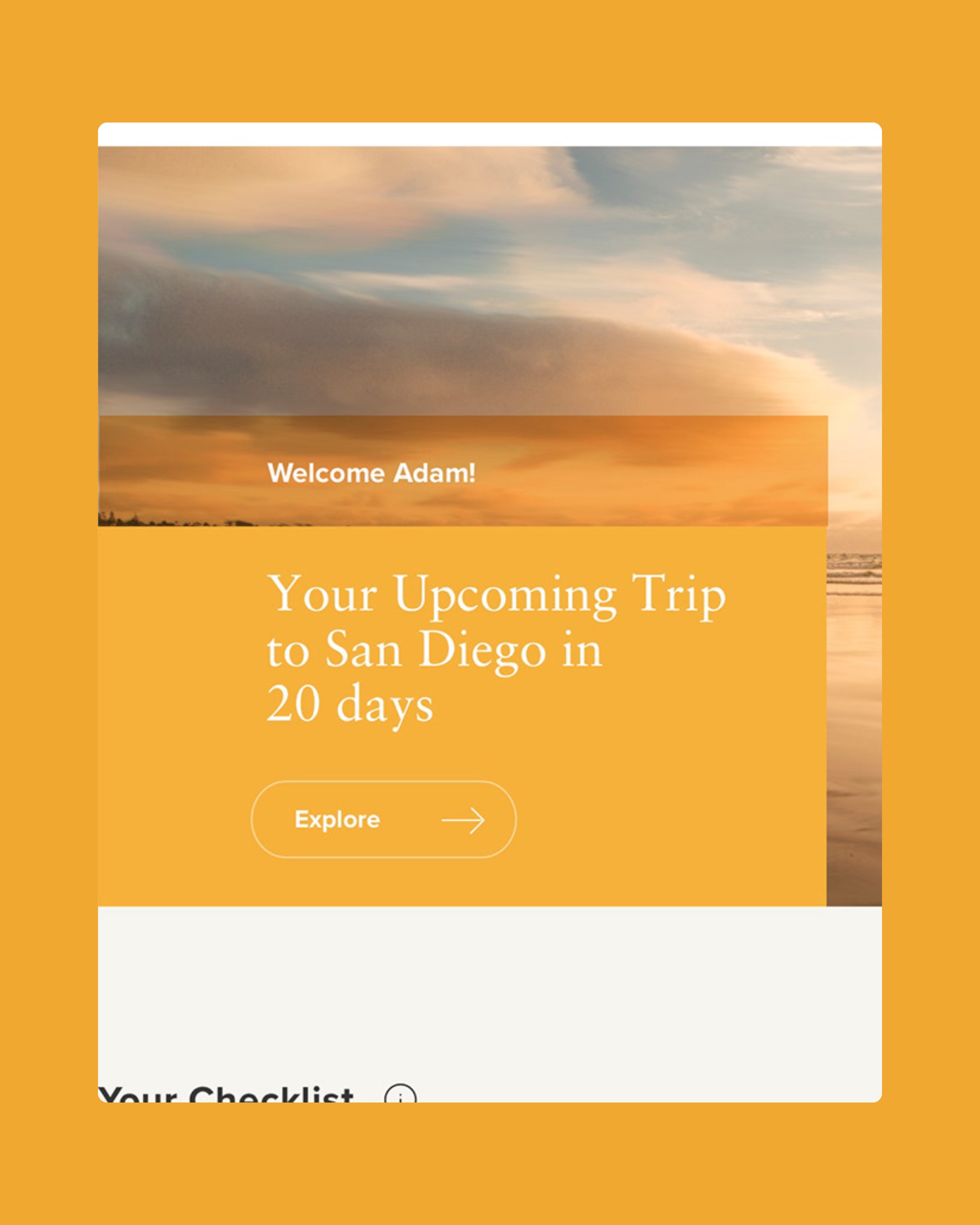
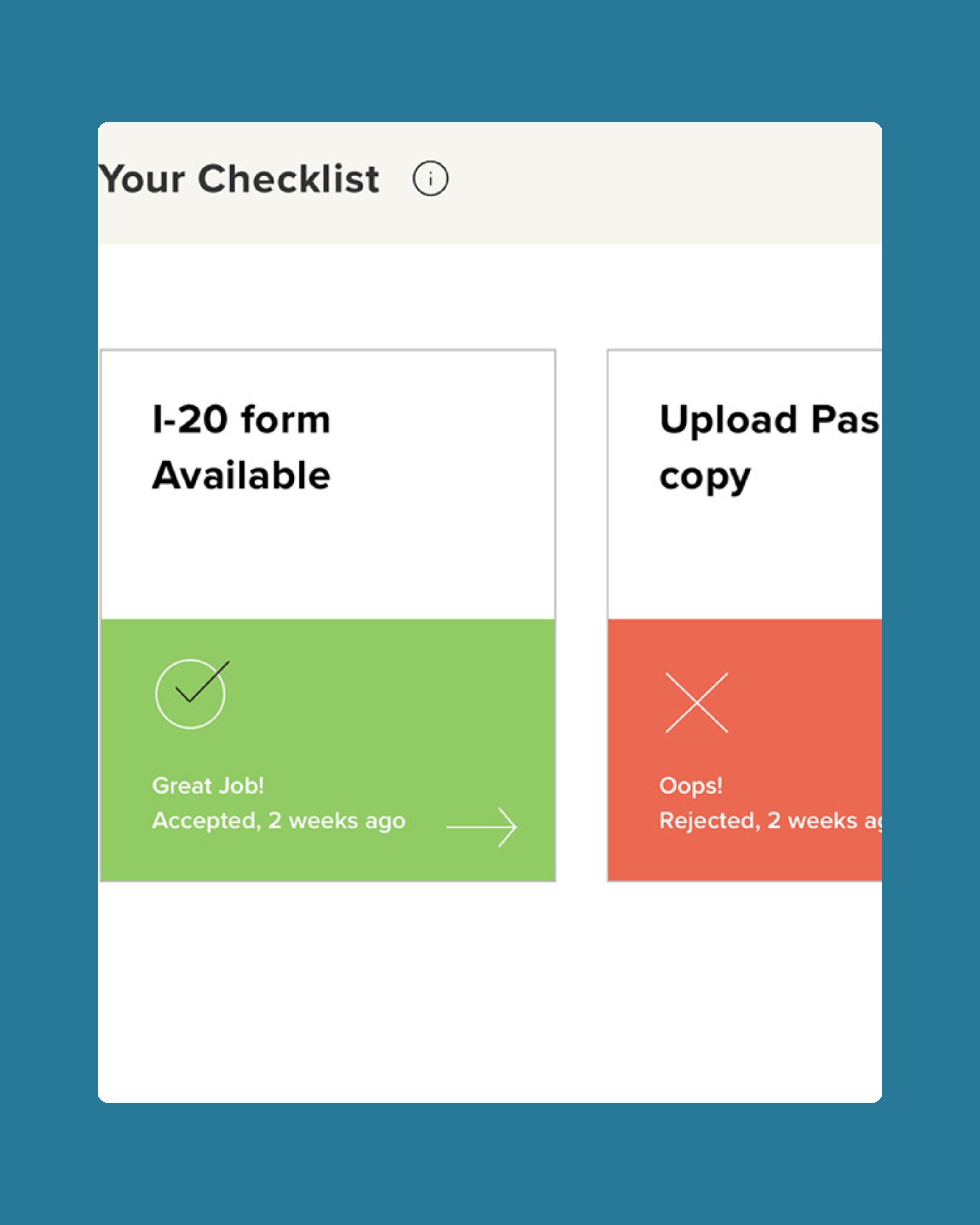
We started with the foundation. I rebuilt the product branding as a style guide in Brand.ai: Proxima Nova and Sabon, a warm yellow for actions and two blues. Its Sketch plugin synced the styles, so every designer worked from the same source. On top of it, the 2018 site opens with the trip itself: a full-bleed destination photo, a countdown, and a checklist of documents accepted, rejected or still pending.
Lead product designer. Restructured the My EF portal and cleaned up its product branding, documented the style guide in Brand.ai and designed the 2018 desktop page layouts, from login to document upload.