12 / 19 · An online campus for EF students

My EF

My EF is the online campus where EF Education First students meet classmates and prepare for their trip. I rebuilt its product branding as a shared style guide and designed the 2018 desktop pages, from login to document upload.

Role
Lead product designer
Client
EF Education First
Industry
Education
Year
2017
Work
Product design, Web design, Design system

A student about to travel with EF Education First opens My EF before leaving home. There they meet classmates, read about their school and city, and handle the paperwork for the trip: visa forms, passport copies, transfers and accommodation.

The portal had grown into an outdated ecosystem. Branding was inconsistent, features sat in separate corners, and a student counting down to a first trip abroad had to hunt for the one document still missing. Every new screen added to the drift, because there was no shared source for styles.

What would a student need to see first, and what foundation would keep dozens of screens consistent as the product scaled?

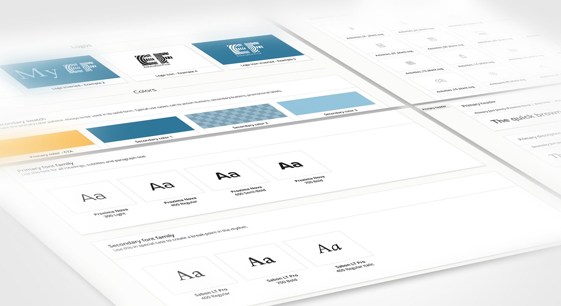
We started with the foundation. I rebuilt the product branding as a style guide in Brand.ai: Proxima Nova and Sabon, a warm yellow for actions and two blues. Its Sketch plugin synced the styles, so every designer worked from the same source. On top of it, the 2018 site opens with the trip itself: a full-bleed destination photo, a countdown, and a checklist of documents accepted, rejected or still pending.

My role

Lead product designer. Restructured the My EF portal and cleaned up its product branding, documented the style guide in Brand.ai and designed the 2018 desktop page layouts, from login to document upload.
What made it hard

  • An outdated ecosystem

    The brief was to re-brand and re-structure the portal from the ground up, while the product was still in active development.

  • Consistency across screens

    Styles had to travel across every screen in the organisation without manual redlining.

  • Paperwork with deadlines

    Students juggle visa forms, waivers and transfer details in several languages, and each has a due date.

  • Social and practical in one place

    The same home page had to feel like a lively student lounge and a dependable trip dashboard.

Questions we asked

  1. What does a student want to know 20 days before departure?
  2. How do we show a rejected document without causing panic?
  3. Which styles belong in the shared library, and which stay local to one screen?
  4. How do school, city and housing information fit into one consistent page pattern?
01

A shared design language

The first job was cleaning up product branding and the design guidelines. Brand.ai holds the logo variants, colour swatches, type scale and icon set, and its Sketch plugin pushed the same styles to every screen across the organisation. Proxima Nova carries headings and body text; Sabon LT Pro is kept for moments that need a break in rhythm.

A shared design language

The Brand.ai guide kept logo variants, colours, type and icons in one synced library.

02

Login and the trip ahead

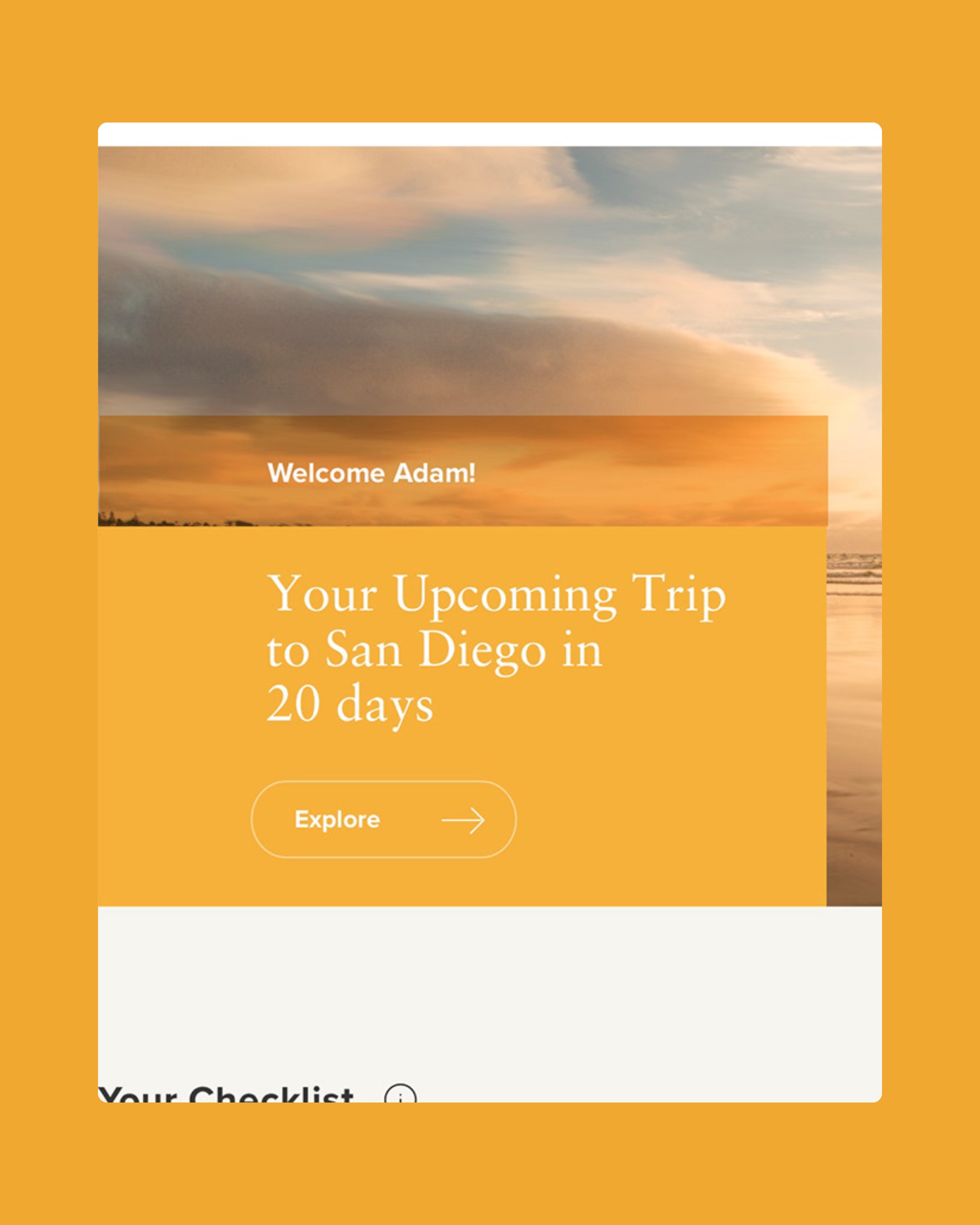
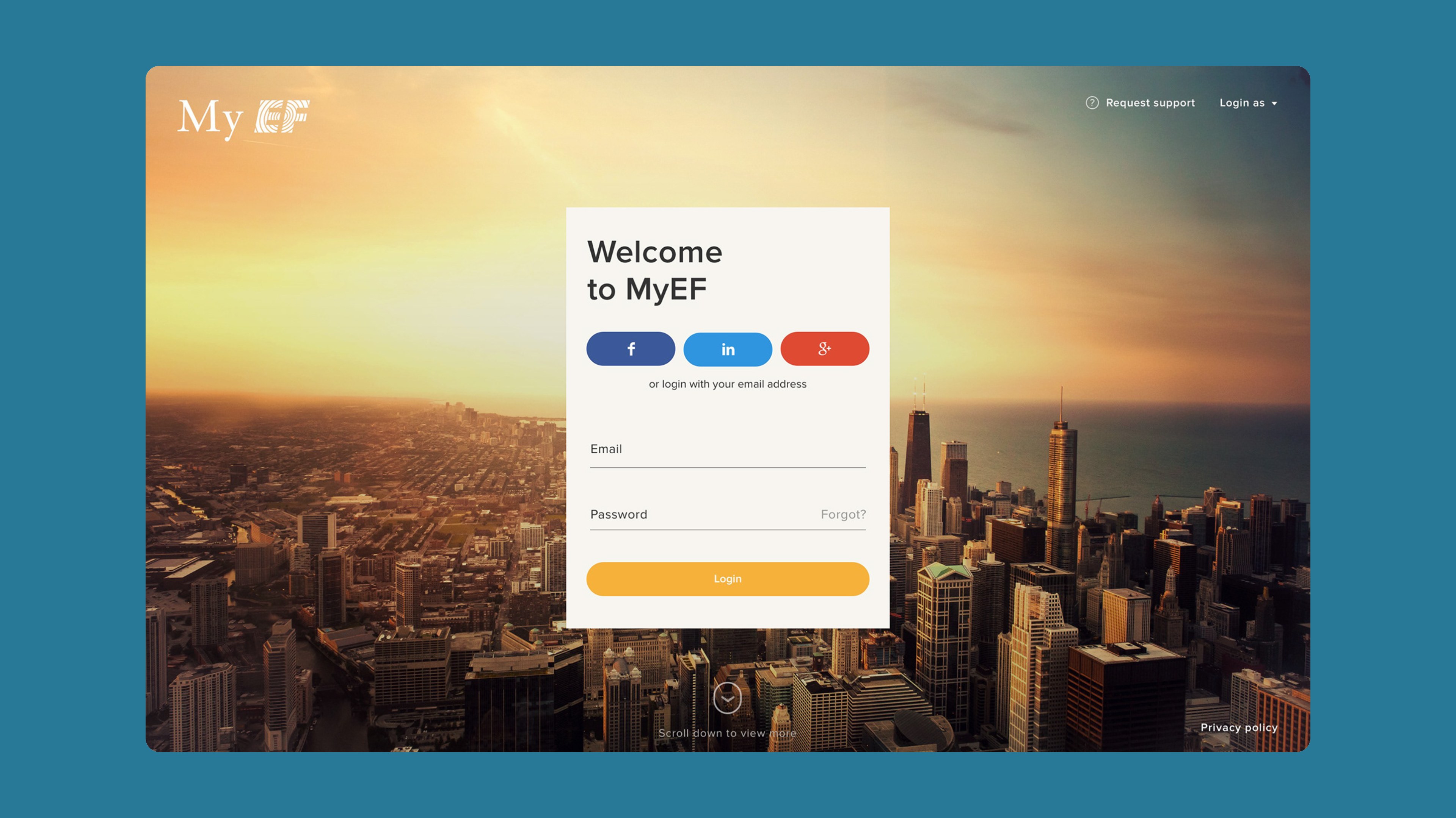
Login sits over a photo of a city skyline, with social sign-in or email. Once in, a panoramic splash greets the student by name with the trip that matters: "Your upcoming trip to San Diego in 20 days". It adds today's weather and a single Explore button.

Login and the trip ahead

Sign-in sits on a single card over a sunset skyline, with social or email login.

03

The lounge

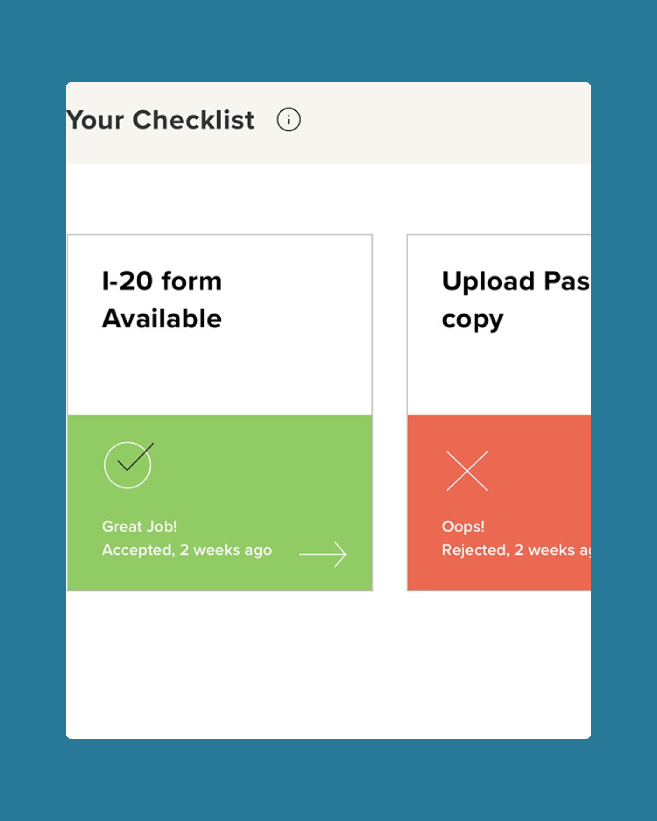
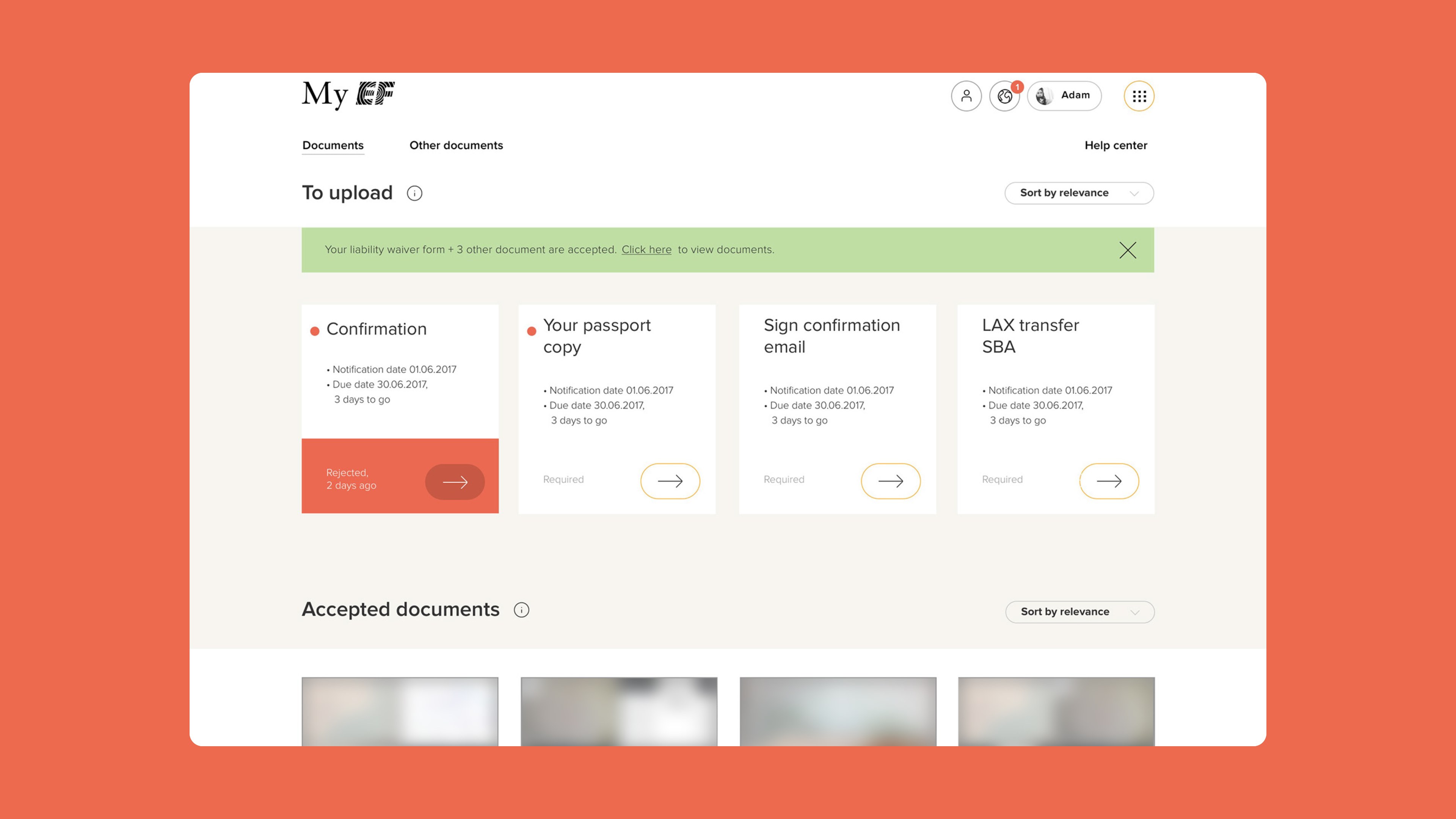
The home page puts a trip checklist above the social feed. Each card shows a document's state in colour: green for accepted, red for rejected, blue for pending. A flight line from CHZ to SAN counts the days. Below it, the local My EF community shares posts pulled in from Twitter, Facebook and Instagram, alongside suggested friends and timely prompts.

The lounge
The lounge

The lounge scrolls from the trip hero and checklist into the community feed.

04

School, city and housing

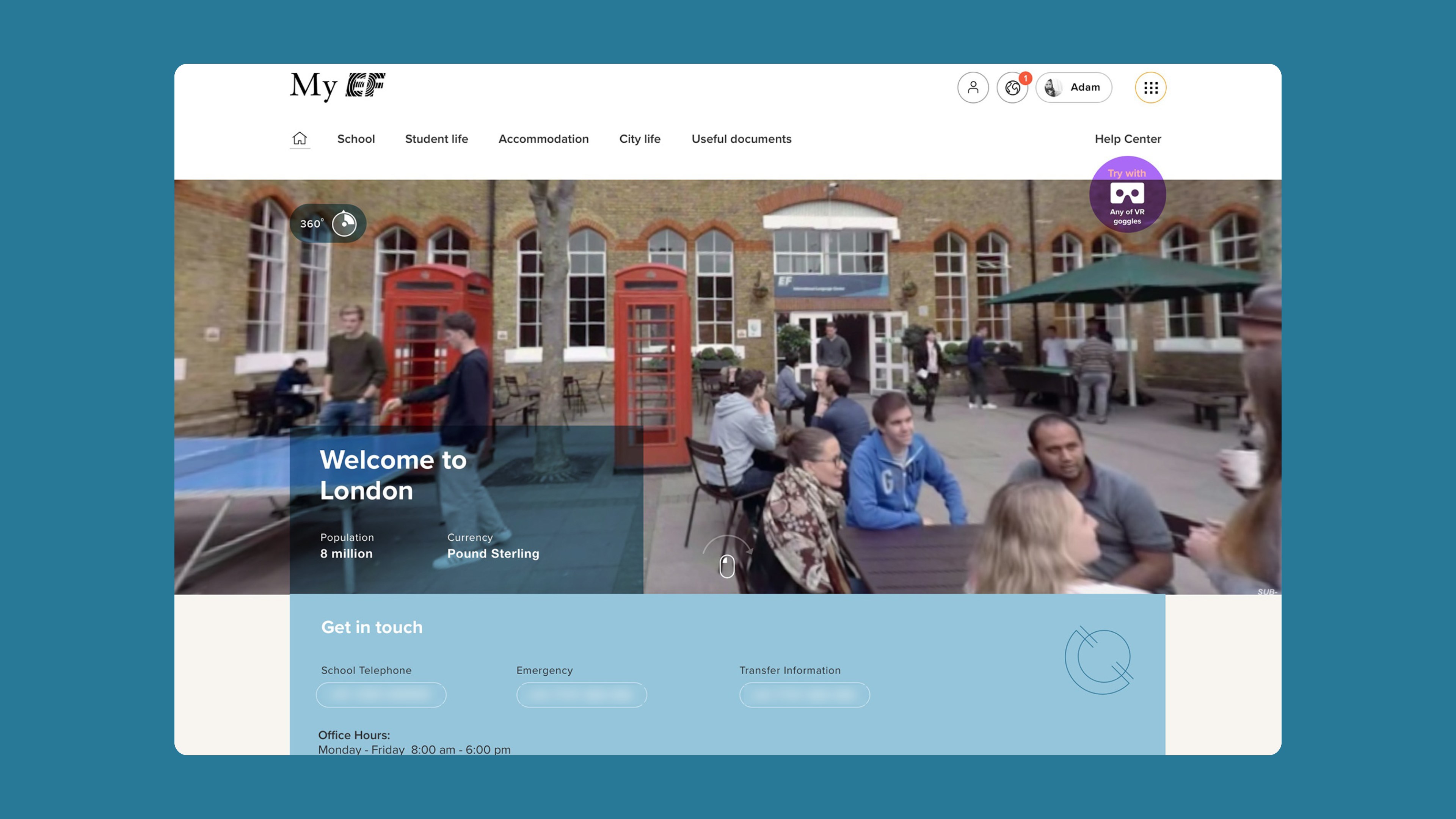
School pages follow one pattern. A welcome, key contacts and a support request come first. Then come the city's sights and activities, the campus, and host families and residences with amenities, facility photos and a map.

School, city and housing

Each school page opens with a 360-degree view of the campus and the ways to get in touch.

05

Document centre

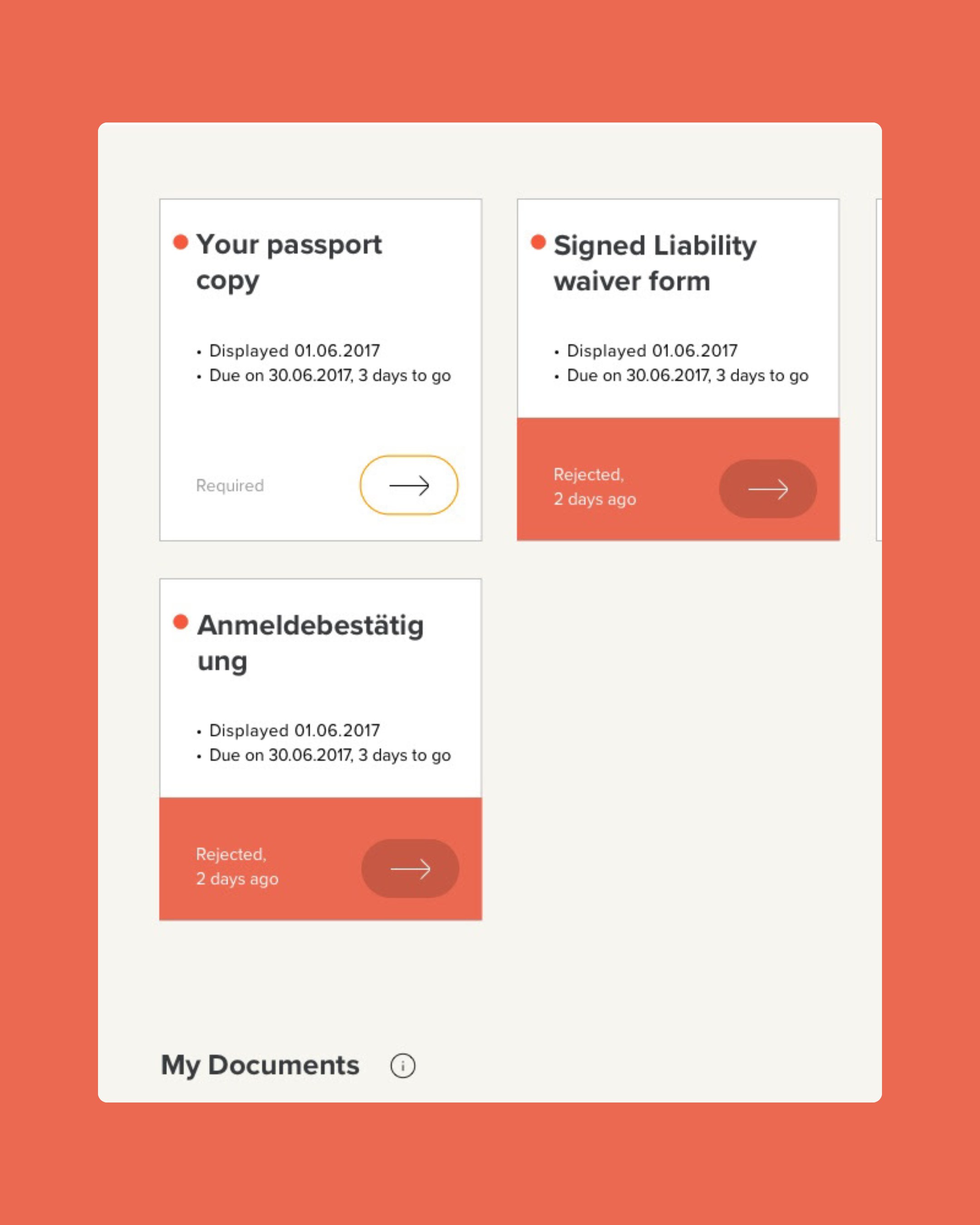
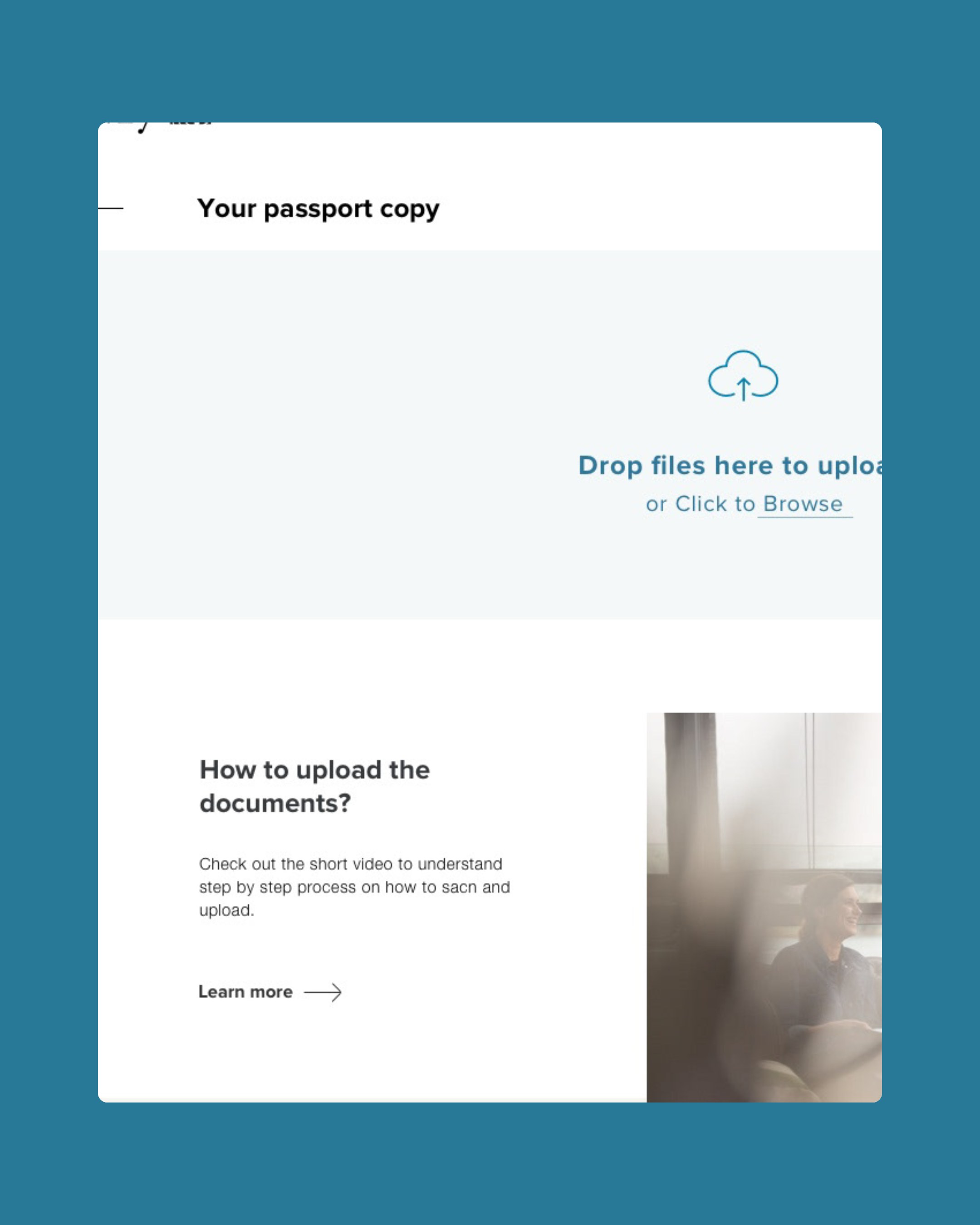
Everything a student must upload sits in one row with due dates and status. Everything EF sends back, from the flight e-ticket to accommodation details, can be downloaded or emailed. Uploading is a drag-and-drop page with a short how-to video and the other documents still required.

Document centre
Document centre

Rejected documents turn coral, and each one opens a drag-and-drop upload page.

In motion

Outcomes

  • 10+desktop page templates designed
  • 1shared style library synced to Sketch

What I took away

  • Fix the foundation first. It made every later screen faster to design and easier to review.
  • Lead with the trip. A countdown and a checklist told students more than any welcome message could.
  • Give each colour one meaning. Status colours only work when green, red and blue never swap roles.
Lead product designer
Preetham Lawrence
Have a hard problem worth solving?

Let's solve it together.

preetham.lawrence@icloud.com
+41 76 740 46 30Phone
LinkedIn↗ Writing on Medium↗

Design leader based in Zürich, Switzerland. Open to leadership roles and selected collaborations.

© 2026 Preetham LawrenceIndex